HellaBlack
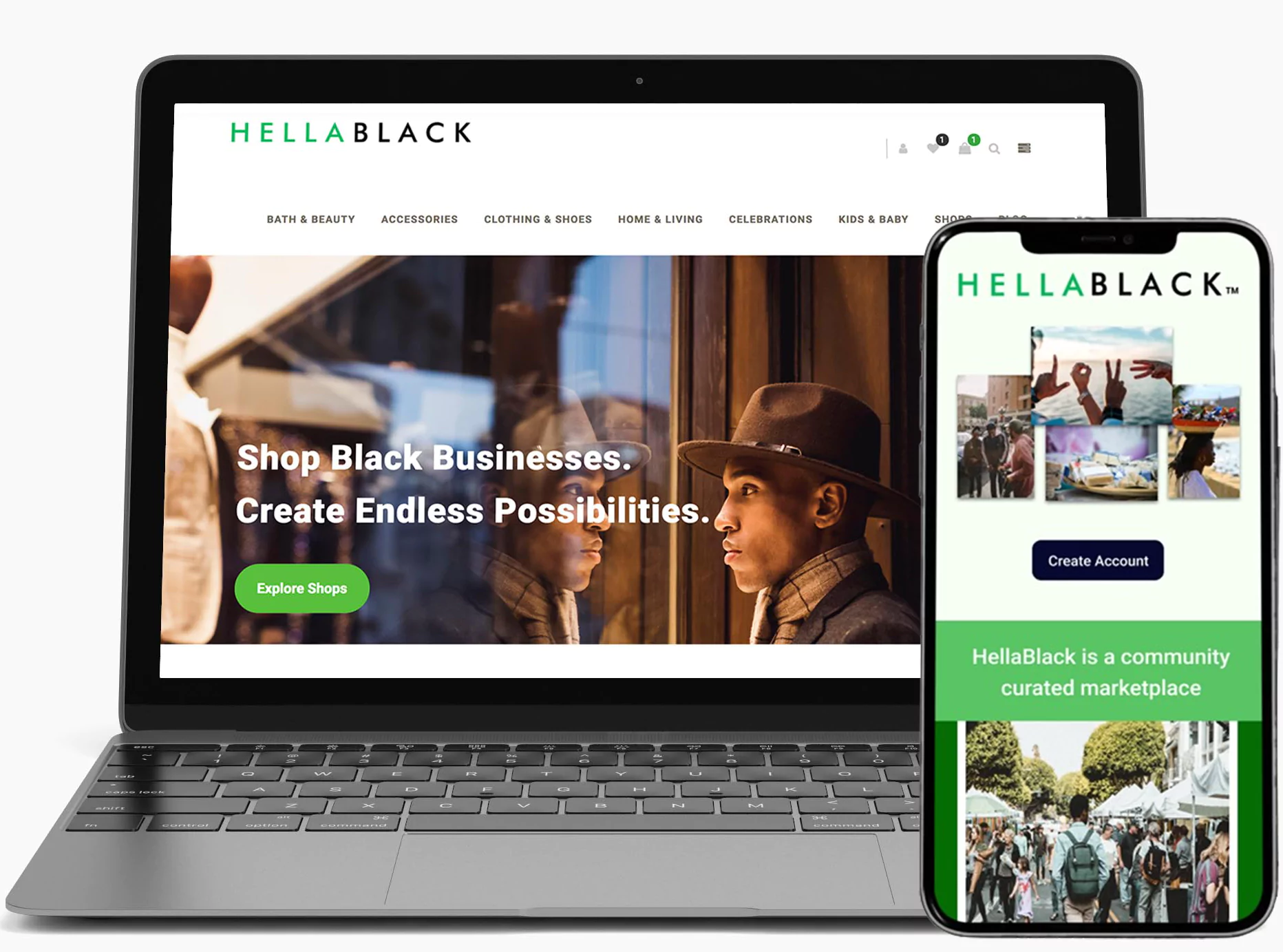


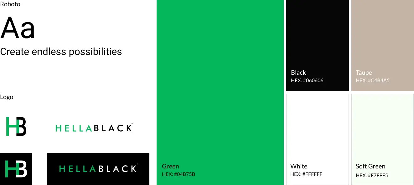
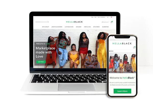


HellaBlack, an aspiring eCommerce startup, emerged from a passionate family's vision to create a platform that not only empowered Black entrepreneurs but also gave 2% of each transaction back to the community.
At its core, the concept was to develop a marketplace, serving both vendors and consumers, focusing on empowering businesses. Our collaboration began with the goal of designing and launching a marketplace website that celebrated Black businesses, prioritized user experience, and supported community growth.
As the founding designer for HellaBlack, I led the end-to-end product design process. This involved constructing the platform's architecture, essential user flows, and gaining CEO approval. I navigated through the complexities of transitioning away from WordPress, from initial wireframes to V1 final designs. Subsequently, I collaborated with the development team over 12 sprints, ensuring a seamless handoff and alignment with the leadership team. Additionally, I played a key role in the creation of the HellaRich Hub microsite, a unique learning and directory platform for sellers.
Directed the complete design process including tasks such as creating user flows, designing sitemaps, crafting landing pages, and ensuring intuitive interfaces for both buyers and sellers.
Over the course of 2+ years, beginning in 2019 and concluding in the spring of 2021, I led the end-to-end product design of HellaBlack's marketplace website.
TEAM
CEO, CMO, Development team, Head of Content , Creative director and Social media manager
Building foundational UX documents was critical to ensuring clarity and alignment with company stakeholders before delving into classification, hierarchy, labels, and navigation.
This initial phase involved mapping out the user journey, emphasizing user actions and interactions to structure information effectively for each screen. My focus was on refining and enhancing the user experience, particularly emphasizing an intuitive flow for products.
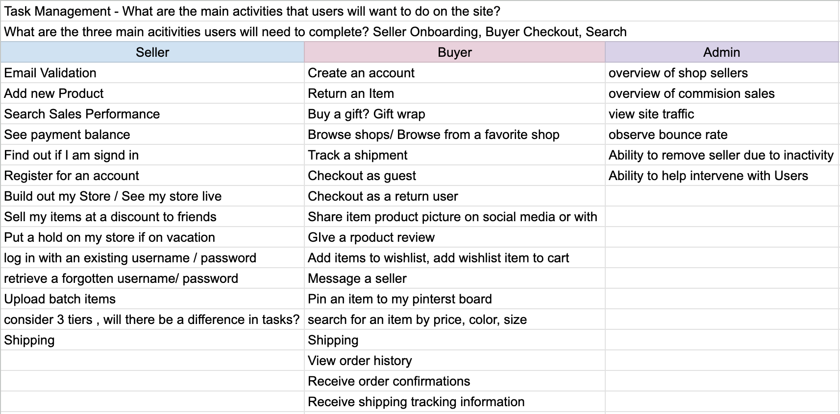
As part of an ideation exercise, I assembled a preliminary task analysis chart, outlining each user type and their respective jobs to be done. My objective was to define essential tasks, providing insights into user behavior and needs.
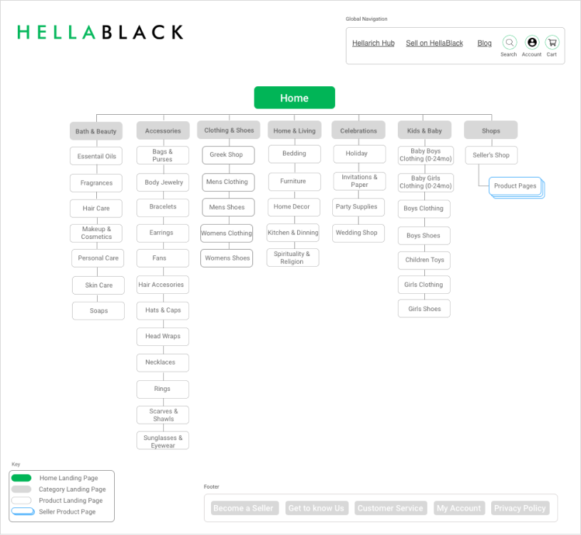
The next step involved constructing a sitemap to lay out essential information, structure the content, and assign navigation labels. This included determining global navigation and organizing content to enhance the overall user experience.
Ultimately, the goal was to visually illustrate the connections between individual web pages and gain approval from stakeholders.
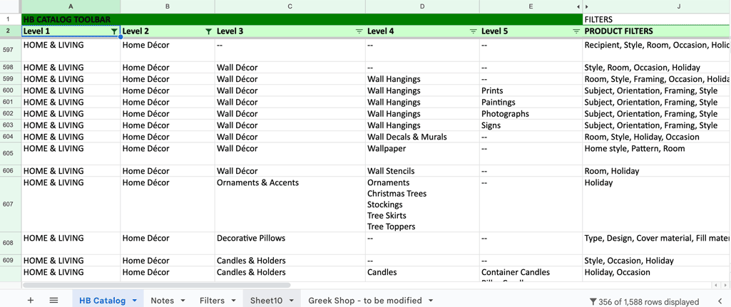
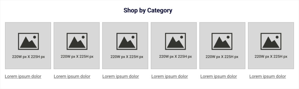
The site map was not going to be enough moving forward. The product categories needed more definition and a solid plan in place to refer to as the company grew.
As a marketplace the majority of the content on site will be user generated it is important to classify any possible product that could be added by sellers.
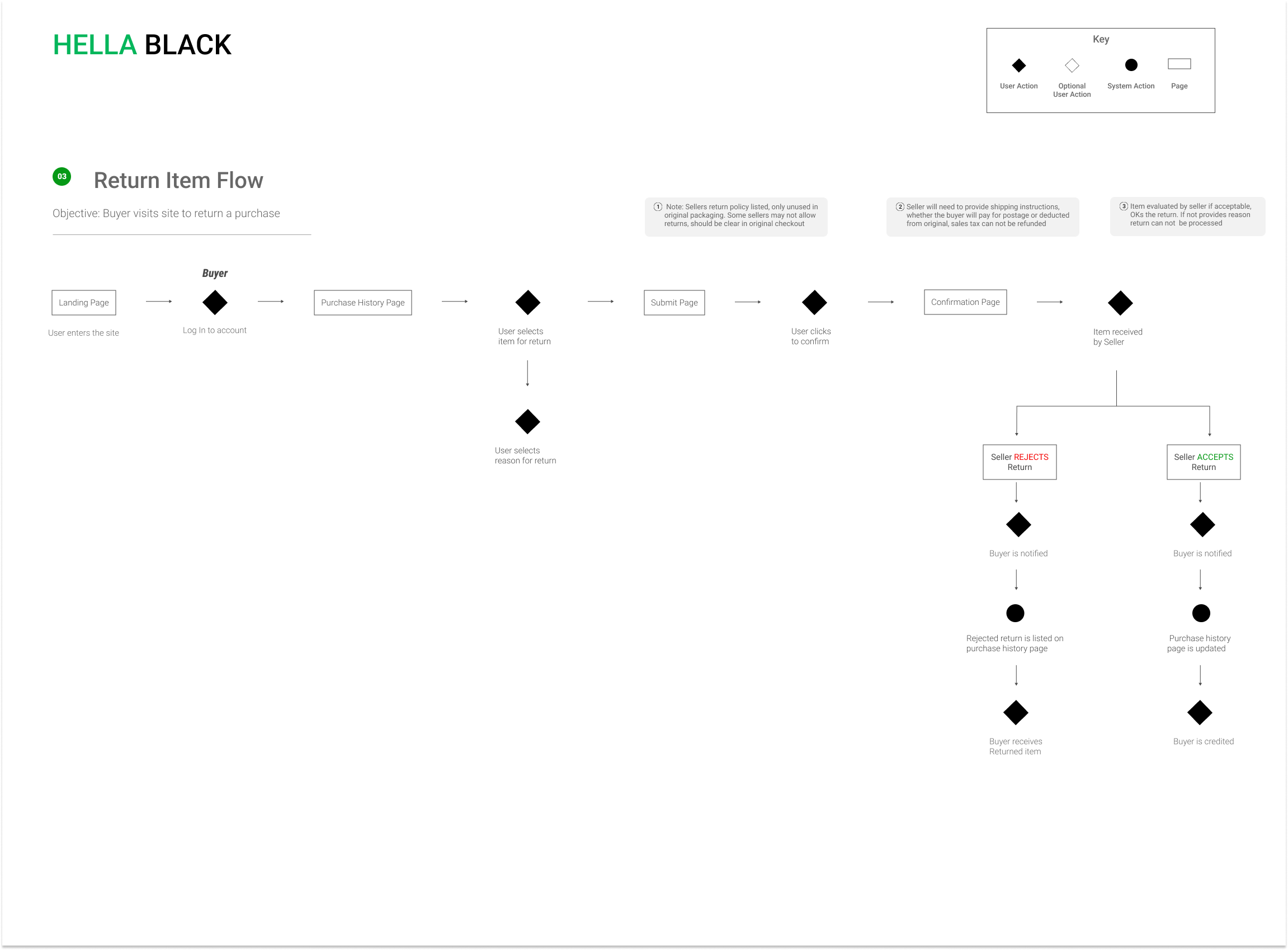
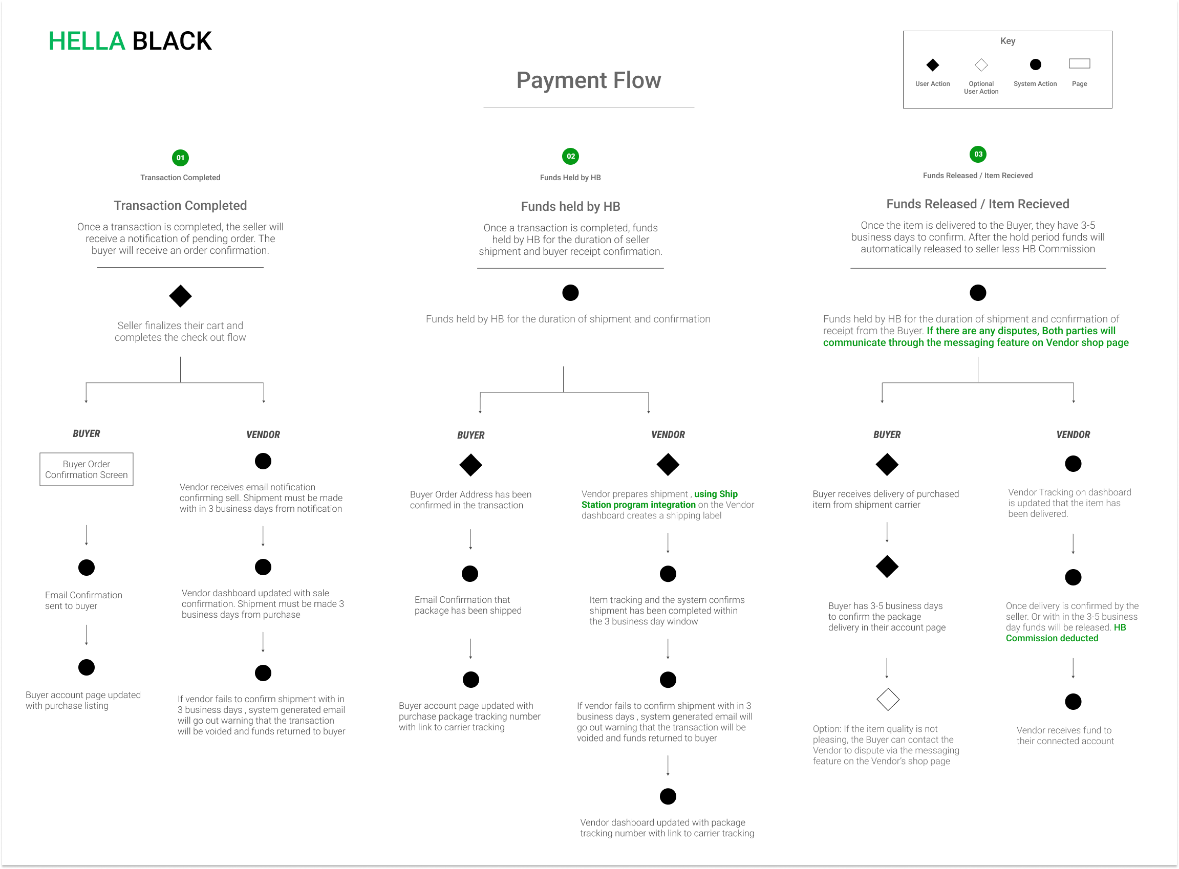
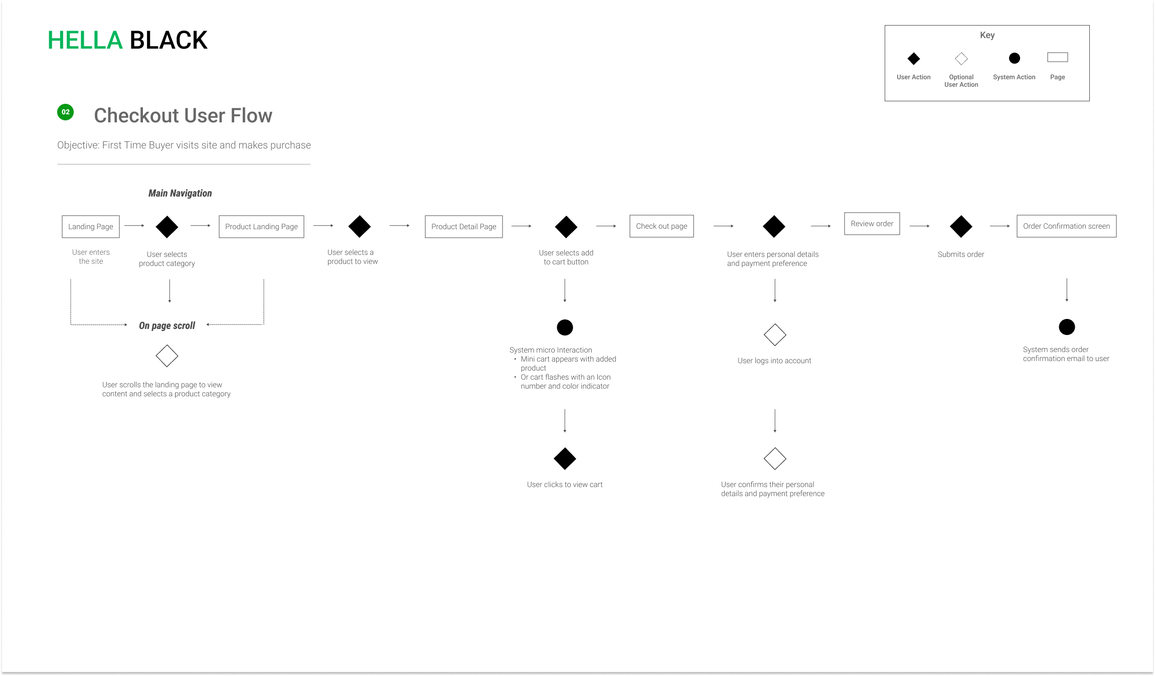
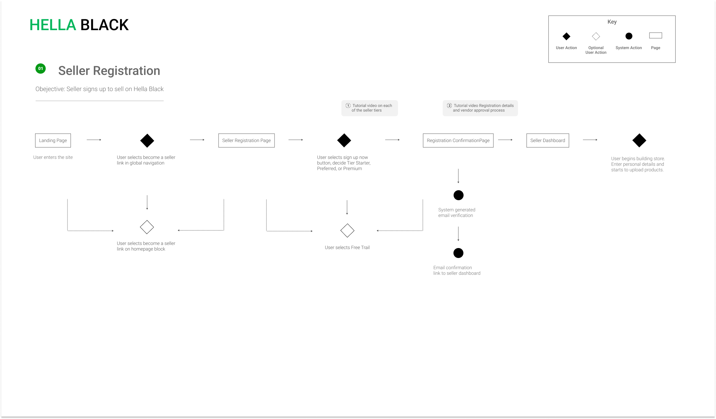
After establishing a solid base for the site structure, the next step was to develop the user flows. Naturally, I focused on the essential user flow for the shopping experience. Following that, I proceeded to build a payment flow to illustrate how vendors would receive payment.
Click images below for preview.
Overall there were some great insights learned from creating the sitemaps and user flows. I discovered four top concerns on the current design that would guide my design thinking and brainstorm solutions for the new design.
Solution:
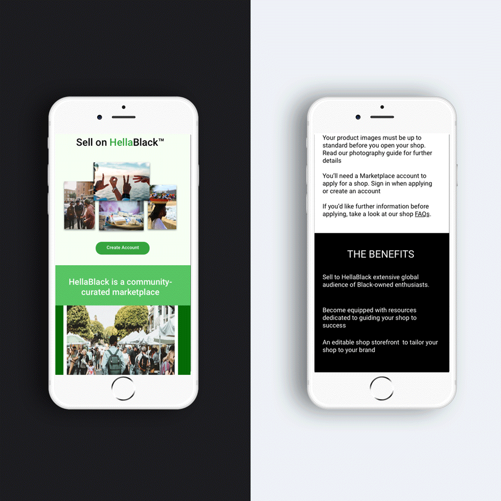
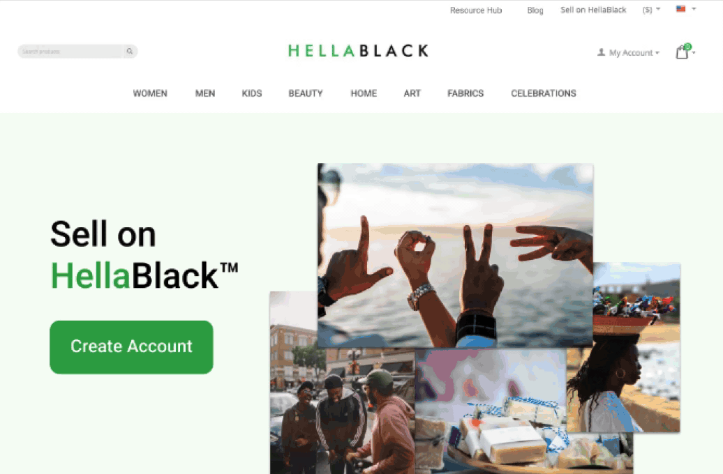
Enhance the seller registration by providing clear guidance and making it a seamless experience.
Solution:
Refine the vendor payment user flow to ensure a smooth and timely process for sellers to receive their earnings.
Solution:
Enhance the definition of product categories, ensuring clear distinctions and easy navigation for users.
Solution:
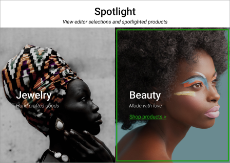
Introduce engaging visuals that align with HellaBlack's identity, creating a visually cohesive and memorable experience for users.
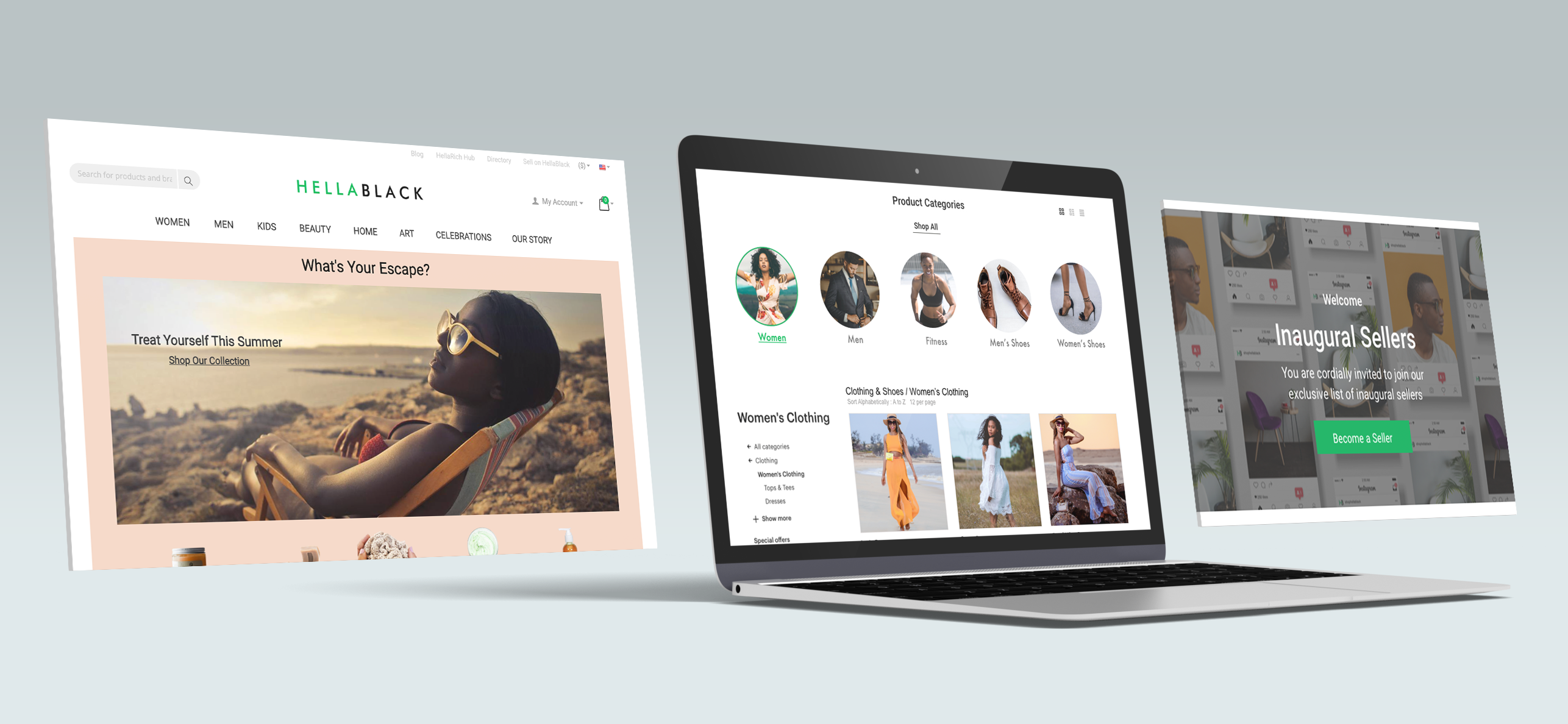
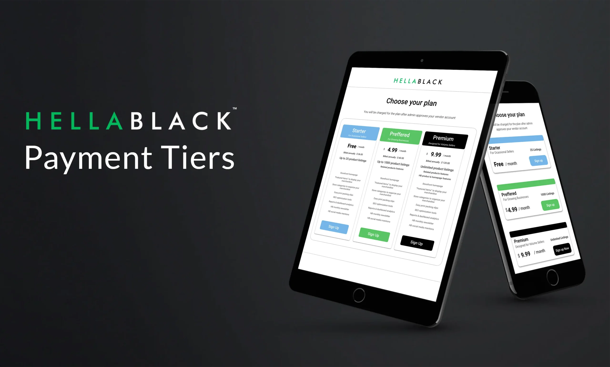
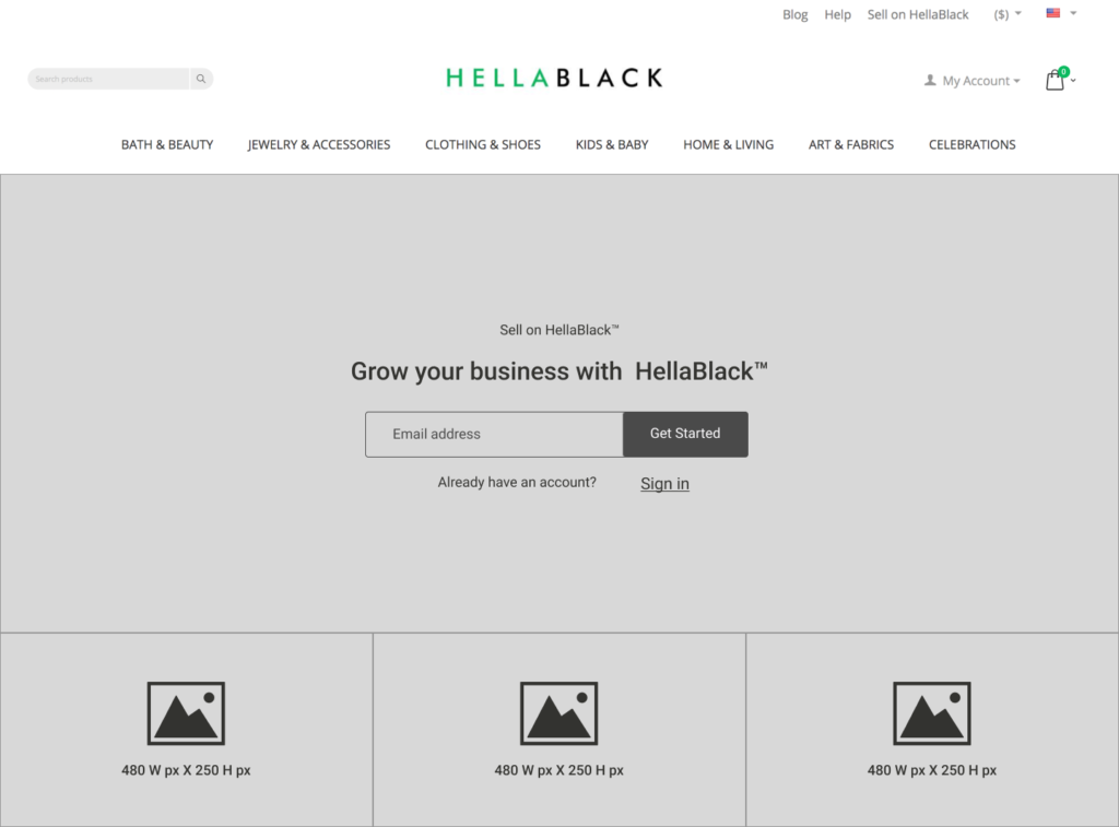
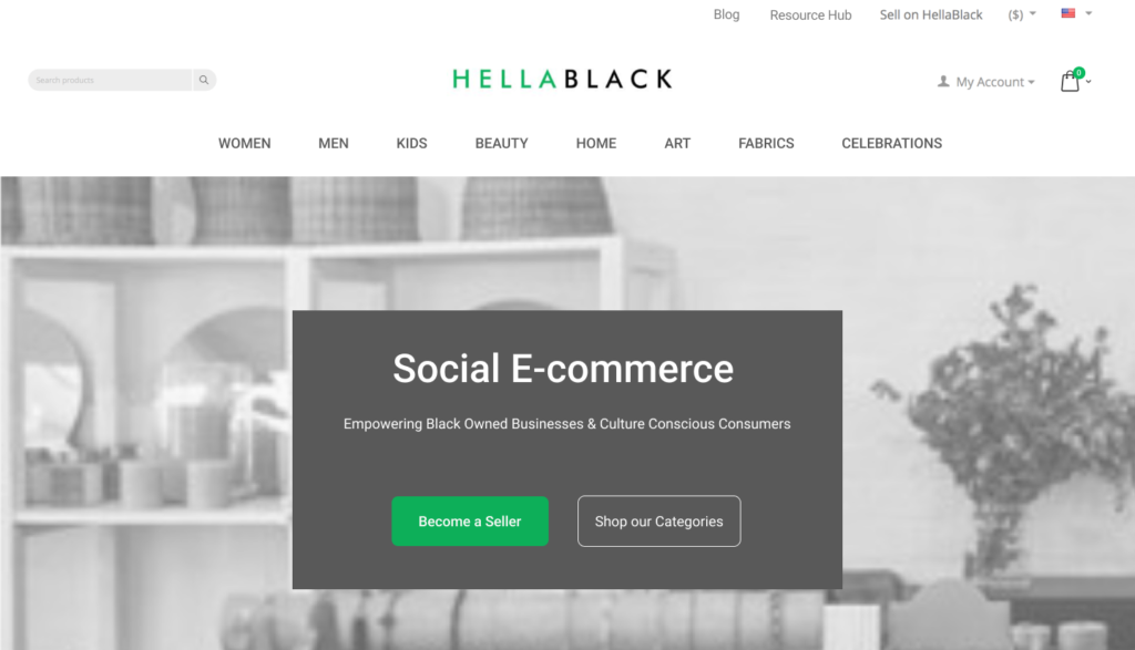
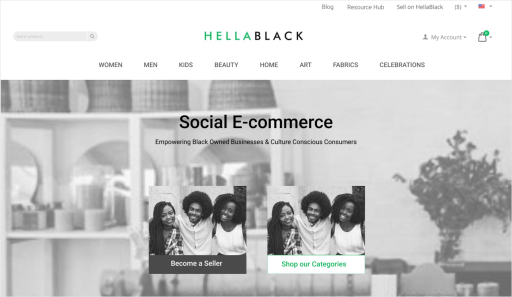
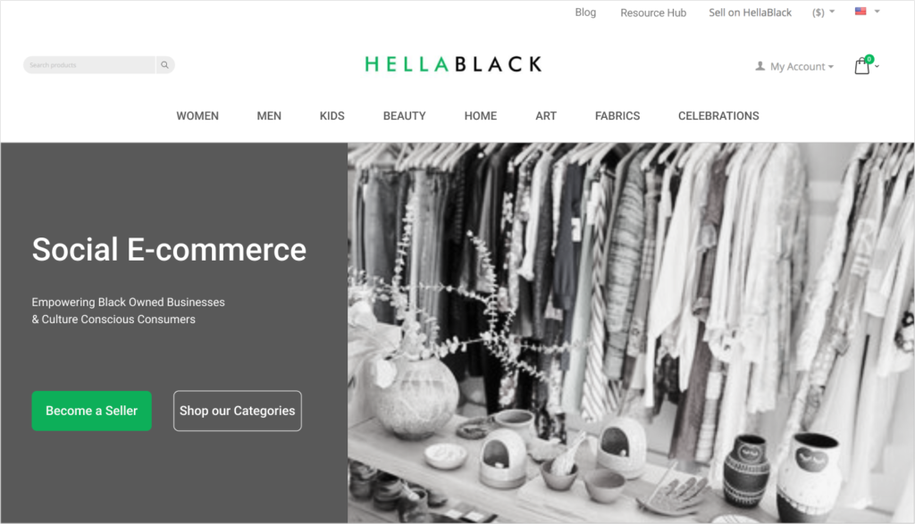
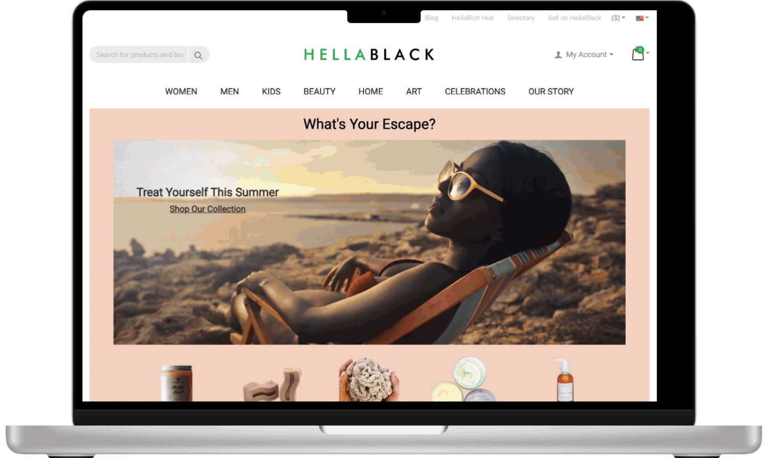
Working collaboratively with the CEO and engineer, we deliberated among various platforms, weighing their capabilities for both the marketplace e-commerce and admin experiences. After exploring Arcadia and trying out their drag-and-drop interface in a demo call, we decided to shift our focus to WordPress. The team's familiarity with WordPress influenced this decision. My initial tasks involved working on the navigation, vendor sign-up, log-in screens, home page, PDP (Product Display Page), PLP (Product Listing Page), and seller registration.
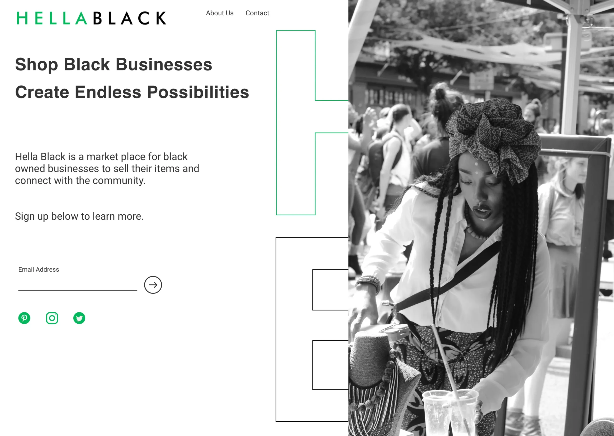
Although we initially built a first-round draft of wireframes on WordPress, the CEO expressed dissatisfaction, prompting a shift to a new platform with enhanced vendor site capabilities. The transition marked a significant phase in the project, moving towards a more powerful technological base. The design is presented in full color; for additional details, refer to version 2 below.
Starting with a new platform gave us the freedom to approach the project with a fresh perspective, allowing us to re-prioritize pages and features.
Areas of focus:
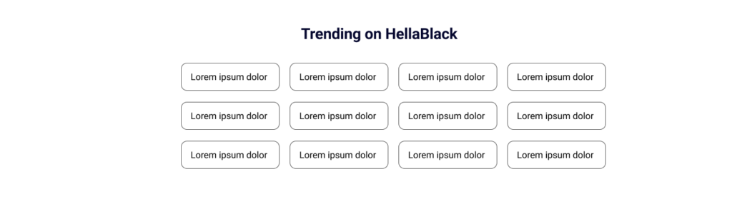
Implement a block wire grid system for the home page to organize content into visually appealing and easily navigable sections. Allowing for clear information hierarchy that could accommodate any future home page content.
Elevate the seller registration experience by streamlining the process and prioritize essential information, for a smooth onboarding process onto the marketplace.
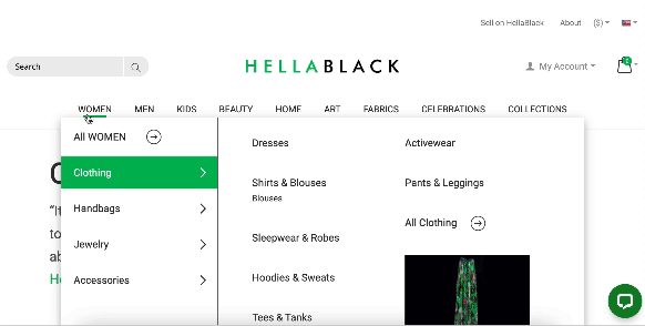
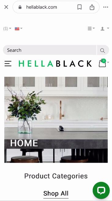
Design a user-centric navigation system with an intuitive mega menu. Prioritize clear categorization, visual cues and concise labels to enhance efficiency.
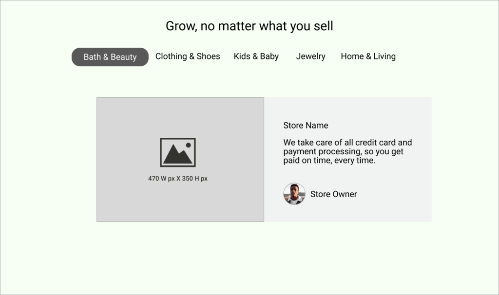
In response to a stakeholder request, Establish the HellaRich Hub as a resource, providing vendors with a platform to showcase thought leadership, create learning presentations, and enhance their visibility.
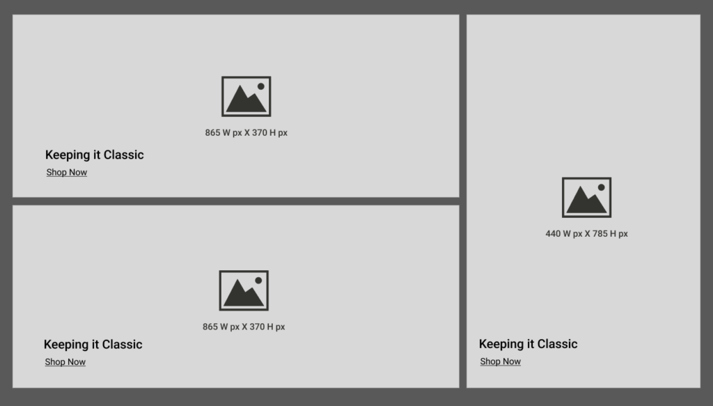
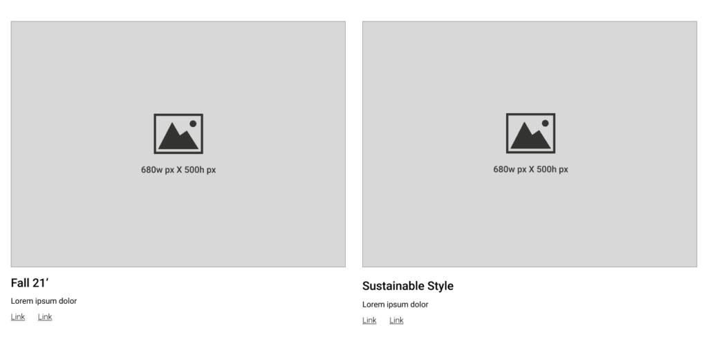
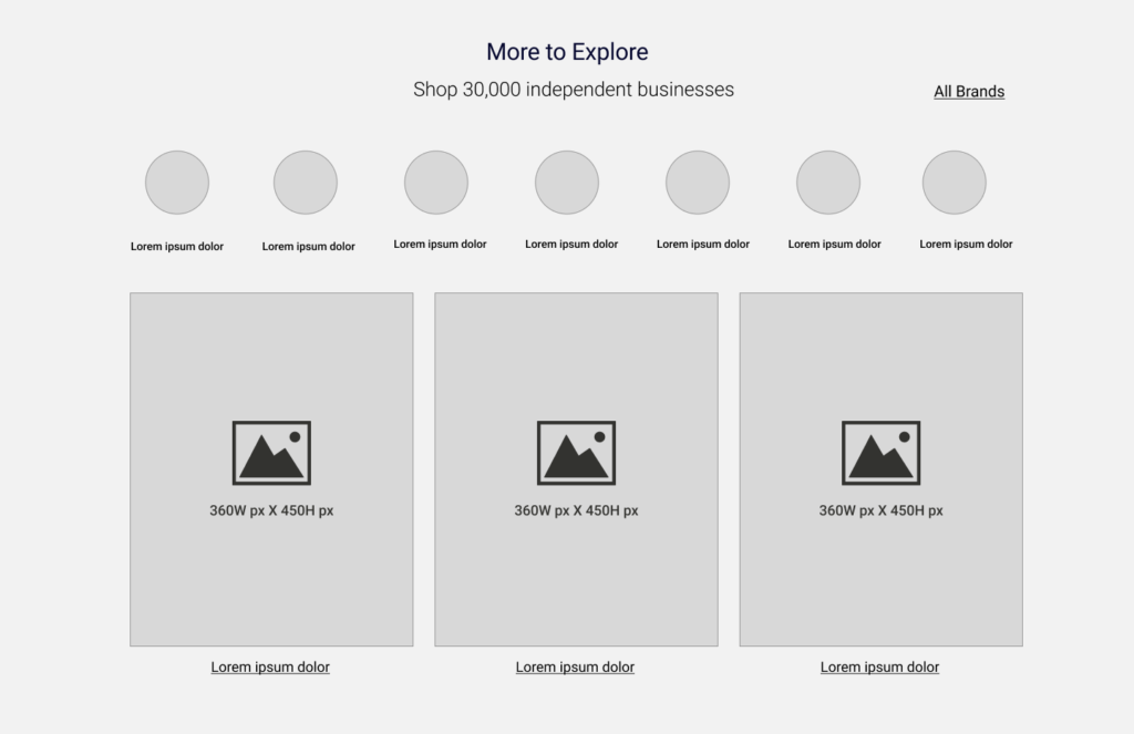
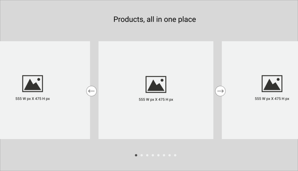
To maximize the timing of the new design and promote the reusability of website blocks, I brainstormed various formats that could be interchangeably used based on the content and product plan for the landing page. The planned frequency of landing page refresh was set at once per month. By maximizing our efforts upfront to have options ready and formatted, we aimed to expedite the launch and reduce development time.
I've included a few examples below.
Hero Options:
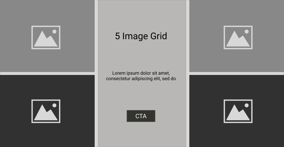
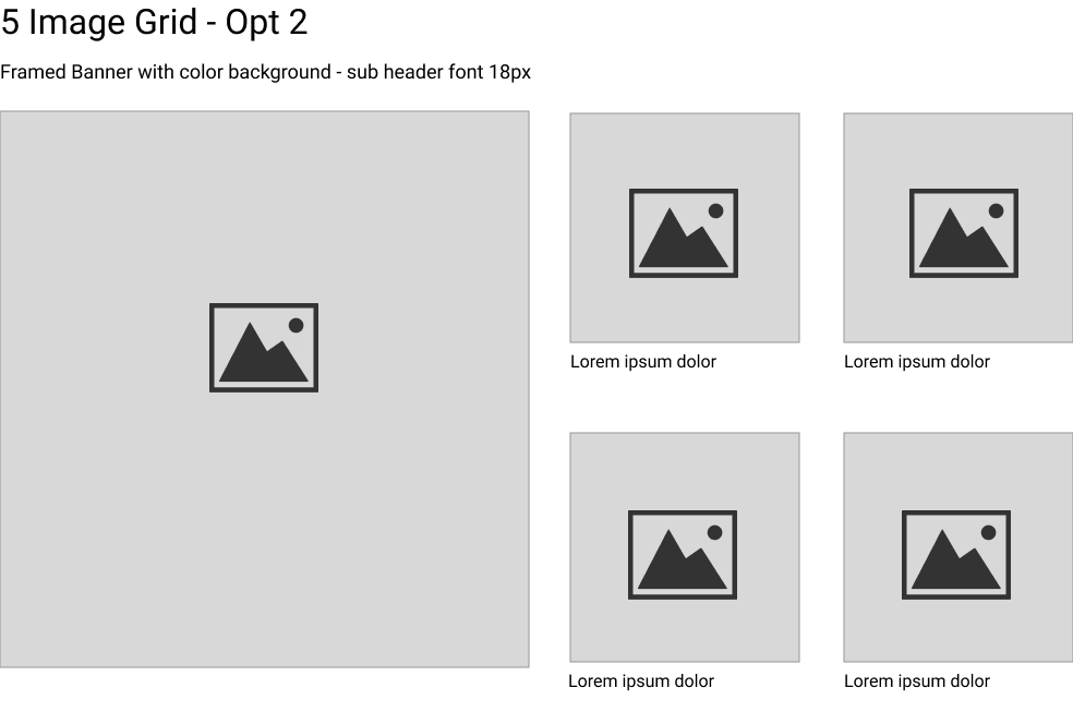
Grid Options:
Banners:
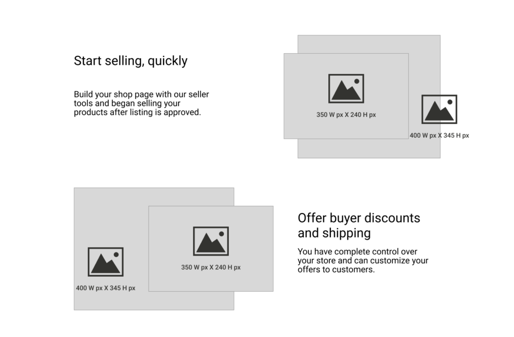
Image Layouts:
The responsive mega menu design is crafted to align with the labels discovered during the category-level chart process. The design prioritizes visibility, categorization, and logical structuring to enhance overall usability.
Desktop
Mobile
I designed a system to support sellers by providing them with tools to build their own mini-store within the platform.
This includes access to create and list thought leadership content in the resource hub linked to their store, as well as in-app messaging, backend shipping, and tax management.
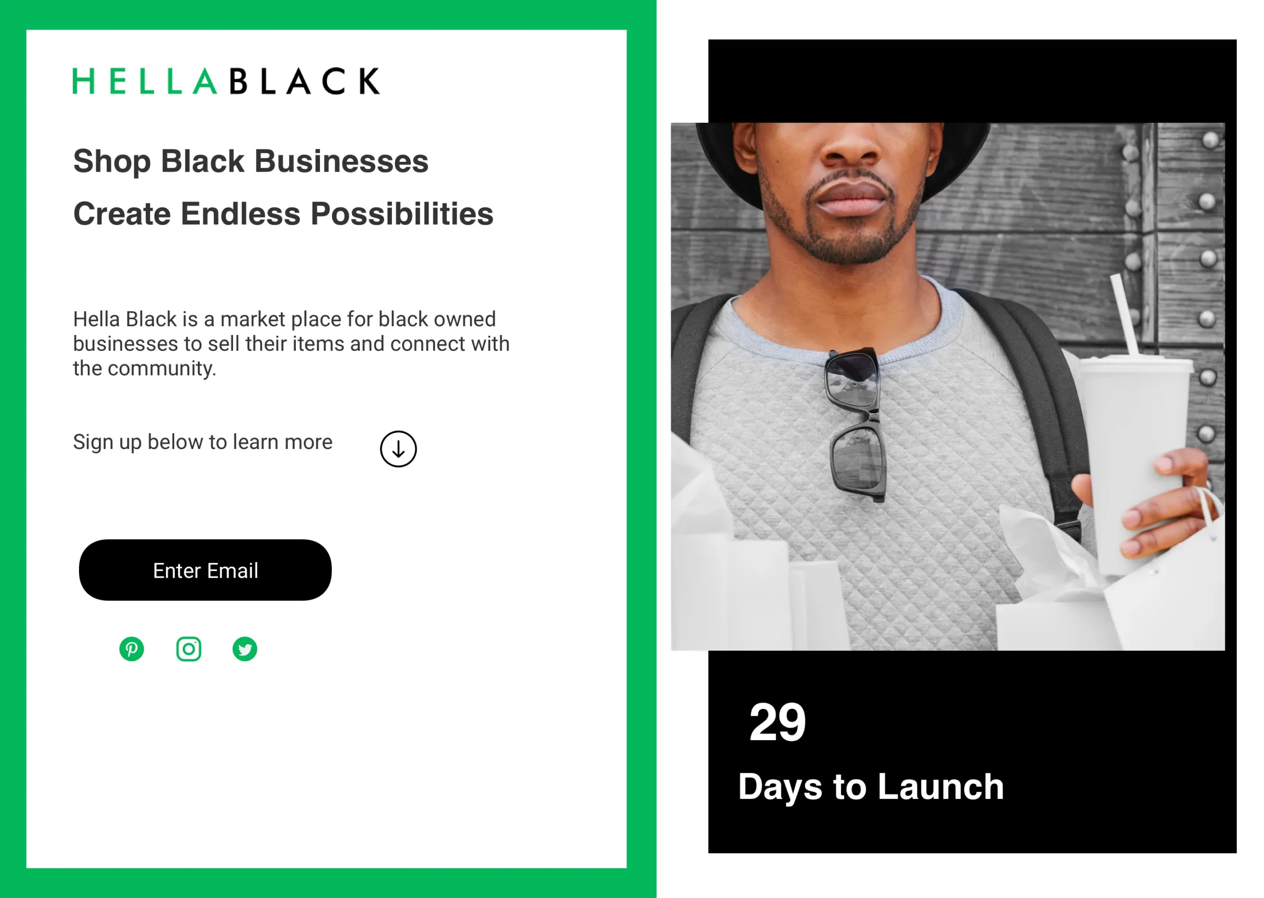
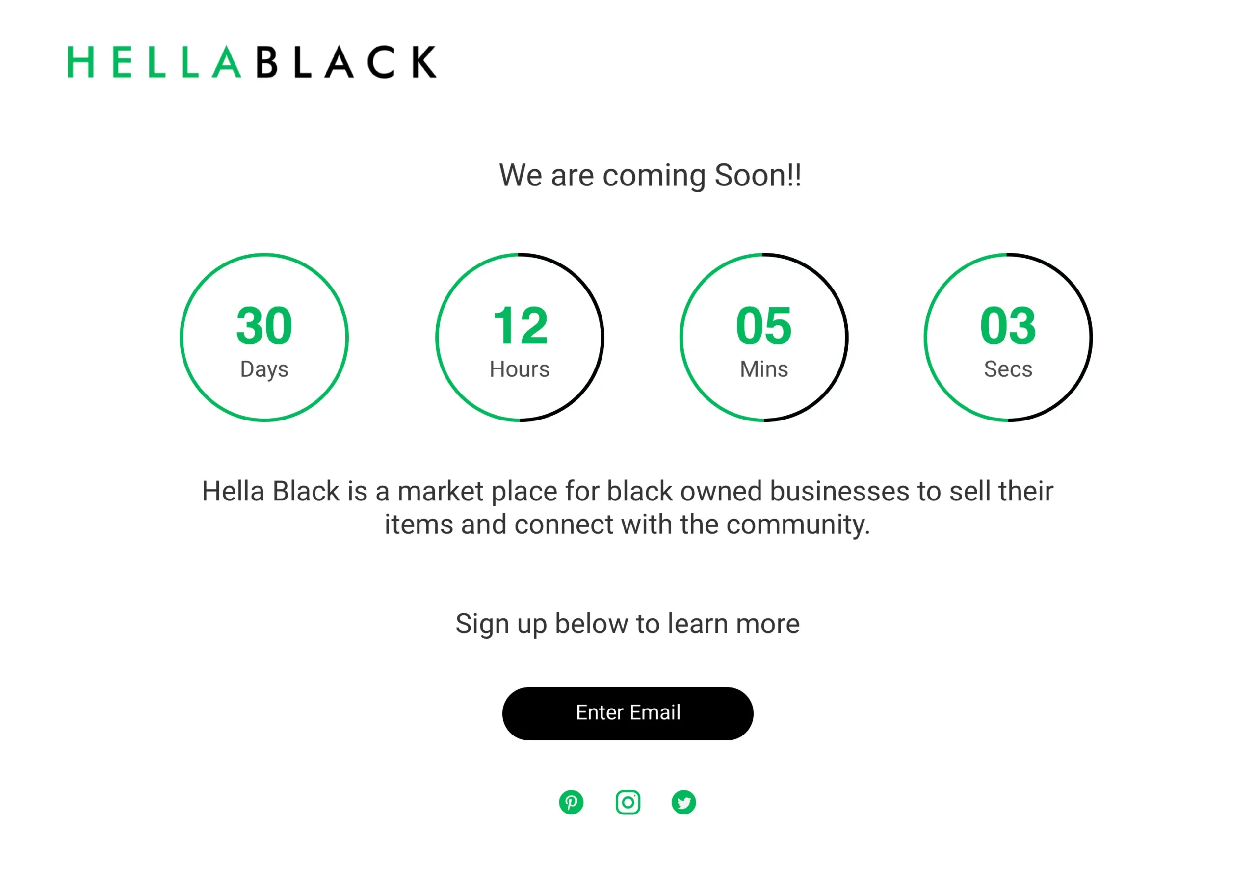
In the summer of 2020, as we approached the launch date, the Leadership team organized a Kickstarter campaign to fund the final phase of the project. I designed website assets, which were utilized as website mockups and in the creation of the promotional video.
When examining the site with a fresh perspective, I would go back and refine the scale of images and the font hierarchy.
During the product build, the consideration for constructing seasonal and occasional shops was overlooked. The navigation was initially designed to accommodate only the essential categories.
The branding and page structures are designed as intended as an interchangeable multi topic pages. However the branding can be more consistent.
We made a light touch on this section of the site and were unable to test it before the launch.
Concluding the HellaBlack marketplace website project, it has been a journey marked by strategic shifts, thoughtful design iterations, and collaborative decision-making. The transition to a new technology base allowed for a more tailored and flexible approach, aligning with evolving project needs. From conceptualizing user flows to refining the seller support system, each stage was a pivotal step towards creating a vibrant and inclusive online marketplace.
The user impact is at the heart of our efforts. Through comprehensive user flows, streamlined navigation, and personalized features, the HellaBlack platform is designed to offer a seamless and engaging experience. The incorporation of the HellaRich Hub empowers sellers, providing a unique space for thought leadership and fostering a sense of community. The personalized user journey, responsive design, and intuitive interfaces contribute to an enhanced experience, ensuring users find what they need effortlessly.
The strategic decisions, such as prioritizing vendor opportunities through the HellaRich Hub and affiliate programs, contribute to a thriving ecosystem. The Kickstarter campaign served as a pivotal moment for funding, highlighting the community's support. The refined category structure, mega menu design, and seasonal shop considerations enhance the platform's appeal, attracting a wider audience. Overall, the project positions HellaBlack as a dynamic and user-centric marketplace, poised for sustained growth and success in the e-commerce landscape.
The best experiences let you recover and edit throughout each step in the flow.