Bare Minerals


Bare Minerals had been reassessing their 'Build Your Own Custom Kit' feature. While the existing kit tool on the website showed promise, analytics uncovered a significant challenge: many shoppers were abandoning the process before completing it.
This discovery highlighted a new opportunity—a necessity for a redesign to address the shortcomings in user experience and revive engagement within this website feature.
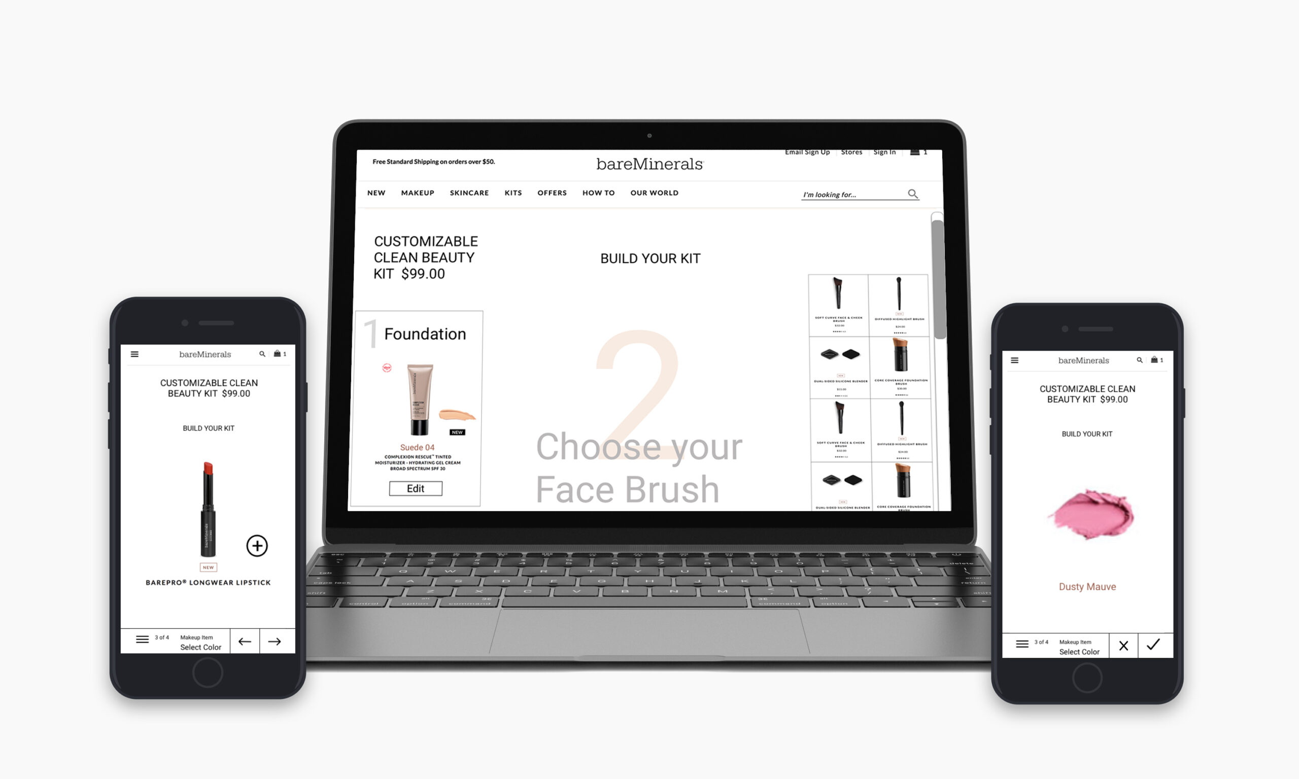
My goal was to deliver an engaging mobile-first experience that not only facilitated kit creation but also encouraged users to explore and discover the range of products available.
The design successfully merged the company's goal of simplicity with users' desire for a personalized touch.
In this project, my primary role involved spearheading the redesign of Bare Minerals' 'Build Your Own Custom Kit' feature. I took charge of researching consumer cosmetic shopping behavior, identifying pain points within the existing kit-building process. Utilizing a mobile-first approach, I conceptualized, implemented, and rapidly iterated the end-to-end design, encompassing testing and prototyping—all within a single week.
My collaboration with the Design Manager and Lead Developer was integral to the process. I incorporated their feedback to ensure design feasibility and alignment with development goals. Leveraging my skill in UX design, I effectively bridge the gap between the company's objectives and a personalized experience for users.
Discovery, UX Audit, Competitive research, Wireframing iterations, end to end prototype & testing
TIMELINE
Project began July 2019. Timeline was expedited to 1 week for wireframes and final design of desktop and mobile responsive experience.
TEAM
Design Manager, Developer
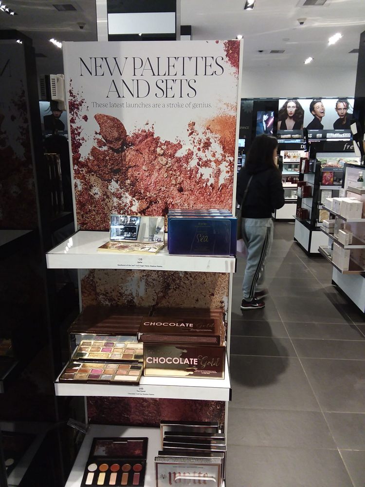
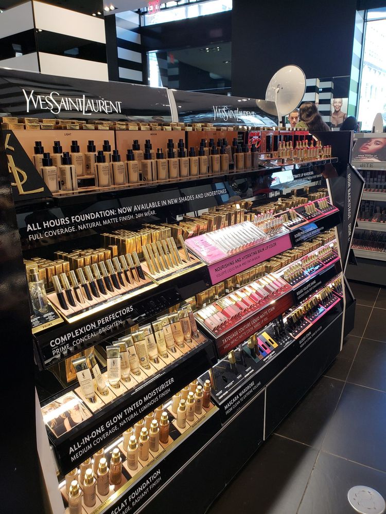
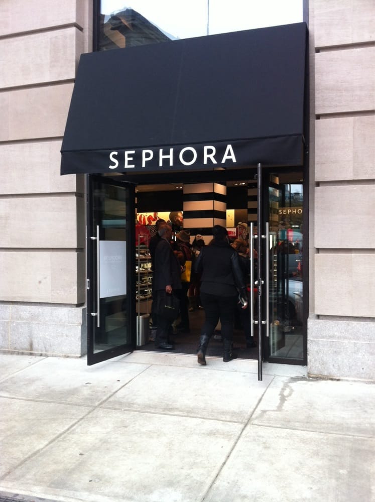
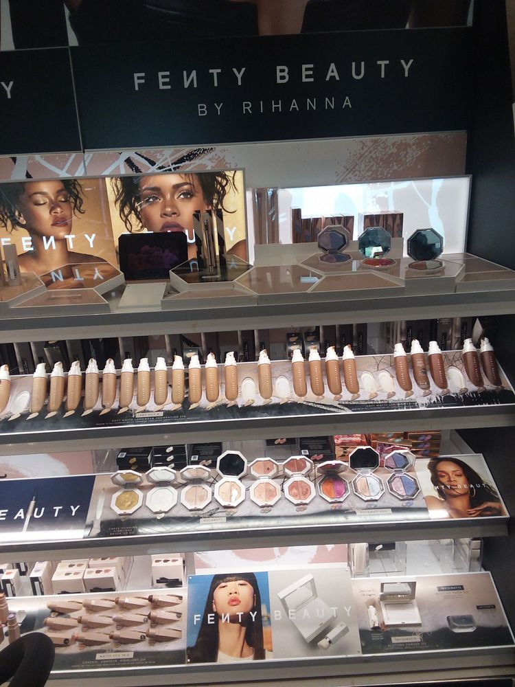
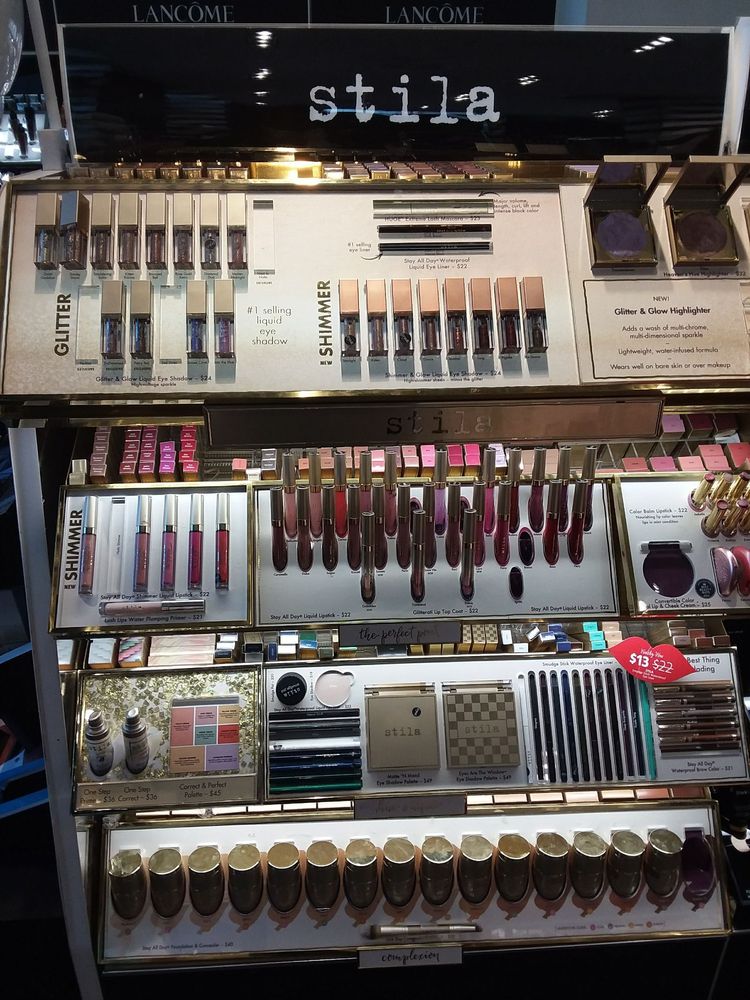
In the initial research phase, I recognized the significance of inspiration in the user experience. To better understand makeup enthusiasts and conduct ethnographic research, I visited a Sephora store on Fifth Avenue. This visit aimed to provide insights into how shoppers engage with makeup products.
The wide range of product choices at Sephora offered a unique opportunity to study the makeup shopping process. Notably, despite each brand having its own signage and branding, all products were consistently organized for user-friendliness. This standardization highlighted the importance of a uniform layout, making product navigation effortless, which influenced the design of our Bare Minerals makeup selection feature in our app.
The goal was to ensure our app not only inspired makeup enthusiasts but also offered a user-friendly browsing and selection experience, mirroring the convenience observed in the physical store.
Shoppers tended to focus on a single item at a time, dedicating their full attention to a thorough examination of each product. This insight highlights the importance of creating an interface that allows users to explore and evaluate makeup items replicating the immersive experience of in-store retail shopping.
A majority of shoppers had a distinct knowledge of the specific makeup category and type they were seeking, indicating a well-defined intent during their shopping experience. This insight underscores the importance of streamlining the user journey, ensuring that users can readily access their desired makeup categories for tailored shopping experience.
The meticulous categorization and product organization provided a clear visual structure, enhancing customers navigation through the store. This observation informed my approach to the feature design, emphasizing the importance of a well-structured digital interface.
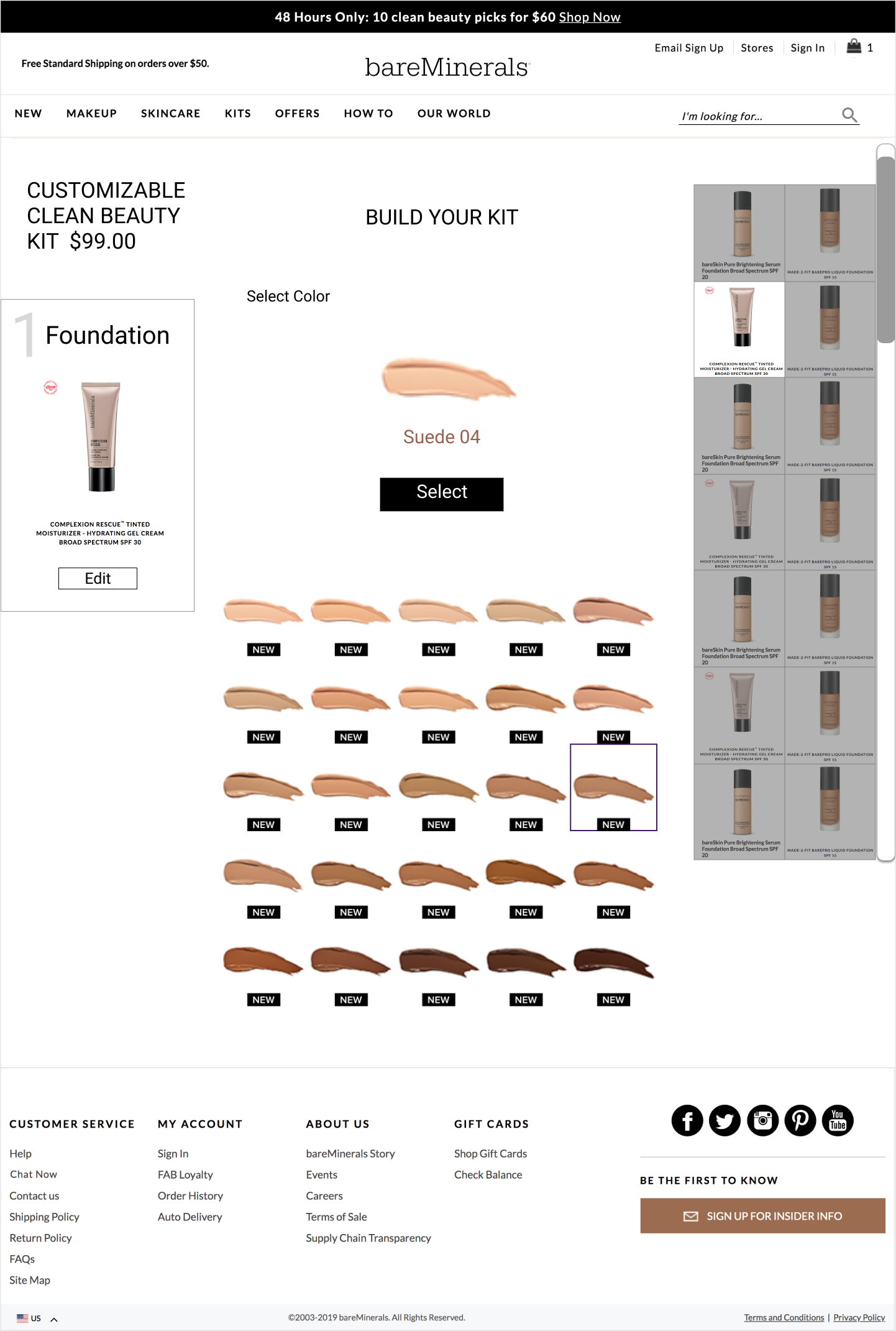
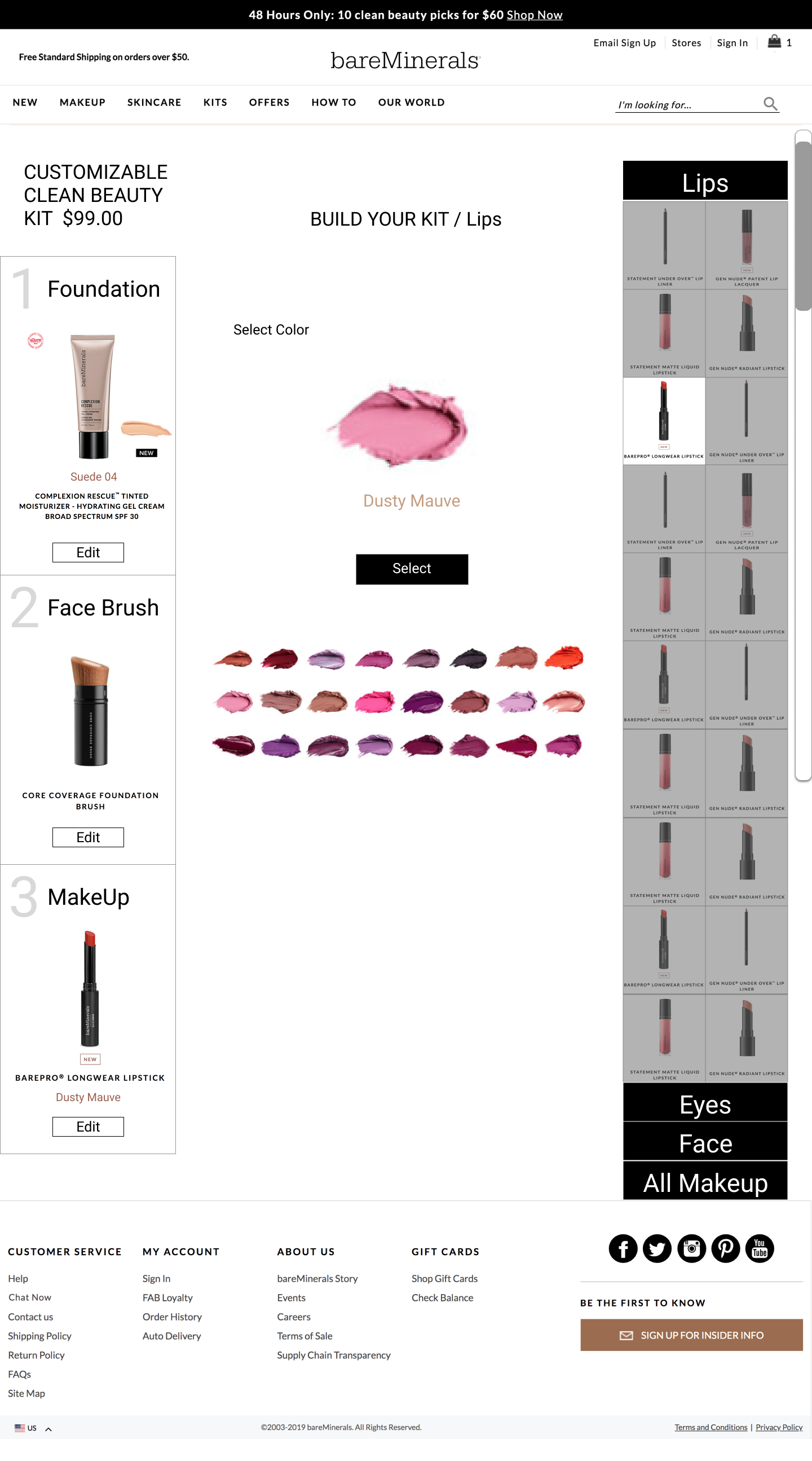
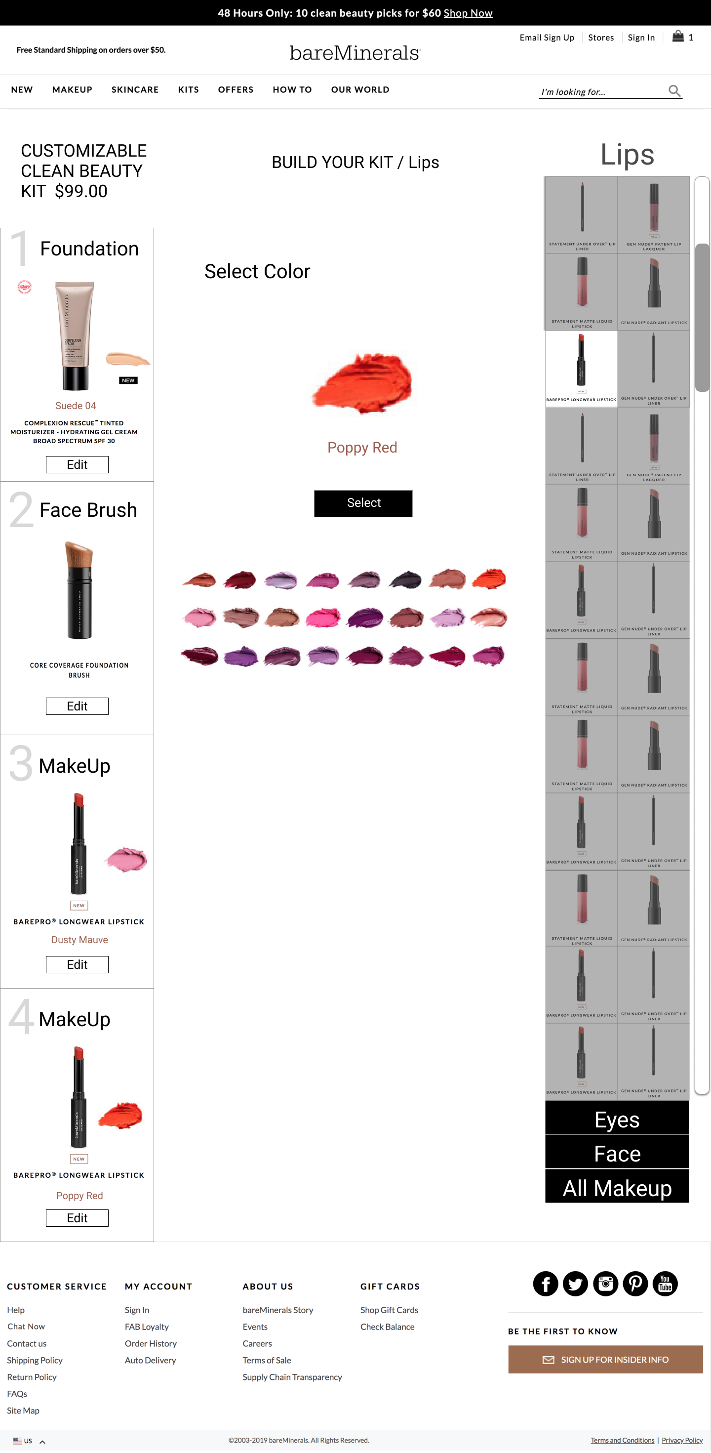
The significance of color in the shopping experience became evident during research. Shoppers frequently engaged in color testing as an integral part of their shopping process. This emphasis on color testing highlights the importance of incorporating interactive and informative color-related features to empower users in making informed choices .
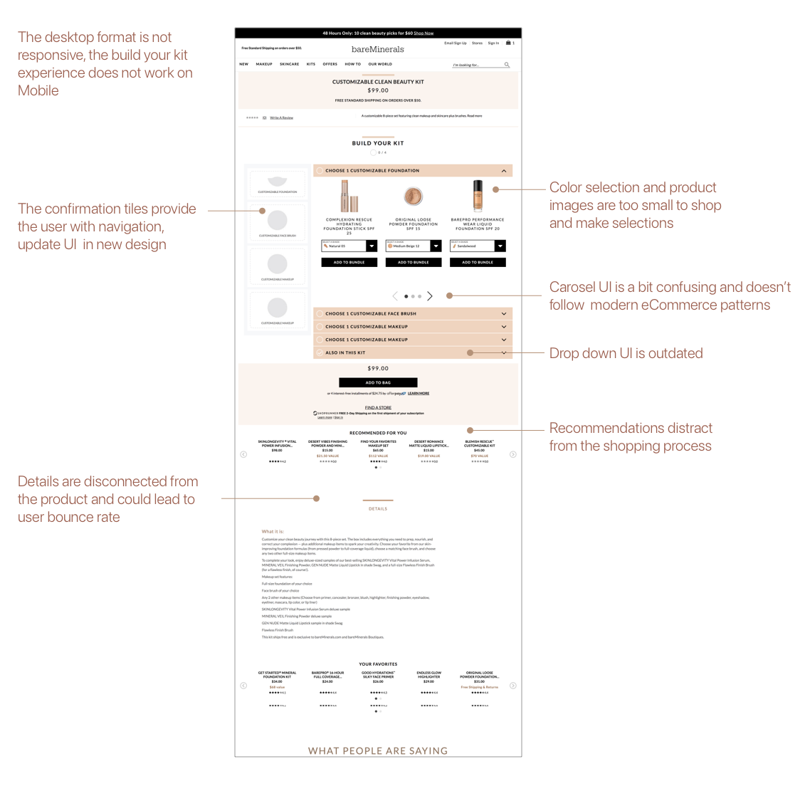
In preparation for crafting the design concept, I recognized the importance of thoroughly understanding the existing Build Your Kit shopping experience. To achieve this, a comprehensive UX audit of the current design was initiated.
This audit encompassed a heuristic evaluation of critical elements within the user interface, including the user flow, controls, indicators, product selection process, and the presentation of product descriptions. The heuristic evaluation process enabled me to dissect the current design, assessing its strengths and weaknesses.
This comprehensive audit formed the foundation for the design strategy, allowing me to pinpoint areas for enhancement and innovation within the Build Your Kit feature.
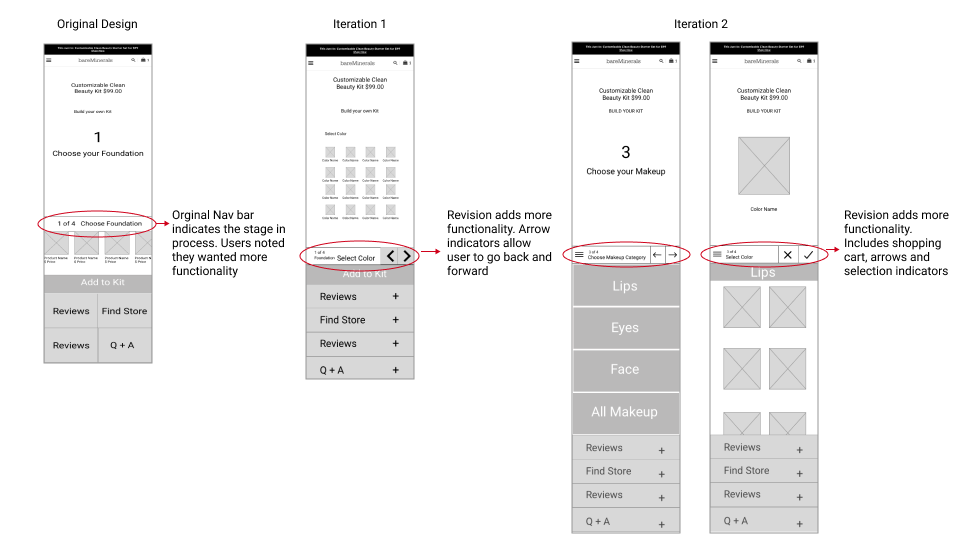
Overall there were some great insights learned from reviewing the current experience. I discovered four top concerns on the current design that would guide my design thinking and brainstorm solutions for the new design.
Solution:
Remove carousel. Incorporate scrolling behaviors for responsive design.
Solution:
Streamline and unify copy descriptions and titles, more clear CTAs.
Solution:
Organize products into clickable categories and provide filtering options.
Solution:
Color selection improvement by removing drop down and adding swatches.
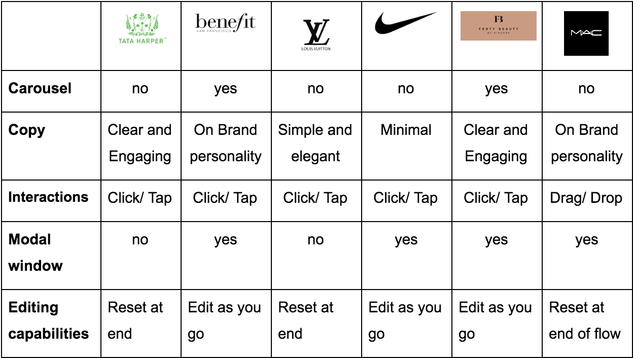
Conducting a competitive audit I found, there are eCommerce companies offering customizable shopping experiences, but how can these solutions be relevant for the Bare Minerals customer? I chose to look at how beauty industry leaders, an iconic luxury brand, and a revolutionary retail giant give their customers freedom to build customizable products.
The strongest customization / personalization system is based on a modular layout.
All customization lead the user into a personal experience.
The best experiences let you recover and edit throughout each step in the flow.
The research phase provided so many insights that would inform my design. Combining the shopping behavior study, ux audit of the current site and the competitive analysis gave me a great direction and lots of inspiration.
Areas of focus:
Isolate shopping action. Reduce friction from website pop ups or recommended products.
Create a customizable “Studio” environment for the user to select products.
Design a playful interface with immediate visual feedback and the ability to change based on scroll (tap) and select.
Give users a digital “ makeup counter experience”.
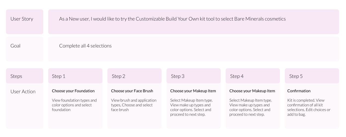
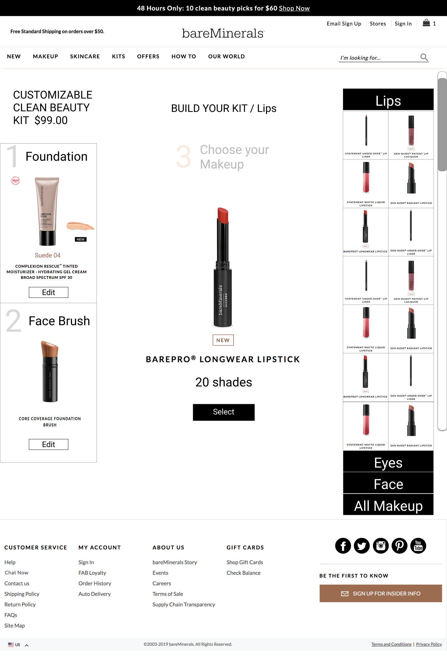
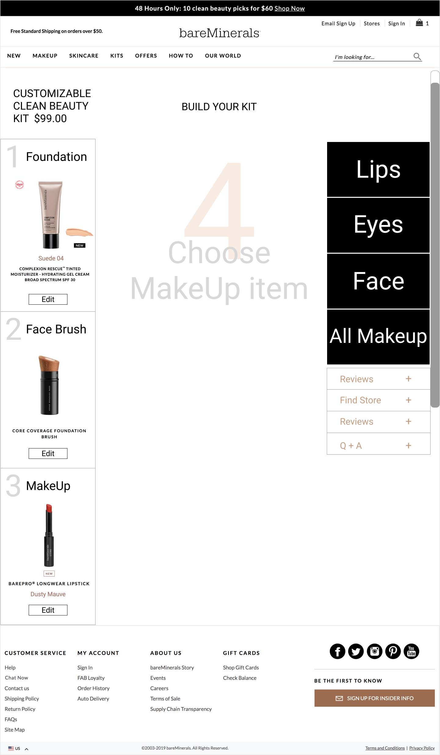
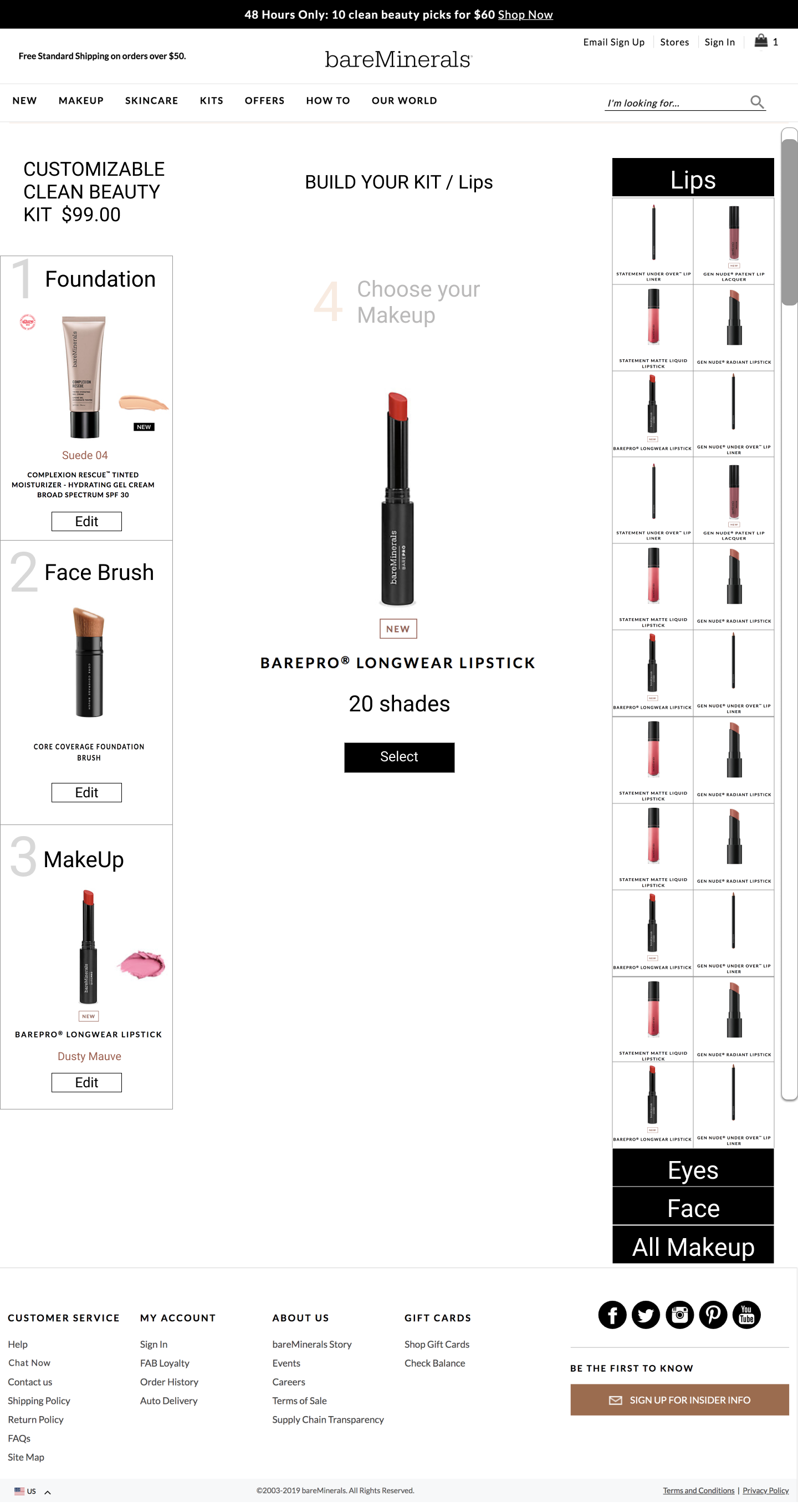
In constructing the user experience, I prioritized adopting a 'mobile-first' approach, emphasizing seamless navigation and adaptability across devices. This strategy formed the foundation for designing the user flow, specifically focusing on product exploration and color selection.
During this phase, the objective was to streamline the user story, ensuring a logical and intuitive pathway for users as they navigated through the selection process.
Special attention was directed towards refining the user interface layout for product and color selection. The design exploration phase played a pivotal role in elevating both the visual appeal and functionality of the 'Build Your Custom Kit' feature.
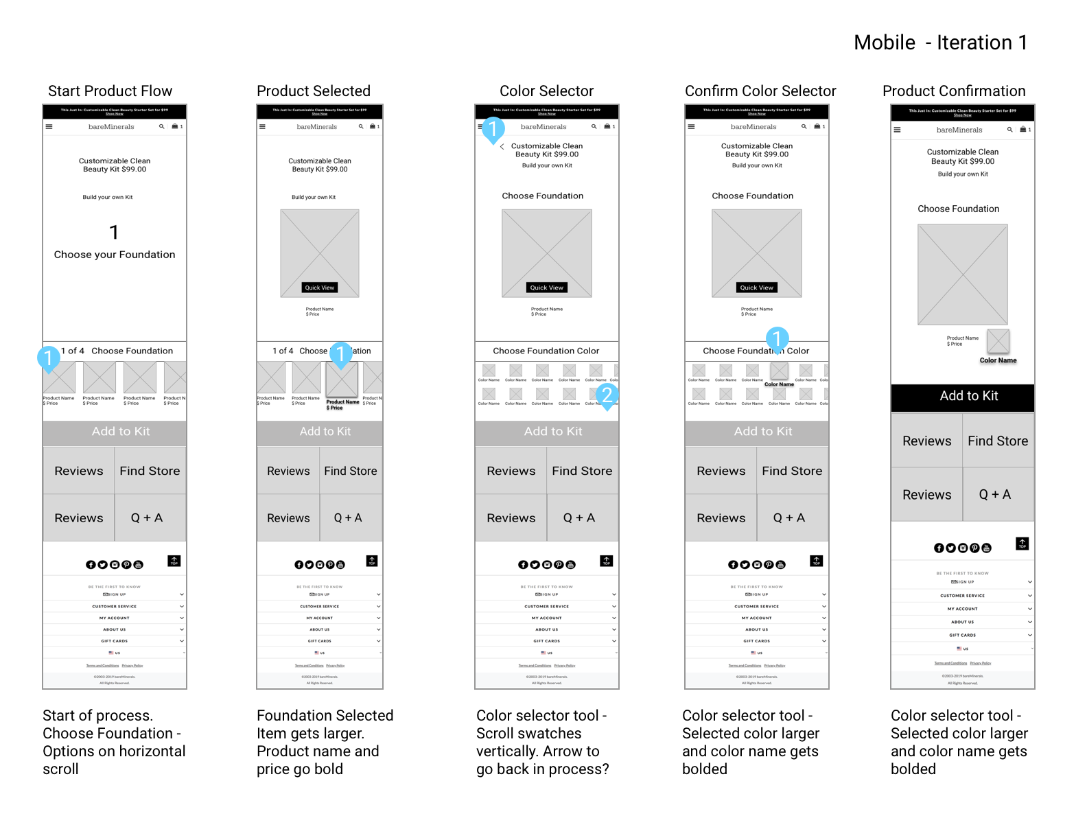
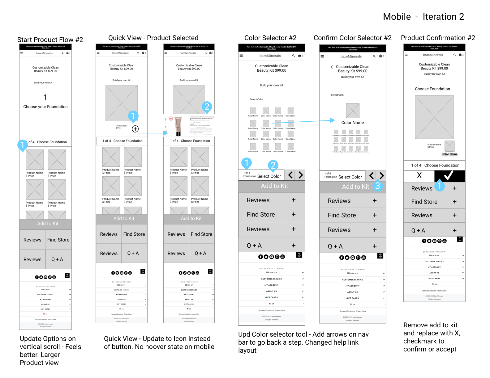
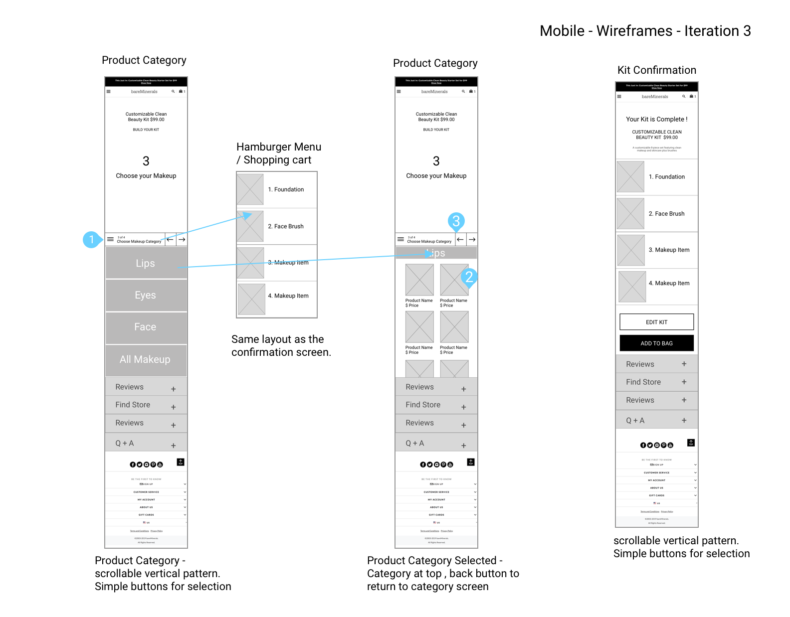
Following the completion of wireframe iterations, a series of user testing sessions were conducted to evaluate design elements. The feedback gathered from these tests was directly integrated into the creation of new design options, significantly influencing the final design.
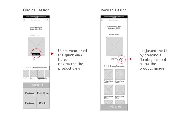
Product Focus
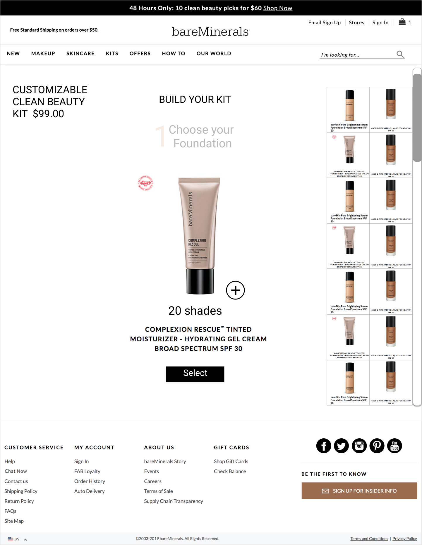
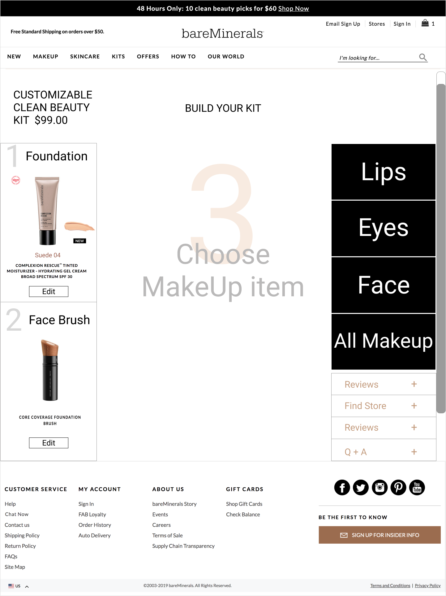
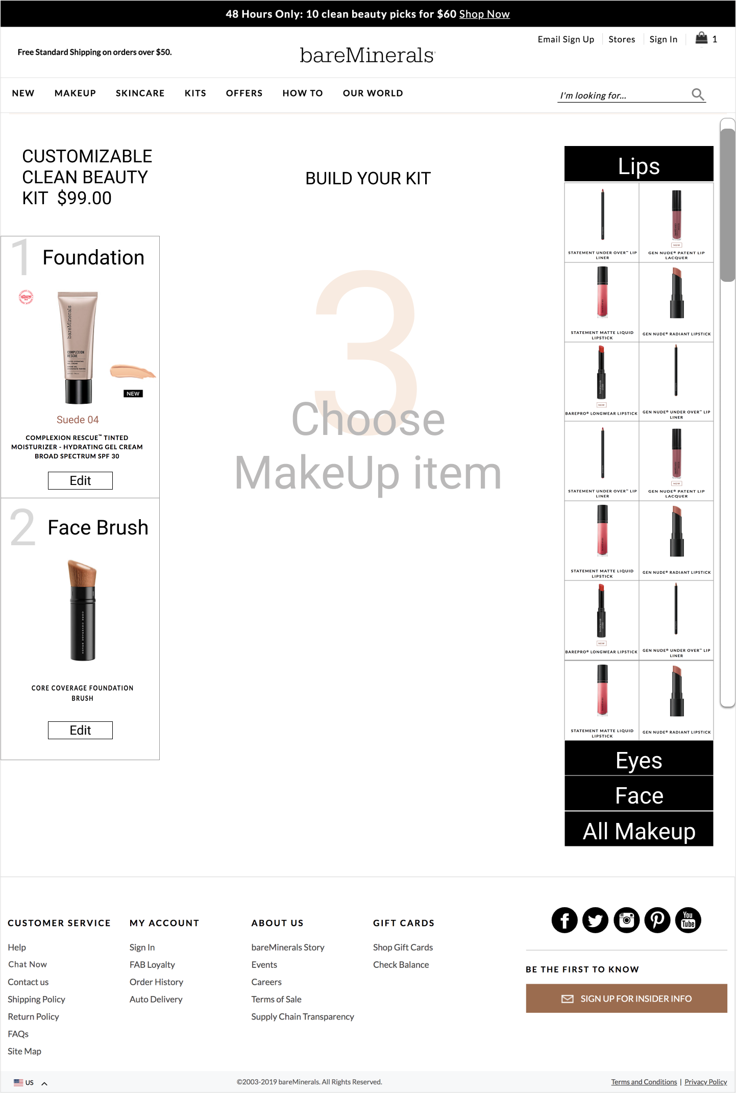
Users mentioned that the quick view button on Mobile obstructed the product view. I adjusted the UI and changed the quick view button to a plus sign below the product image.
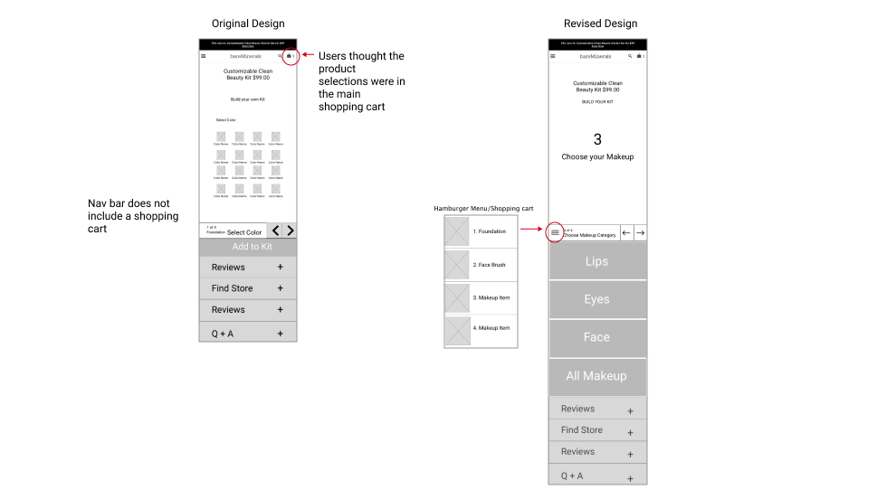
Shopping Cart
Users were confused as to whether their selections were adding into the shopping cart or view the selected items while building the kit.
Navigation Bar
The navigation bar received the most feedback of all design elements. Through two rounds of iteration I adjusted the design to make the navigation bar a central functional control.
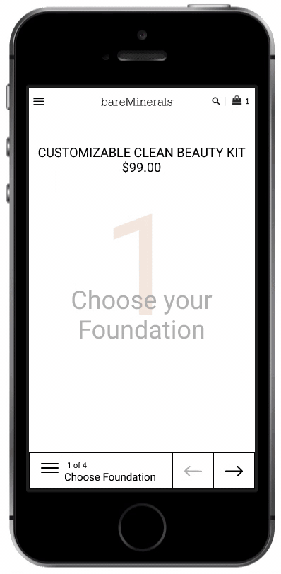
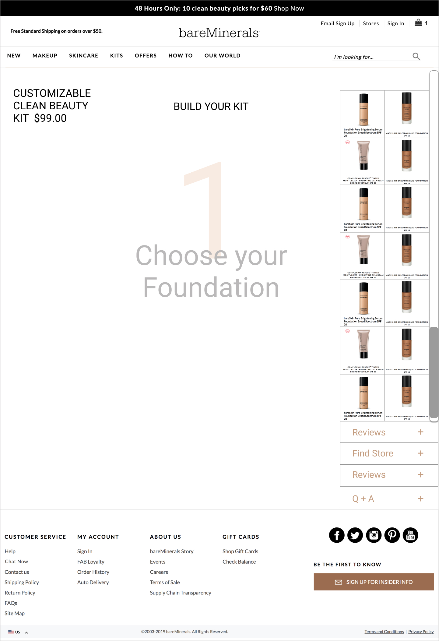
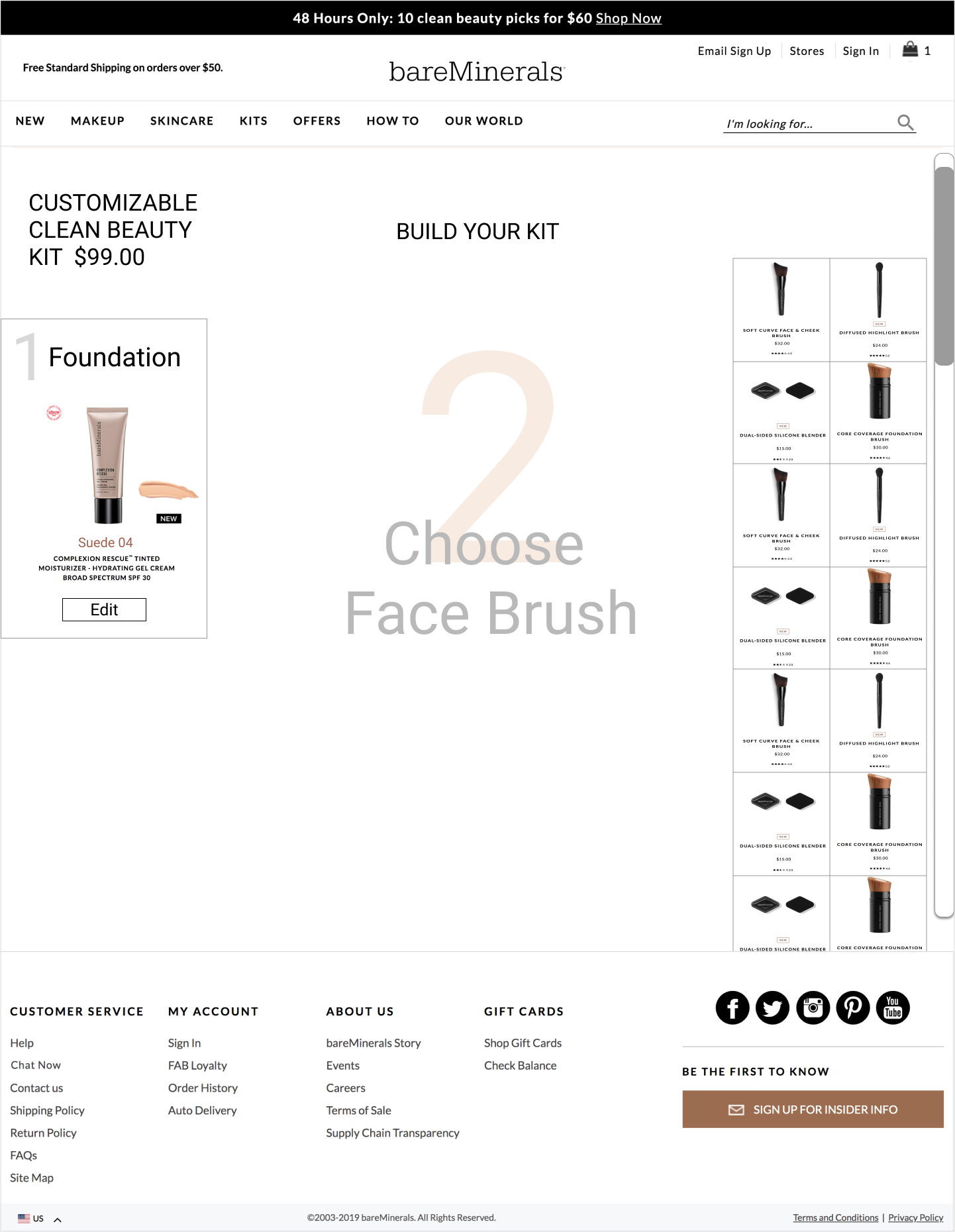
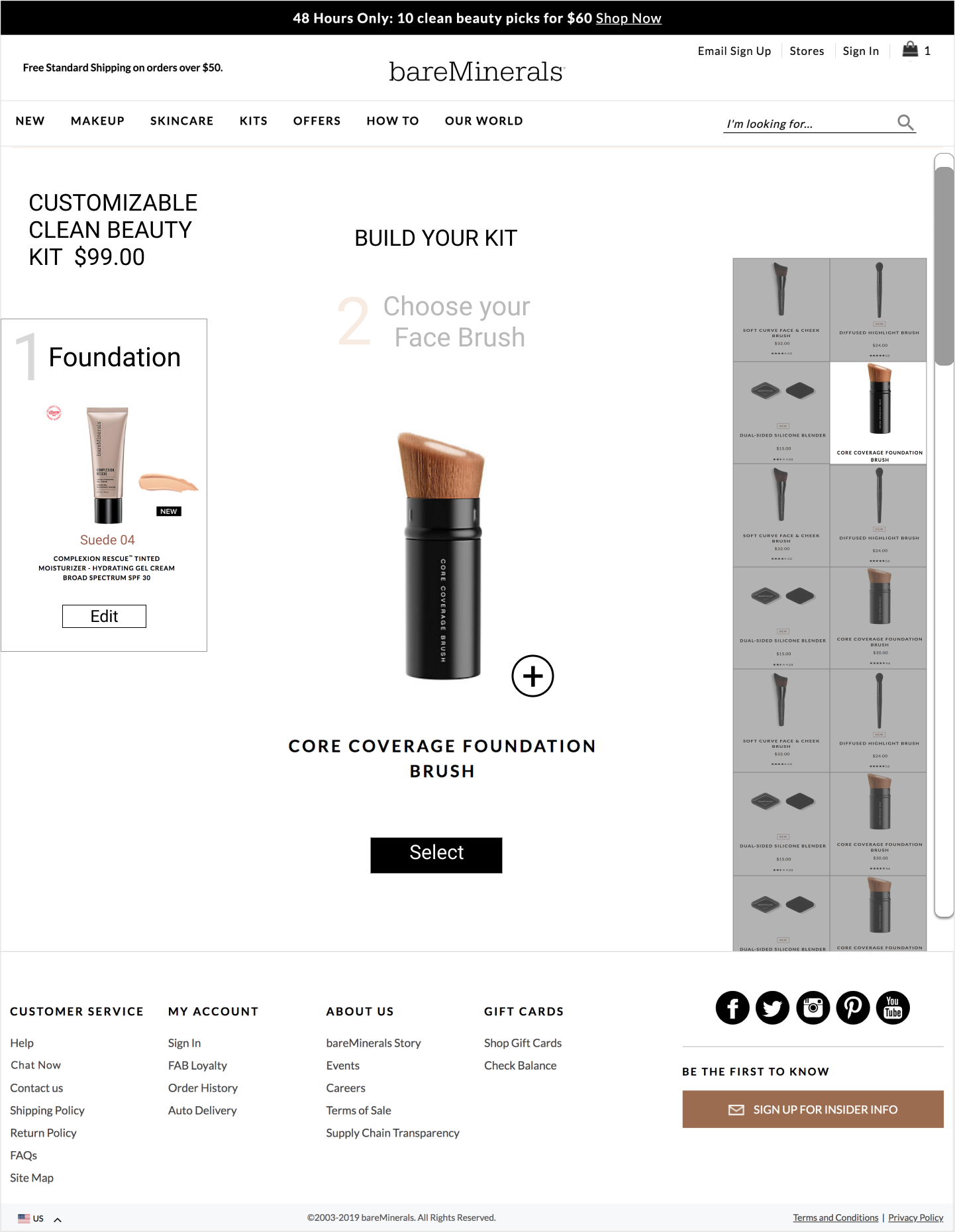
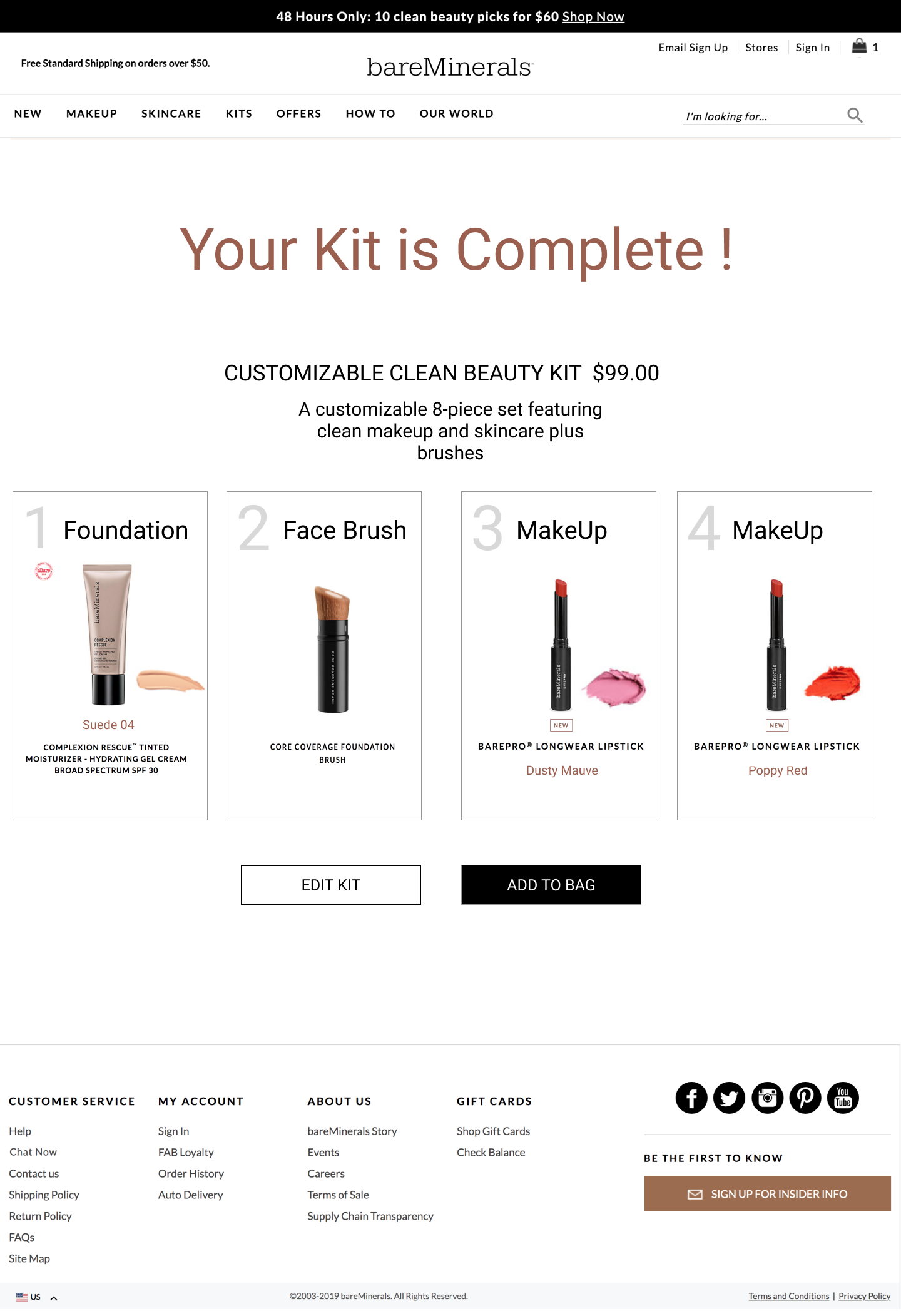
I created a prototype showcasing the final color mockups in a realistic scenario, depicting a first-time user's journey in building their custom kit. The studio experience initiates with the initial step of selecting the foundation. This prototype aimed to illustrate a seamless user flow, emphasizing the mobile-first approach and ensuring an engaging and user-centric experience from the outset of the kit-building process.
Adjust product names to larger font.
More usability testing. I'd would have liked to try a diary test with 7-10 participants and brand loyalists. Specifically testing the color select tool and the category select layout, and the confirmation screen.
With micro interaction planning the selection process and product flow would become clearer. These interactions could help to unify the signature experience of the custom kit.
Implementing a virtual try on feature for users to test their makeup selections would add a new level of personalization, and improve conversion.
Increasing visibility of the custom kit product would help to drive user navigation to the feature. Perhaps marketing team partnership could further support feature launch efforts.
Beauty companies are known for having strong brand identities and very loyal customers. Cosmetics are personal, these products help people express their individuality, creativity and can help them build self esteem. In other words people return to products and experiences that appeal to their freedom to express themselves.
A simplified shopping experience with clean and consistent copy. Product selectors provided with large images and more realistic color selections.
Elegant design that promotes brand consistency, reduces shopping distraction for increased conversion. Updated look and feel that meets project goal.