Designing a new fintech category of Banking Social
Wellthi Tech, is a forward-thinking fintech startup, set out to modernize a longstanding tradition of peer saving by digitizing it. With a focus on social finance, the product aims to seamlessly integrate community influence into the collaborative achievement of financial milestones.
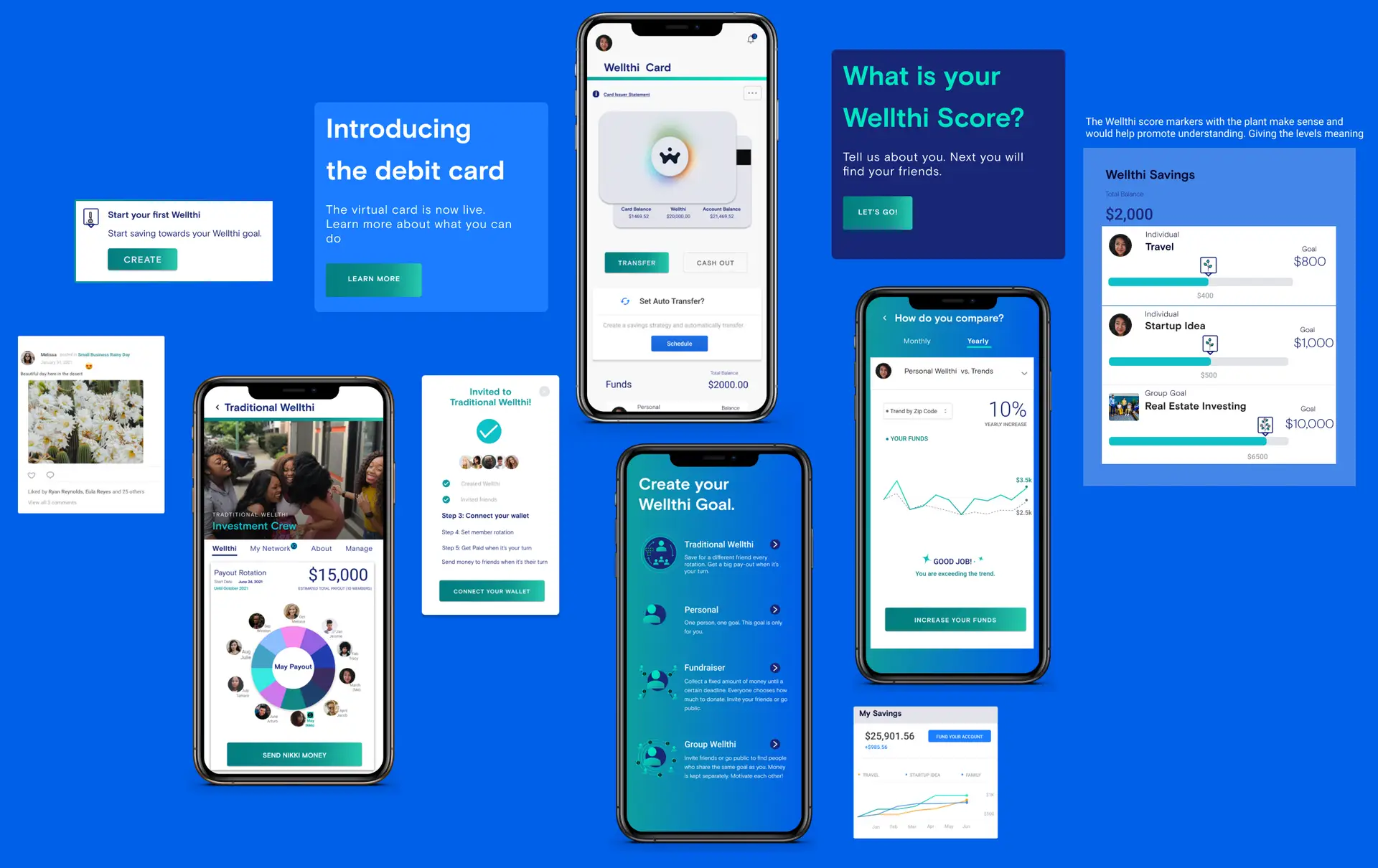
The first phase of the project was to design and develop a marketing site capable of a successful launch and gaining traction for new partners, investors, and users. The second phase involved creating an intuitive app that provides users with a distinctive blend of a banking platform, social media features, and a virtual debit card.
My role
As the lead and solo designer on the team, my responsibilities spanned both the strategic design and operational aspects of the project.
I designed, developed, and maintained the responsive WordPress marketing website, resulting in a substantial 50% increase in site visits and an average of 250+ unique site visitors in 2020.
I led the end-to-end product design for the Wellthi MVP / V1 App, my responsibilities included conducting user interviews, mapping user flows, creating wireframes, creating high-fidelity designs, interactive prototypes and collaborating with international development team for launch.
Collaborating with a cross-functional team of stakeholders, advisors and contracted development teams, over 16 sprints through out this multi year project.
Responsibilities
Website design and development, End to End product design for Wellthi MVP app, user interviews, user flow mapping, interactive prototypes, lead product meetings and developer handoffs, usability testing, synthesize research to develop product strategy.
TIMELINE & OUTPUT
October 2019 through August 2021 . Delivered marketing website and all essential app designs for MVP, V1, and proprietary traditional wellthi.
TEAM
CEO, CTO, Project Manager, Company Advisors, Contracted app development team.
High level goals
01/ Design and Launch the Marketing Website
Create an engaging online presence that attracts visitors and effectively communicates the platform's value proposition.
02/Introduce the Intuitive Mobile App
Envision, design, and launch an intuitive mobile app that combines the functionality of a banking platform, social media engagement, and a virtual debit card.
03/Enhance Website Traffic and Engagement
Optimize the responsive WordPress marketing website to increase sign-ups and inquiries for partners, investors, and users.
04/ Integrate Social Finance Dynamics through out both products:
Create a unique user experience that empowers users to leverage community support in achieving their financial goals.
Getting Started
Prior to this project, I had not heard about the tradition of peer saving groups. I was fascinated to discover the enduring tradition practiced by people worldwide, where they form small groups to organize a structured savings payout schedule.
These collective savings often lead to substantial payouts, enabling individuals to pursue their dreams of financial independence. Inspired by this tradition, the stakeholder team embarked on a mission to develop a platform that digitizes this practice and empower users.
In initiating the process of creating a website to promote this concept, I conducted interviews with company stakeholders and potential users of the product. By crafting a discussion guide, I unearthed valuable insights that shed light on user perspectives and expectations.
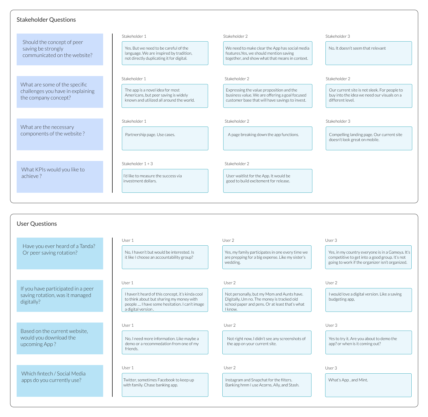
User Interview
Synthesis
01/ Stakeholder pain points
1. Conceptual Communication Challenges:
Stakeholders identified difficulty in effectively communicating the concept to potential users.
2. Desire for Modern Website Design:
Stakeholders expressed a need for a modern and minimalistic website design that not only conveys information effectively but also captivates users.
3. Focus on Analytics and Conversion Rates:
Analytical benchmarking and conversion rates emerged as key objectives for stakeholders. They aimed to measure platform effectiveness.
4. Building Trust and Credibility:
Stakeholders emphasized the importance of presenting the platform as a world-class financial tool by positioning the platform as reliable and trustworthy.
02/ User pain points
1. Lack of Awareness of Peer Saving History:
Although they find the concept intriguing the lack of awareness highlights the need to educate users about the benefits of peer saving.
2. Preference for Traditional Community-Based Peer Saving:
First-generation Americans prefer to participate in peer savings within their own community rather than digitally. The challenge will be finding ways to bridge traditional practices with a digital platform.
3. Difficulty Imagining Digital Version:
Despite their interest in exploring the concept, there was hesitation. Additional support will be required to understand how the platform would function and benefit them.
4. Lack of Trust in Current Website:
The existing website fails to inspire trust among users due to a lack of transparency and explanation of a Social FinTech product.
Opportunities
The user interview synthesis clearly illustrated the challenge ahead. Building trust and demonstrating the apps functionality on the website seemed like the biggest hurdle. While the current website had great content it wasn’t organized in a way to communicate effectively with the users, partners and investors.
01/ FOCUS ON CLARITY AND TRANSPARENCY
Provide information about the platform's security measures, financial regulations, and user protections can instill confidence and encourage user participation.
02/ INCORPORATE USER FEEDBACK INTO CONTENT DESIGN
Tailor the content design to user preferences, interests, and needs.
03/ Visualize the Wellthi Experience
Demonstrate “ How it Works” Show users the steps of how to build a Wellthi.
04/ Define the Wellthi Value proposition and product differentiation
Articulating the unique benefits and offered to users, partners and investors by Wellthi compared to other financial platforms.
Sitemap
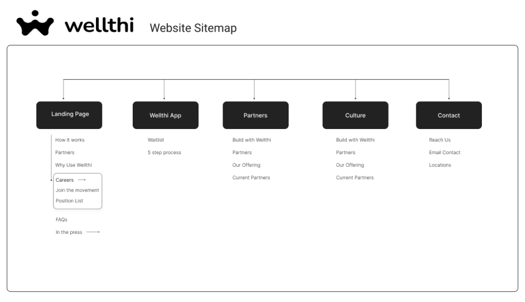
Phase 1
Website Opportunities
The research and planning phase provided so many insights that influenced my design approach. Re-platforming the website from Shopify to WordPress gave me the added advantage of a fresh start.
Following discussions with the team, we decided on a two-phase approach to the project. Initially, I would focus on website design, followed by designing a few mobile app screens to be included on the website.
Areas of focus:
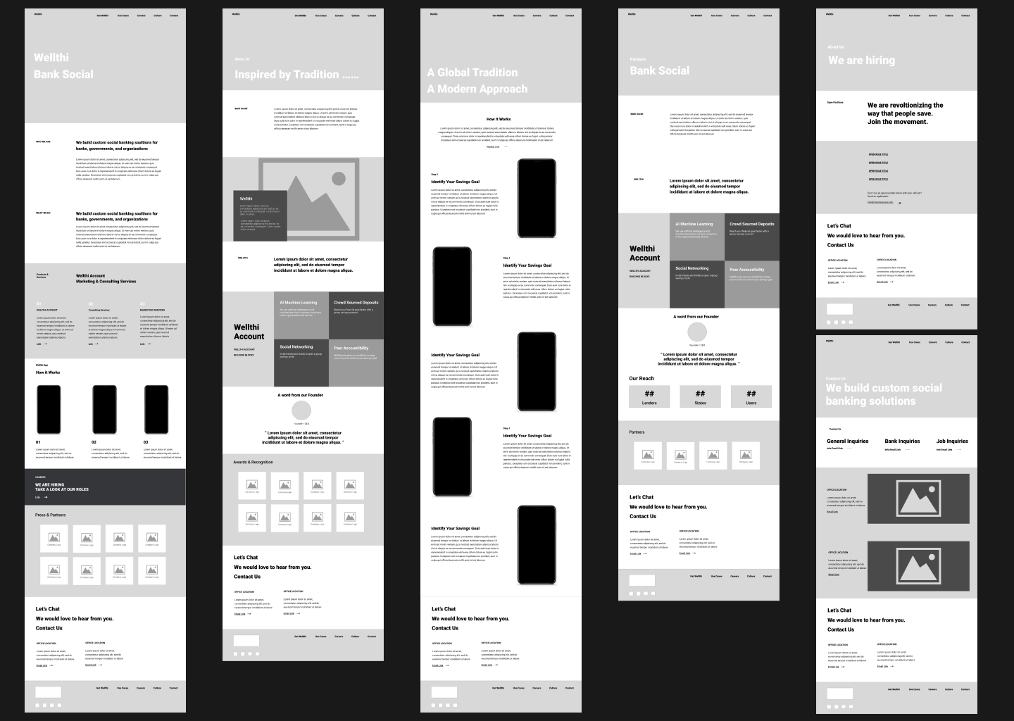
01/ Organize and simplify content
Solution:
Organize the content on individual pages with careful consideration for the target audience.
02/ SET A HIGH STANDARD FOR USER EXPECTATION
Solution:
Create a memorable first impression that captures users' attention and encourages them to explore further.
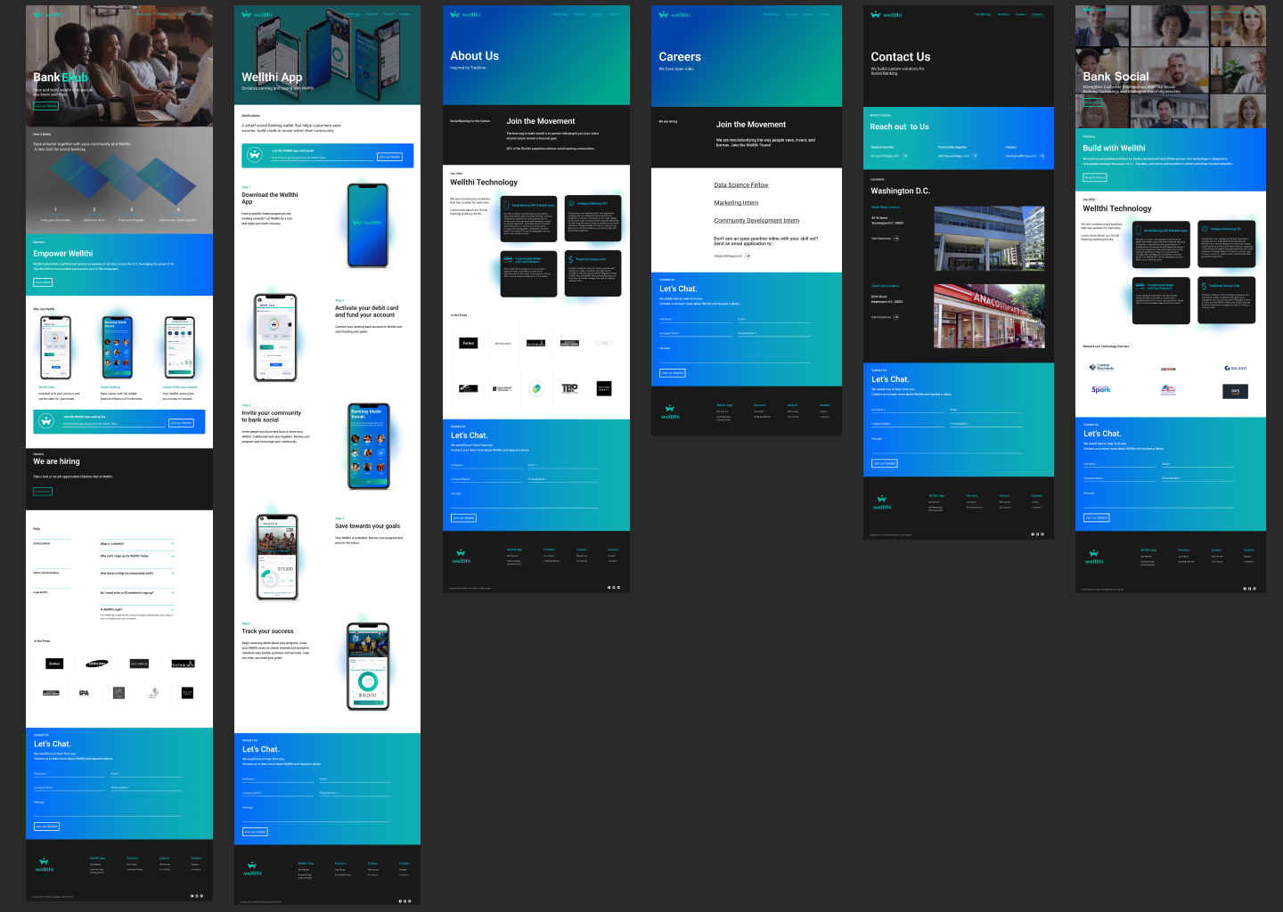
03/ Elevate visual design
Solution:
Establish brand identity and recognition through well-crafted visual elements, high-quality images, vibrant colors, pleasing typography.
04/ SYSTEMIZE COMPONENTS
Solution:
Ensure visual consistency across all touch points, focus on creating intuitive layouts. Establish a cohesive visual language and improve usability.
Website Wireframes
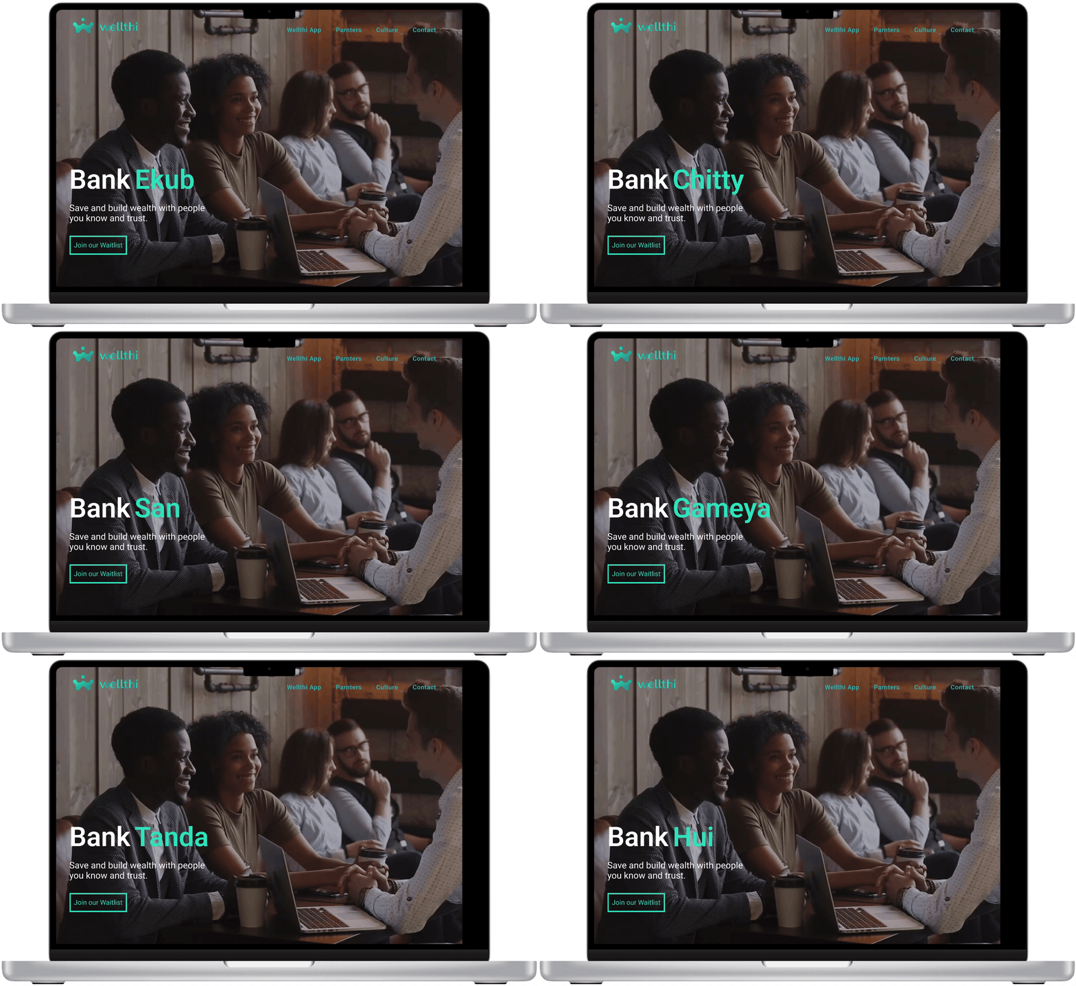
Website Final Design
Phase 2
Research survey
highlights
The stakeholder team created a Typeform survey as part of a tech accelerator program prior to my joining the company. The research survey gained quantitative data from 100 participants. At the project's outset, I received a raw Excel file. I sifted through the data by creating search words and organized the Excel file using filters to identify patterns among respondents. Below are the six major themes that emerged from research synthesis.
82 out of 100
Didn’t feel like they wanted another app for social unless it provided extra value outside of communication and pictures.
77 out of 100
Would like interactive tools for savings plans within their current financial and banking apps.
63 out of 100
Wanted to save for very specialized life events or goals. Such as travel, buying a home, family planning, or fundraising for causes.
54 out of 100
Did not want to open a bank account just to use the app. They already have bank accounts and apps to transfer money to friends.
42 out of 100
Traditional wellthi participants and wanted a better system for tracking and a central place for communication.
37 out of 100
Would be open to a new social media app if they had friends or family already on the app.
Mobile App
Opportunities
Based on the research survey, and the initial user interviews, I concentrated on four key opportunities to inform my design approach and brainstorm solutions for the company's flagship product: its mobile app.
Areas of focus:
01/ PERSONALIZED RECOMMENDATIONS
Solution:
Implement personalized recommendation features based on user preferences, demographics, and financial goals.
02/ INTERACTIVE LEARNING TOOLS
Solution:
Interactive tutorials within the platform assist users in building a Wellthi and navigating features through step-by-step guidance.
03/ DESIGN FOR SOCIAL
Solution:
Design a playful interface with immediate visual feedback and the ability to recover based on scroll (tap) and select.
04/ Social Proof and Community Validation
Solution:
Boost user confidence through features that highlight participation and interaction. Enhance user trust and platform credibility.
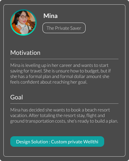
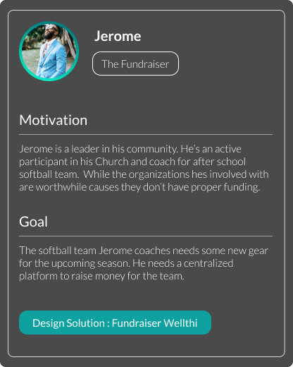
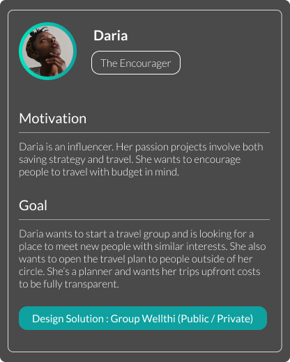
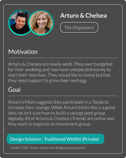
MOBILE APP USERS
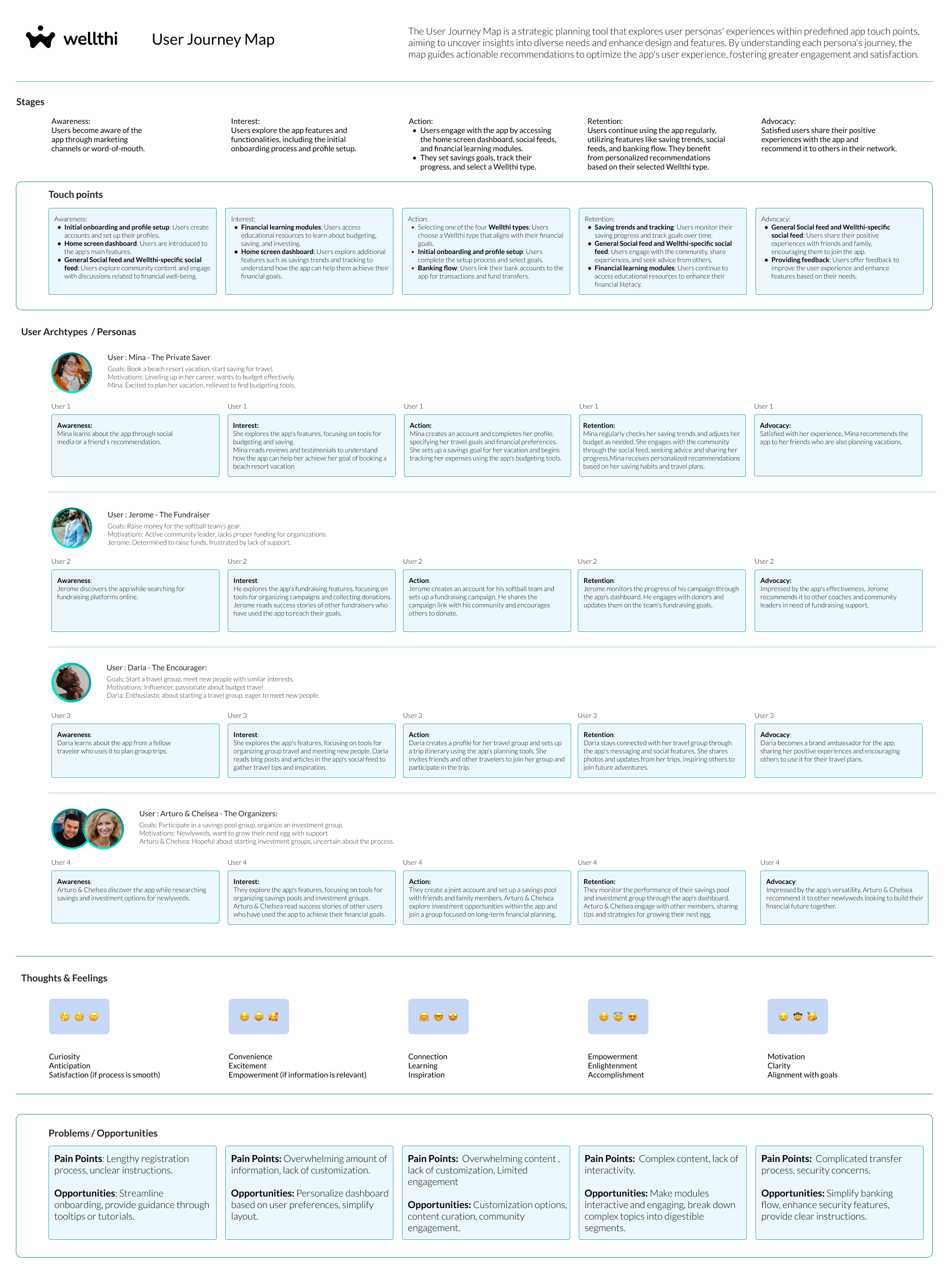
Referring to the research synthesis, I opted to create simplified user personas. This approach, which focuses on understanding users' identities, motivations, and goals, greatly informed the app's design process. The 'Create your Wellthi' goal flow is entirely based on these personas.
User Journey Map
Expanding on the personas, the next step was to create a user journey map that captured all of the team's data and touchpoints for the app experience. Through this process, we could better identify the pain points and confirm the opportunities outlined in previous steps.
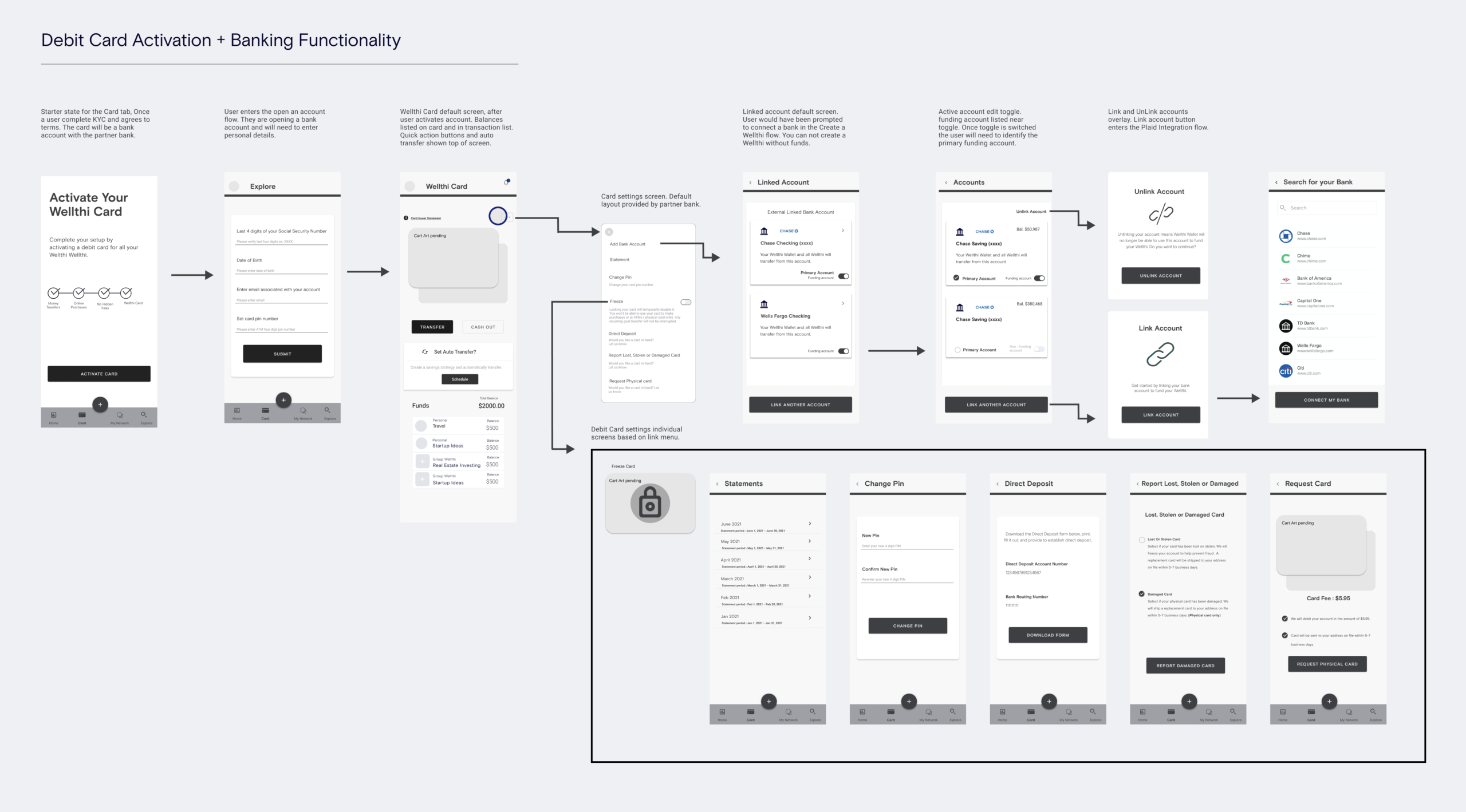
Mobile Wireflows
fINAL MOBILE APP DESIGN
Recapping the App in the following flows to give a sense of the onboarding, card activation and a social saving pool experience.
How did I decide on these flows? They all balance both user goals and business requirements. Narrowing down was a challenge—my design file contains over 300 screens!
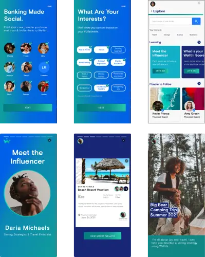
Onboarding and Influencers
The onboarding flow guides users through the process of connecting with their social community and interests. Additionally, the explore flow was introduced to showcase learning opportunities and social features.
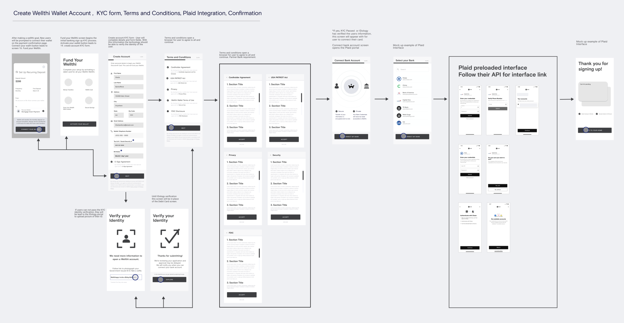
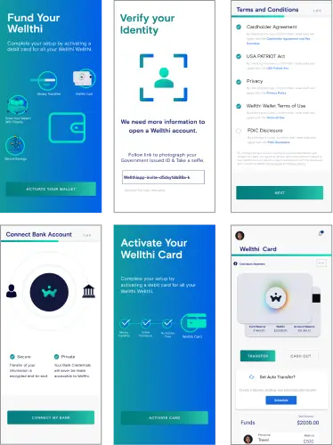
Create an Account & Banking
Creating an account goes hand in hand with creating a Wellthi savings plan. I highlighted the major screens in the flow, along with a Plaid integration.
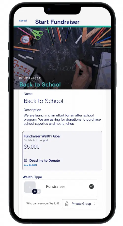
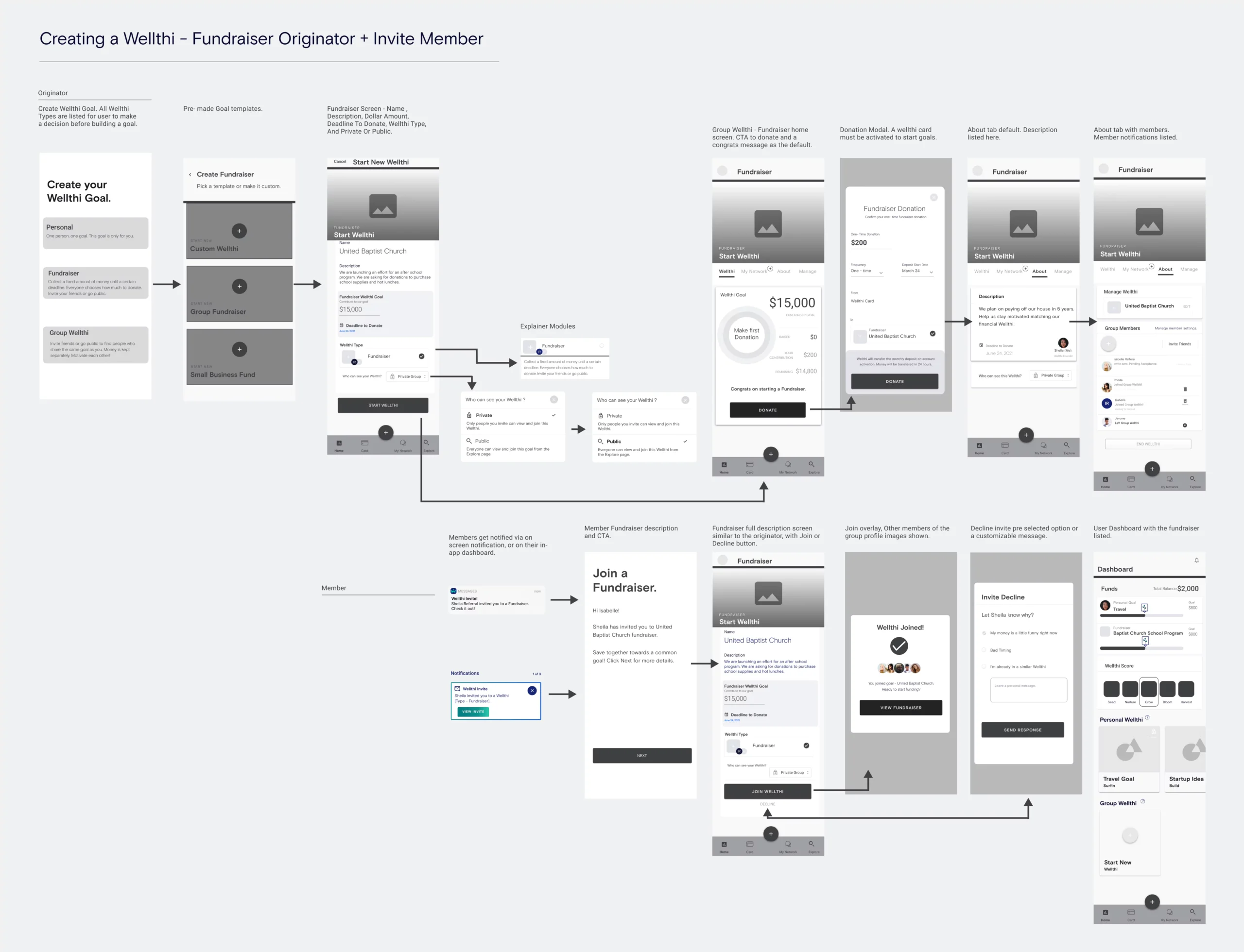
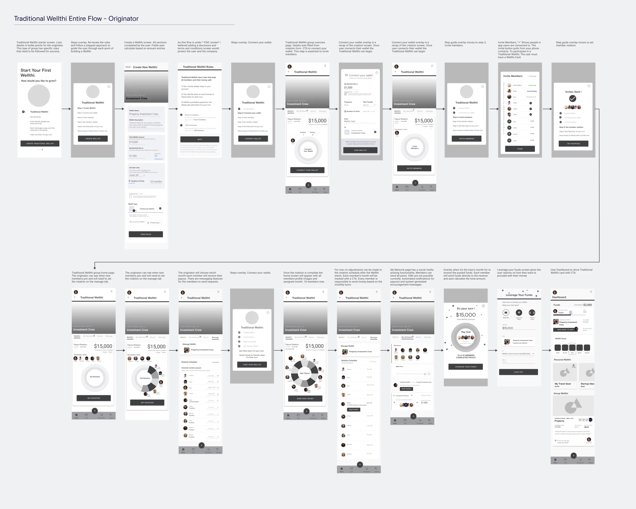
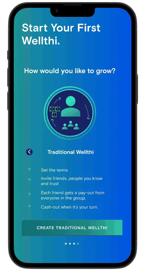
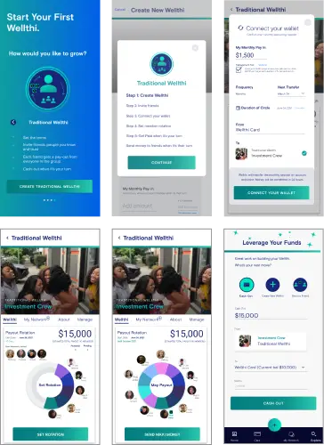
Traditional Wellthi
The traditional Wellthi is the social banking platform closest to the traditional practice. I highlighted the flow from the perspective of a plan originator.
*Note: Under FDIC review, shown for design purposes only*
Project
highlights
$1M
Designed a prototype that enabled a 1M raise for Wellthi App
250+
Unique Daily Visitors to website in 2020.
50%
Increase in site visits in 2020.
iMPACT
Throughout the Wellthi project, both research and my comprehensive design process were pivotal in shaping the platform. The journey began with research and planning, leveraging insights from user interviews and stakeholder discussions to inform the design strategy. Transitioning from Shopify to WordPress provided an opportunity for a fresh start, enabling a refreshed approach to design and user experience. The iterative design process involved creating simplified user personas, developing user flows, and refining interface elements to align with user needs.
USER IMPACT
By focusing on understanding user motivations, goals, and preferences, the platform was tailored to meet the needs of its diverse user base. Features such as personalized recommendations, interactive learning tools, and social integration enhanced user engagement and empowerment.
business impact
From a business perspective, the Wellthi project had a significant impact. The website and mobile app prototypes played a key role in building momentum with investors and partners. While design isn't the sole factor contributing to the company's success, it certainly laid the foundation.

