Bristol Meyers Squibb Design system
Bristol Myers Squibb (BMS), a global biopharmaceutical company, initiated a web design refresh project to establish a consistent digital brand presence and enhance user experience for their published digital reports.
The success of the digital report design prompted both the BMS client team and the brand agency I worked with to agree on implementing the new style across their current webpages and initiating a component-based design system.
This involved developing a comprehensive design system to streamline UI elements, components, and modules, reducing redundancy, and enabling agile solutions for their in-house team. The primary goals were to ensure global accessibility, accommodate future content needs, and maintain visual consistency across platforms.
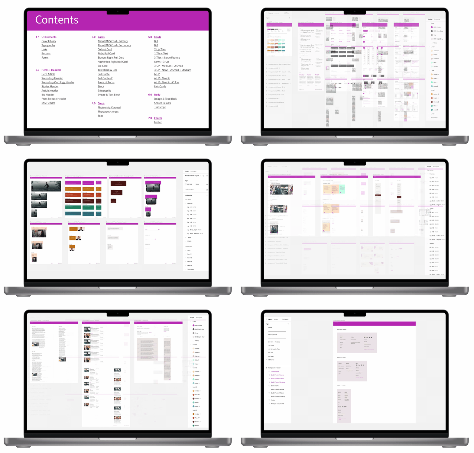
My role encompassed organizing an inventory of approved designs, grouping various component types, and crafting usage instructions within comprehensive guidelines including a detailed image scale guide for breakpoints above 1024px. To test the components, I rebuilt the current L1 pages in the main navigation with the new system. Lastly, I curated a Figma component library crucial for the client handoff, empowering their team for future autonomous design endeavors.
I collaborated with the UX Associate director to approve final deliverables and an Account manager who communicated directly with the client team to handoff deliverables.
Inventory design elements, Categorize UI elements and content components, Build guidelines, Create refreshed L1 pages, Build Figma library document
Split between December 2022, and May 2023.
6 weeks total for project completion.
TEAM
UX Associate director, Account Manager
01/ Organizational Structure: Systematize newly developed designs into a cohesive framework, ensuring a structured and unified approach to design elements.
02/ Responsive Design Guide: Segment design elements to establish a responsive guide, facilitating adaptability across various devices and screen sizes for a seamless user experience.
03/Figma File Reference: Develop a comprehensive Figma file as a reference tool for the client team, empowering them to navigate and utilize design components efficiently for future endeavors.
04/ Component Testing and Integration: Experiment with 2.0 components within a new L1 Navigation page design
05/ Detailed Specifications: Create in-depth guidance and reference points, facilitating consistent implementation
Getting started, my first step involved reviewing the newly designed 2.0 page layout, followed by cataloging the components, assigning names, and crafting clear usage instructions.
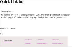
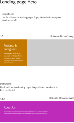
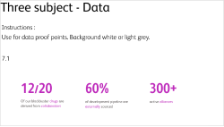
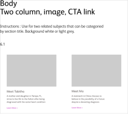
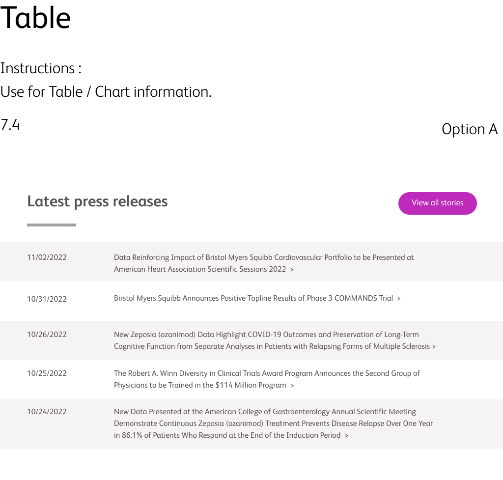

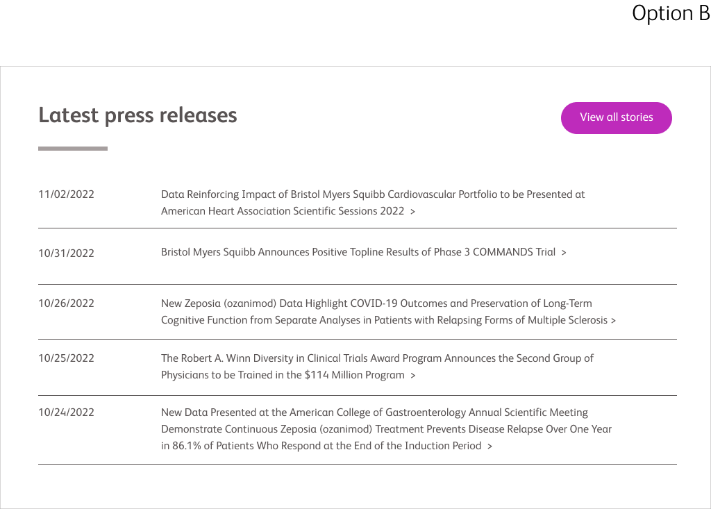
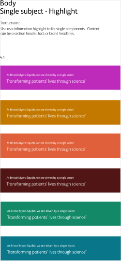
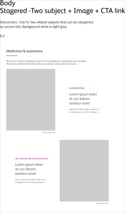
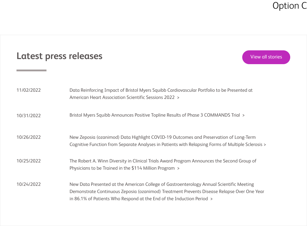

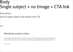
My next step involved creating technical guidelines that outlined background color options, content and link treatments, and demonstrating proper spacing and padding for all 2.0 components.
Special attention was given to defining the responsive scaling behavior at desktop breakpoints.
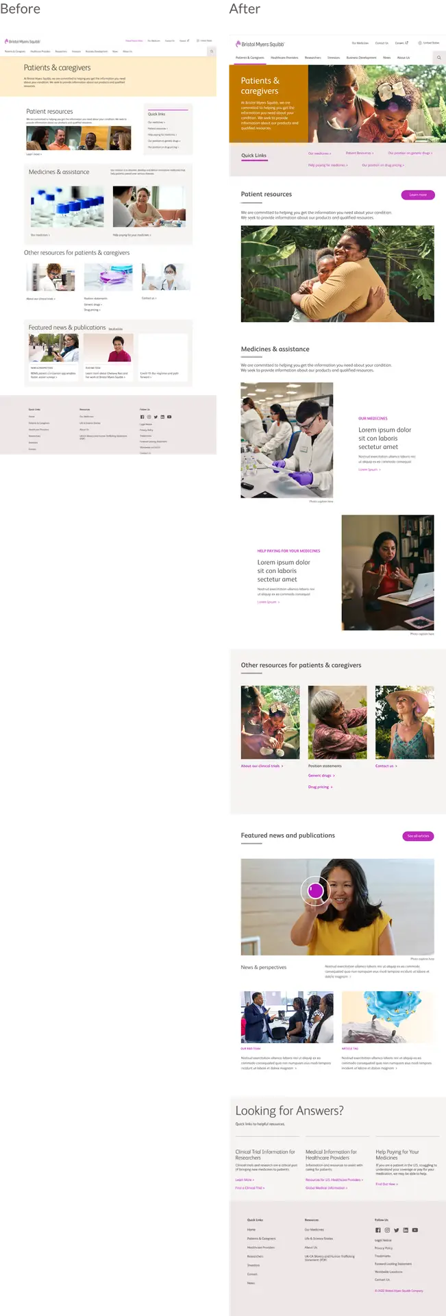
To assess the usability and adaptability of the newly documented components, I conducted a comparison of the current L1 pages in the main navigation. The side-by-side comparison distinctly illustrates a marked difference in the site's look, feel, and overall user experience.
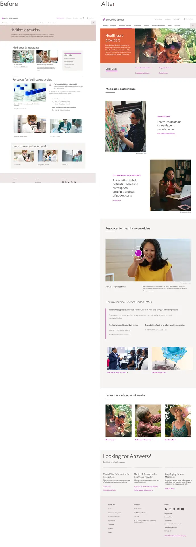

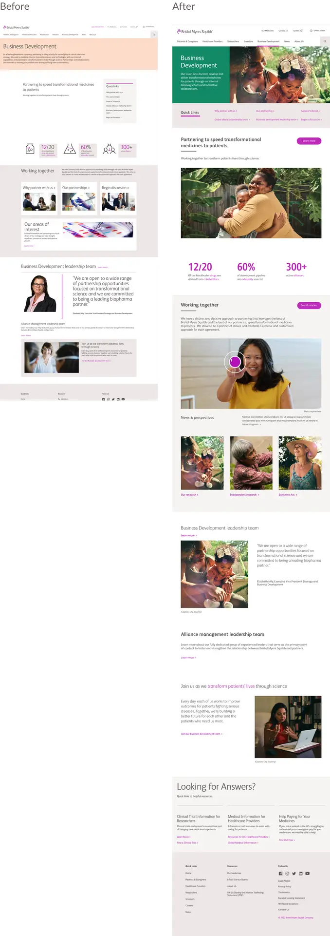
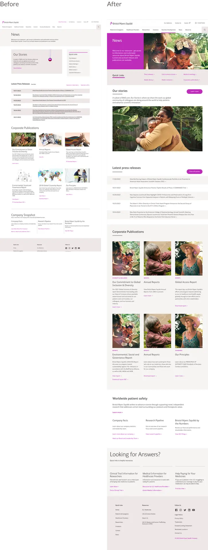
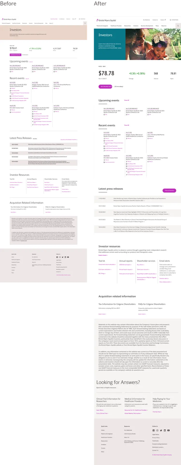
The final step in the design system process involved compiling and organizing the UI elements and their various states. This included cataloging responsive component types such as Heroes, Cards, Carousels, Tiles, Body, and Footer, all built into a Figma library for client handoff.
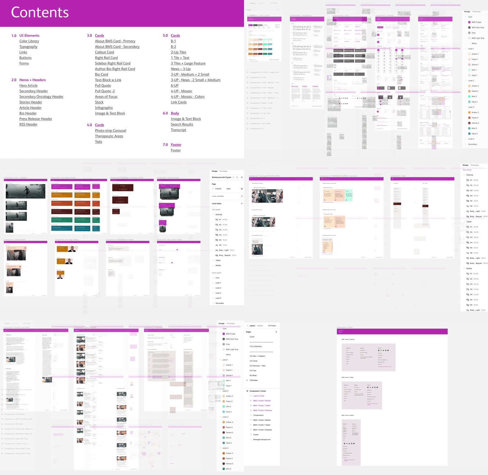
For this project I decided not to nest UI elements to be more flexible and easy for the client to use with minimal figma training.

The same approach was taken when building components. Each component was built separately and categorized by color and device size.
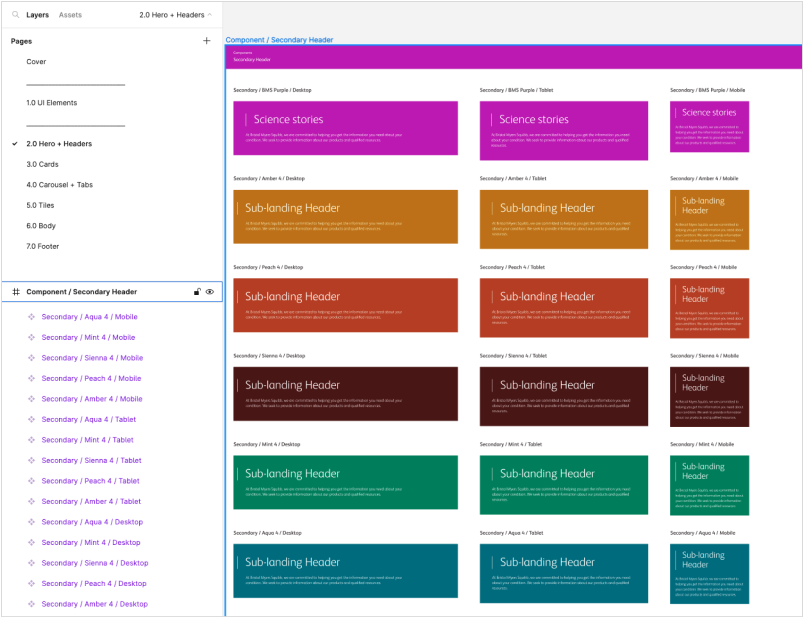
The implementation of a comprehensive design system at Bristol Myers Squibb (BMS) marked a pivotal phase in their web design strategy. Beginning with a need for a consistent brand presence and enhanced user experience, the project led to the development of a meticulous design system aimed at streamlining UI elements, minimizing redundancy, and ensuring global accessibility.
The meticulous organization and categorization of UI elements greatly improved user interactions. Clear usage instructions, responsive design guides, and the incorporation of newly documented components led to a more intuitive and user-friendly experience across the website. Users will benefit from a cohesive and visually consistent interface, providing a seamless navigation experience, particularly evident in the revamped L1 pages and responsive component types. New design has yet to launch.
The adoption of the design system brought significant advantages to BMS. The streamlined approach to UI elements, alongside the creation of a Figma library, empowered the in-house team, allowing for independent and agile design iterations. This autonomy not only expedited the design process but also fostered scalability and consistency across the brand's digital landscape. Moreover, the successful handoff of deliverables ensured a smooth transition, marking the design system's impact on operational efficiency and brand cohesiveness for Bristol Myers Squibb.