3M Solventum
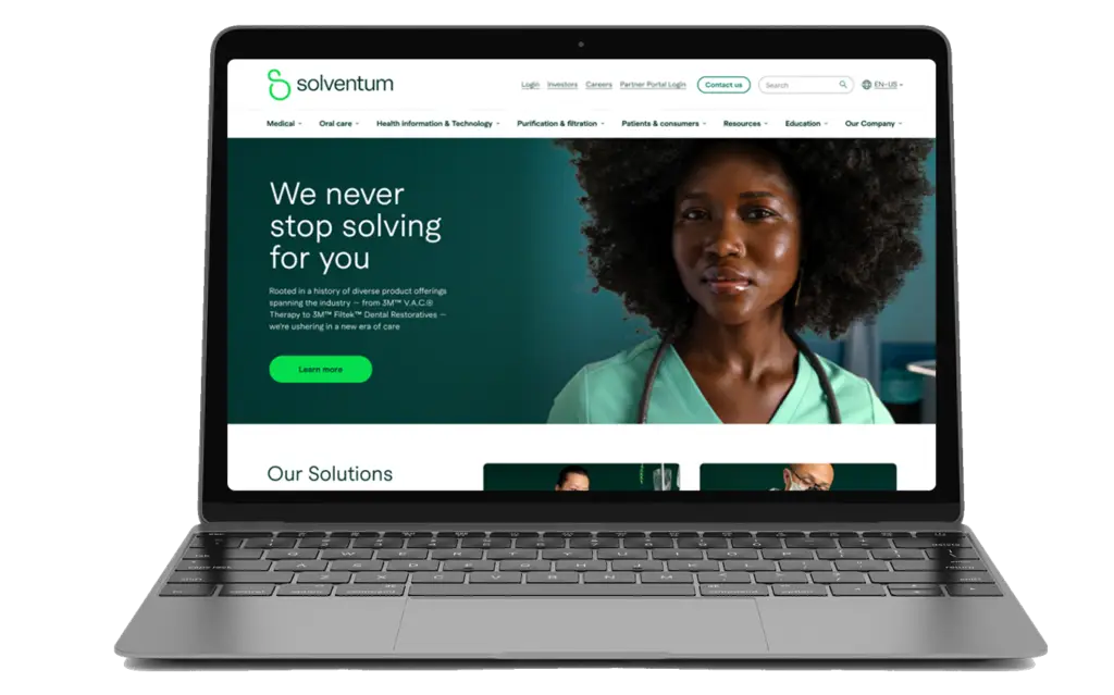

Solventum is a global healthcare technology brand that spun off from 3M in 2023. As part of the UX team at Siegel+Gale, I helped design its first-ever digital presence. The goal was to create a scalable, multi-audience website that introduced the new brand and built trust with clinicians, regulators, and investors. We applied e-commerce design patterns to help users navigate a large product catalog, place orders, or connect with the corporate sales team. The experience needed to feel distinct from 3M while aligning closely with Solventum’s brand strategy.
I contributed to the creation of Solventum’s digital presence by ideating the homepage layout and modular landing templates, and creating wireframes for both level 1 and level 2 pages over six sprints. I designed and documented key global elements including the navigation, footer, and language selector, and delivered fully annotated handoff files for all core components. Throughout the project,
I collaborated closely with strategy, content, visual design, and development teams, ensuring alignment with the sitemap and audience flow. I also identified key dependencies for third-party integrations such as Okta login, and regularly participated in internal design reviews and client-facing presentations.
Homepage and navigation ideation, L1 & L2 wireframes across 6 sprints, Annotated component handoff delivery, Cross-functional team collaboration, Audience flow alignment, Third-party integration planning (Okta, search)
May - August 2023
TEAM
UX Director, UX Design team (2–3 designers), Brand Strategists, Content Strategy, Visual + Identity Design, 3M stakeholders
The challenge was to design a digital experience that established Solventum as a credible, standalone healthcare brand, distinct from 3M. With a large product catalog at its core, the site required clear, intuitive navigation to help users explore offerings, initiate orders, or connect with the corporate sales team. It also had to meet strict accessibility, regulatory, and enterprise standards. All of this needed to align seamlessly with the newly defined brand strategy.
Align design decisions with brand pillars and voice.
Support new markets and global content in the future.
Through modular content and audience-based navigation.
Offering technical assistance and support to a list of qualified leads.
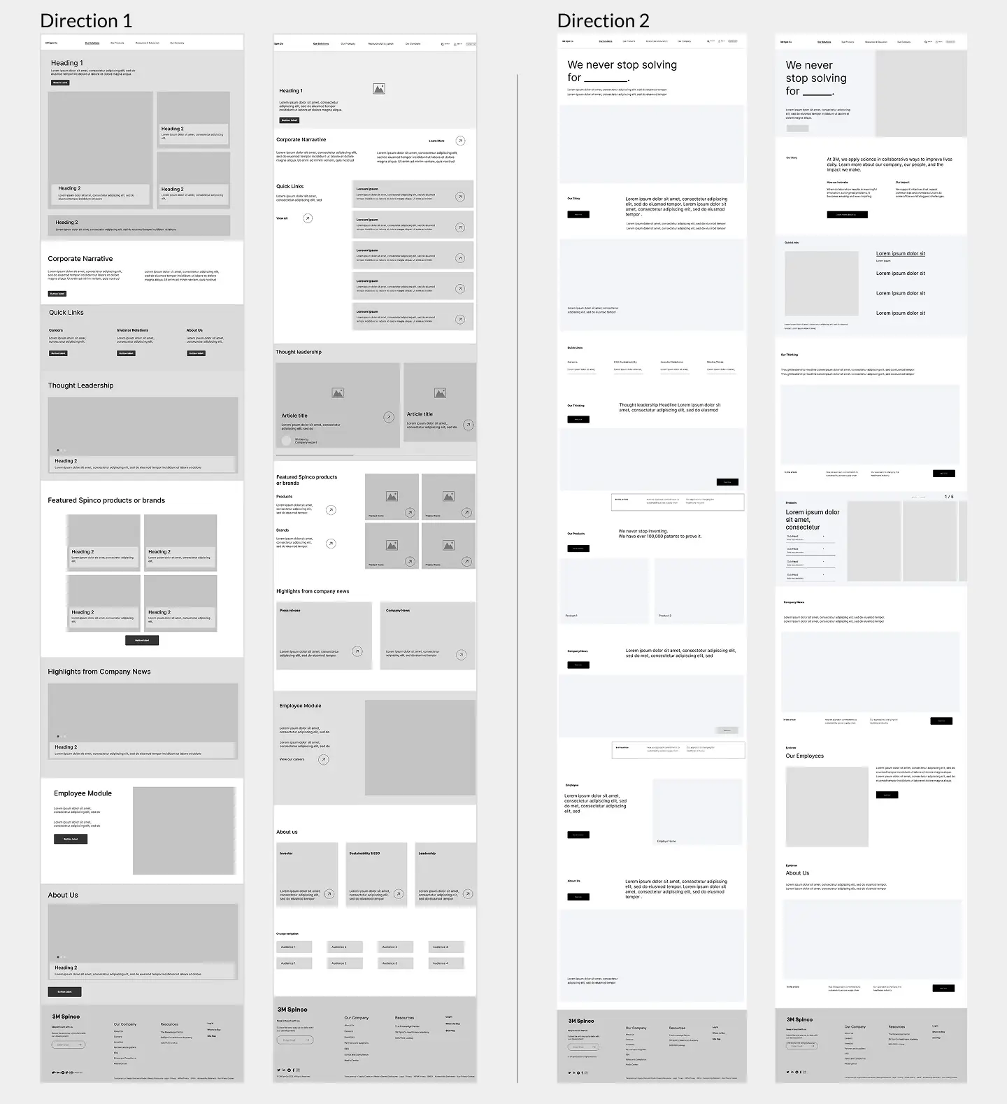
In the early phase of the project, I explored two distinct design directions to guide the visual and structural foundation of the site. One was inspired by editorial healthcare magazines—content-forward with immersive imagery and storytelling. The other followed a soft-grid system rooted in Swiss design principles, emphasizing clarity, balance, and modularity. These wireframe explorations helped align the team on layout, hierarchy, and component strategy before moving into visual design.
Reflected the brand’s caring and people-first vision through emotive storytelling and impactful design. Layouts featured full-width photography, ample breathing room, and bold typographic callouts to highlight key takeaways. Inspired by immersive editorial experiences like the NYT, the navigation included large panel takeovers and featured content with explanatory copy. Subtle interactions—such as parallax, video backgrounds, and reveal effects—were used to foster a sense of connection and engagement.
The design direction embraced a minimal, Swiss-inspired aesthetic that was elegant, efficient, and easy to scan. Layouts used negative space, soft corners, and iconography to communicate structure and content types clearly. Navigation followed a list-based format where function informed form, with added copy to support clarity. Interactions prioritized discovery—through filters, expandable sections, and hover states—creating a smooth and informative user experience.
After the client selected a direction, I moved into designing the global elements that would shape the user experience across the entire site. These components needed to be intuitive, accessible, and adaptable to a wide range of content and audiences. Establishing consistency and clarity at this level was essential to support both navigation and future scalability.
Intuitive and scalable, guiding diverse user groups through a complex product ecosystem
Consistent access to essential legal, corporate, and support content, reinforcing trust and usability
Support localization, offering a way for global users to access region-specific content
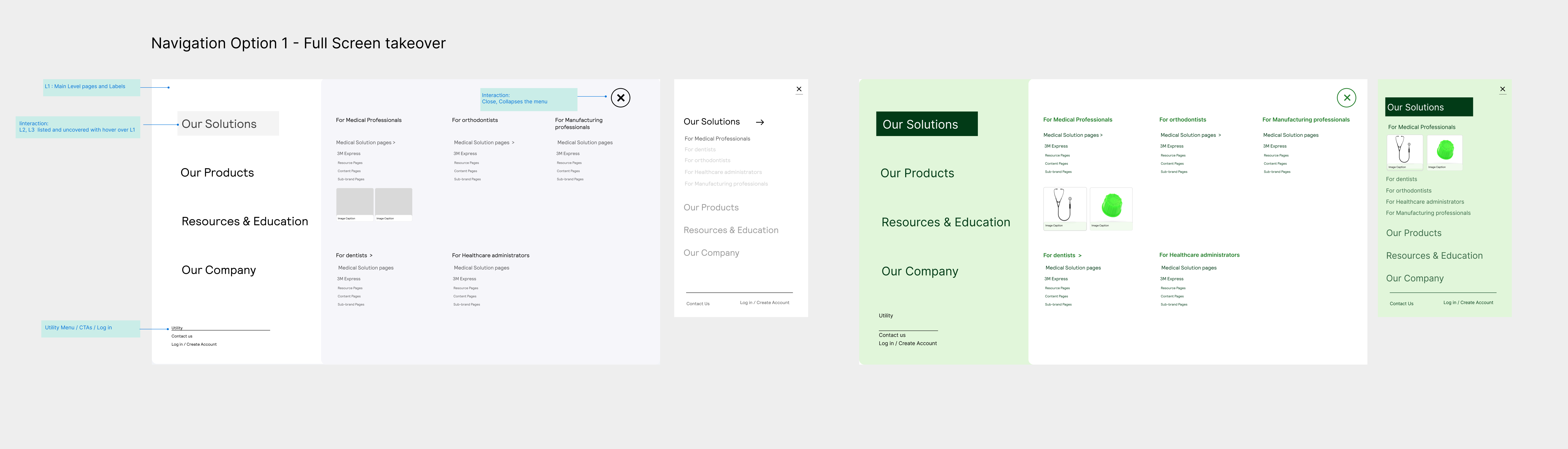
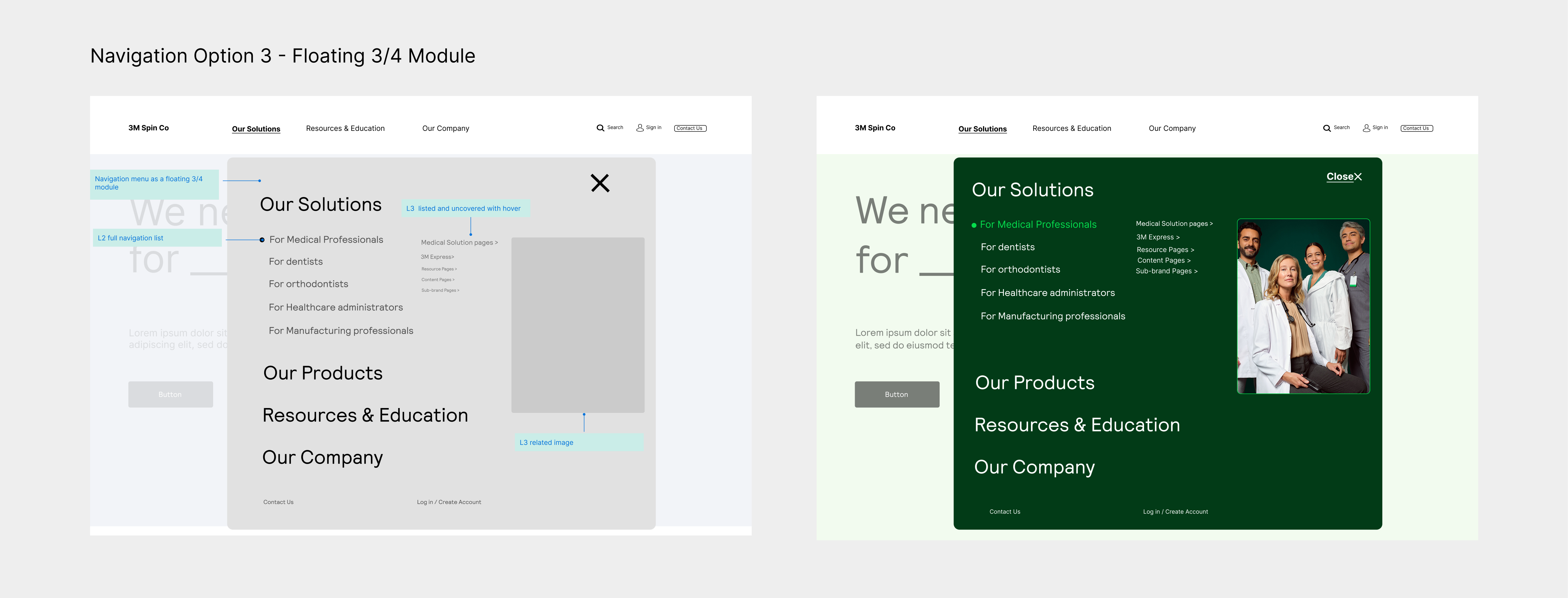
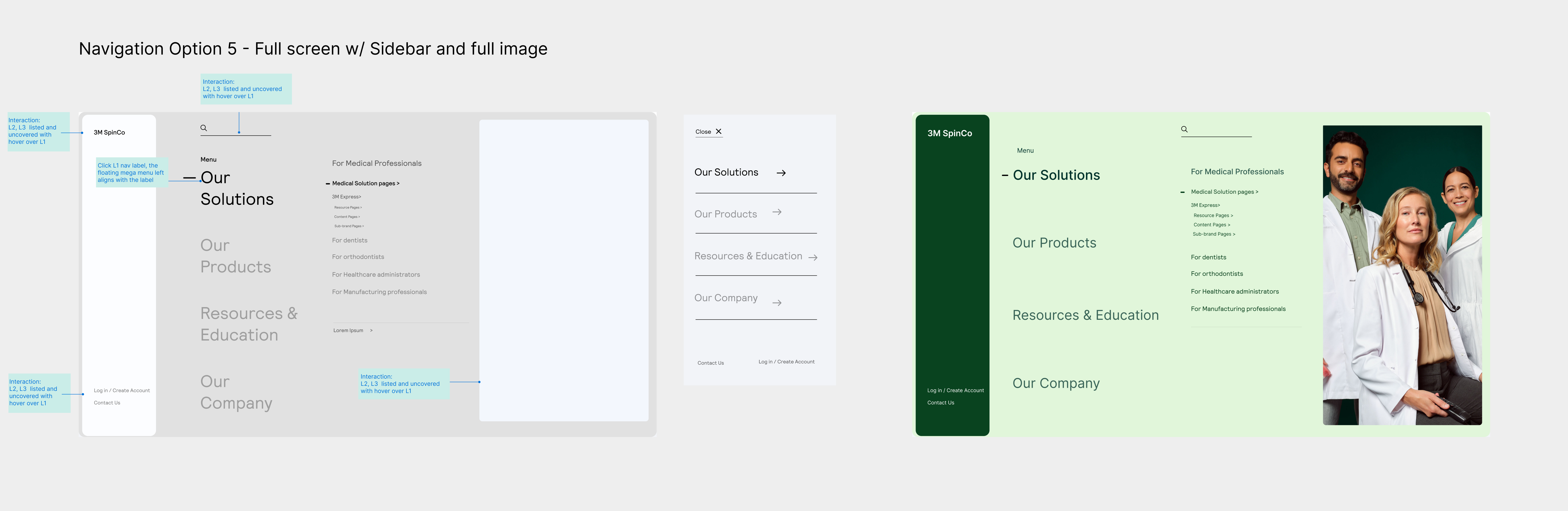
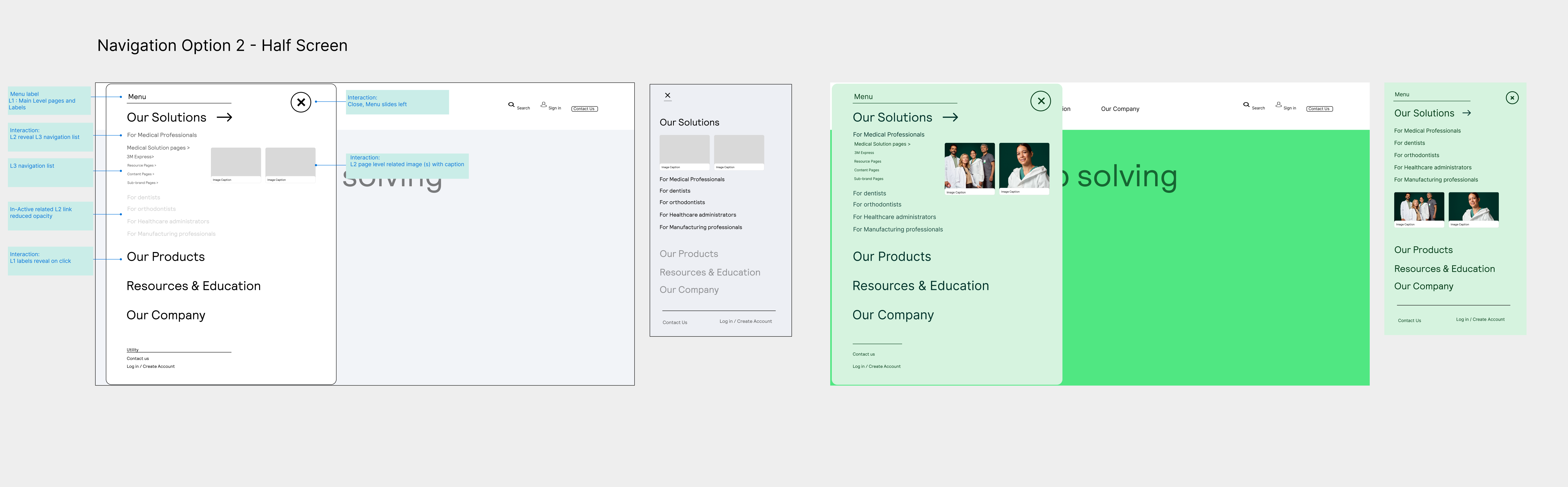
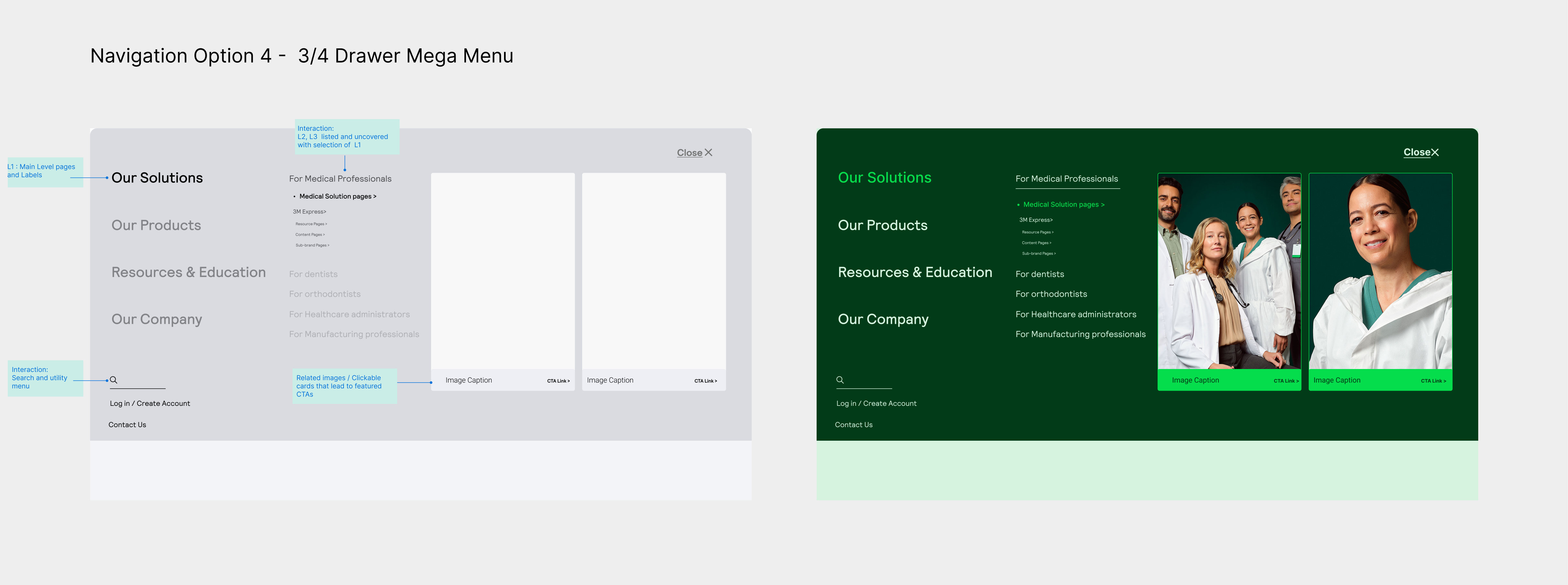
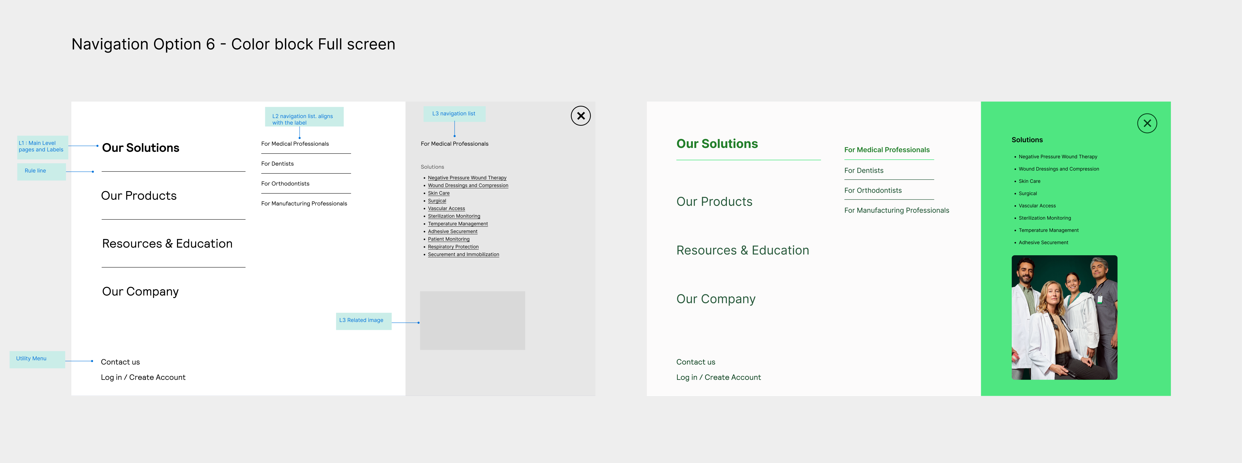
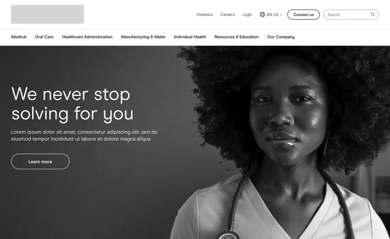
Now that we were aligned on the design direction, the next step was ensuring the experience aligned with the visual identity before moving into components. We kept the top-level navigation fixed, allowing the dropdown to remain clean and minimal.
While I explored more innovative concepts, it became clear that a simple, scalable navigation was best for the growing product catalog. We ultimately chose a drawer-style menu with clear text links and a quick link bar to support efficient access.
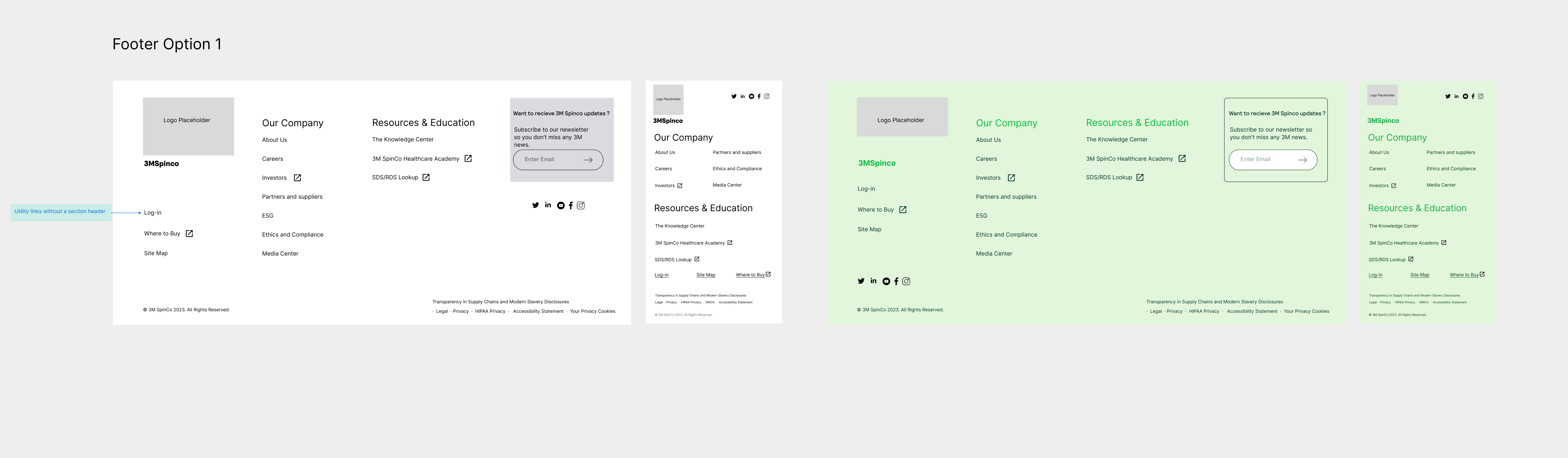
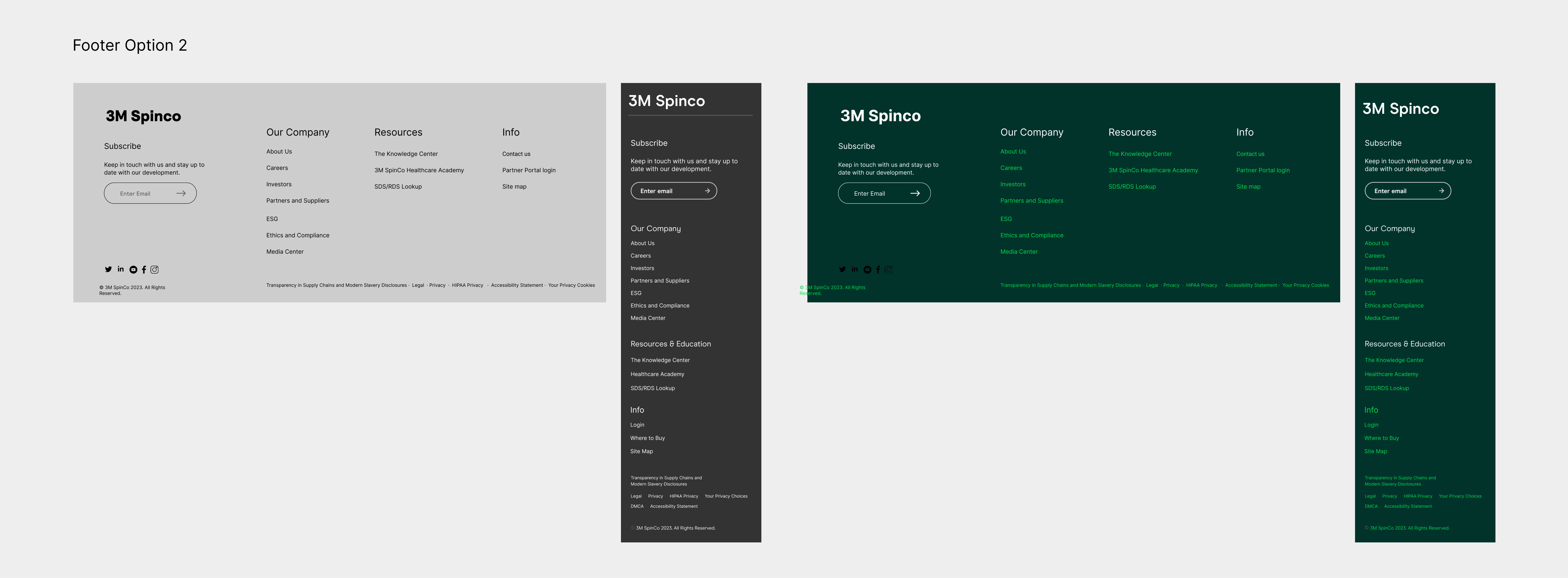
With the main navigation established, I shifted focus to designing a footer that reinforced trust and provided essential utility. The goal was to organize legal, corporate, and support content in a way that felt accessible without overwhelming users. I explored multiple layout options to balance clarity and content density across all screen sizes.
Next, the language selector—an essential feature for a global brand preparing to serve 41 countries across 4 regions. I designed four layout options ( only 2 shown ) that balanced visibility, ease of use, and long-term scalability. The goal was to make language selection intuitive, ensuring users around the world could easily access region-specific content without disrupting the overall experience.
Option 1
To enhance usability while leveraging automation, I designed a language and location selector that balances intelligent defaults with user control.
Key decisions included:
1. Defaulting to the user’s detected language and region based on preferences and IP
2. Displaying the country menu in the detected language, with the native language
3. Allowing users to independently update language and location
4. Instantly updating all languages based on user selection
5. Updating the content to reflect the selected language
Option 1 was approved for V1 of the website.
Option 2
To simplify the language & region selection, I designed an experience that uses autofill and clear interaction states while preserving user control.
Key decisions included:
1. Displaying auto-detected language by default
2. Clicking into the form field replaces content with “Please select,” disables the button, and reveals country dropdown
3. Chosen language populates field and enables button
4. All content is translated based on selection
I created detailed wireframes, component specifications, and annotated handoff notes to ensure consistent implementation and clear communication with developers throughout the completion of all sprints outlined on the product roadmap.
Six sprints with overlapping feedback cycles; we managed this with early wireframe reviews and clean documentation to reduce rework
Compliance and integration with existing 3M systems like login, privacy, and search added layers of constraint—solved through flexible handoff models and placeholder components
created templates with interchangeable modules that allowed teams to target each group with relevant, dynamic content