Redesigning Mack Weldon’s shopping experience
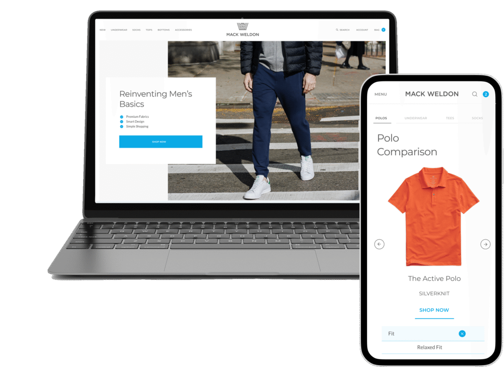
Mack Weldon is a premium menswear brand with a large DTC e-commerce presence. The business goal was to increase conversion and customer satisfaction on Product Detail Pages (PDPs), improve add to cart rate and prioritize quick wins.
My role
I led the end-to-end UX design for Mack Weldon’s PDP and PLP optimization, starting with stakeholder interviews to understand business goals and customer pain points. I developed a Project Prioritization Chart and a Quick Wins document to align the team on impact versus effort. Using FullStory and site analytics, I identified friction points, audited the experience for accessibility (WCAG 2.1), and designed wireframes, interactive Figma prototypes, and high-fidelity mockups that adhered to brand and accessibility standards. Throughout the project, I partnered closely with the product manager and Shopify developers to ensure a seamless implementation across web and mobile.
Responsibilities
Discovery, UX Audit, Competitive research, Stakeholder interviews, end to end prototype, and handoff
TIMELINE & OUTPUT
Jan 2020 - March 2020
TEAM
Creative Director, Product Manager, Shopify Development Team
High level goals
01/ Conduct a site audit and create a Quick Wins document to identify low-effort, high-impact improvements
02/ Interview stakeholders to align priorities and build a clear roadmap for enhancements
03/ Reduce user frustration by decreasing rage clicks and interaction friction on PDP pages
04/ Improve the add-to-cart experience to increase conversion and average order value
Initial Audit
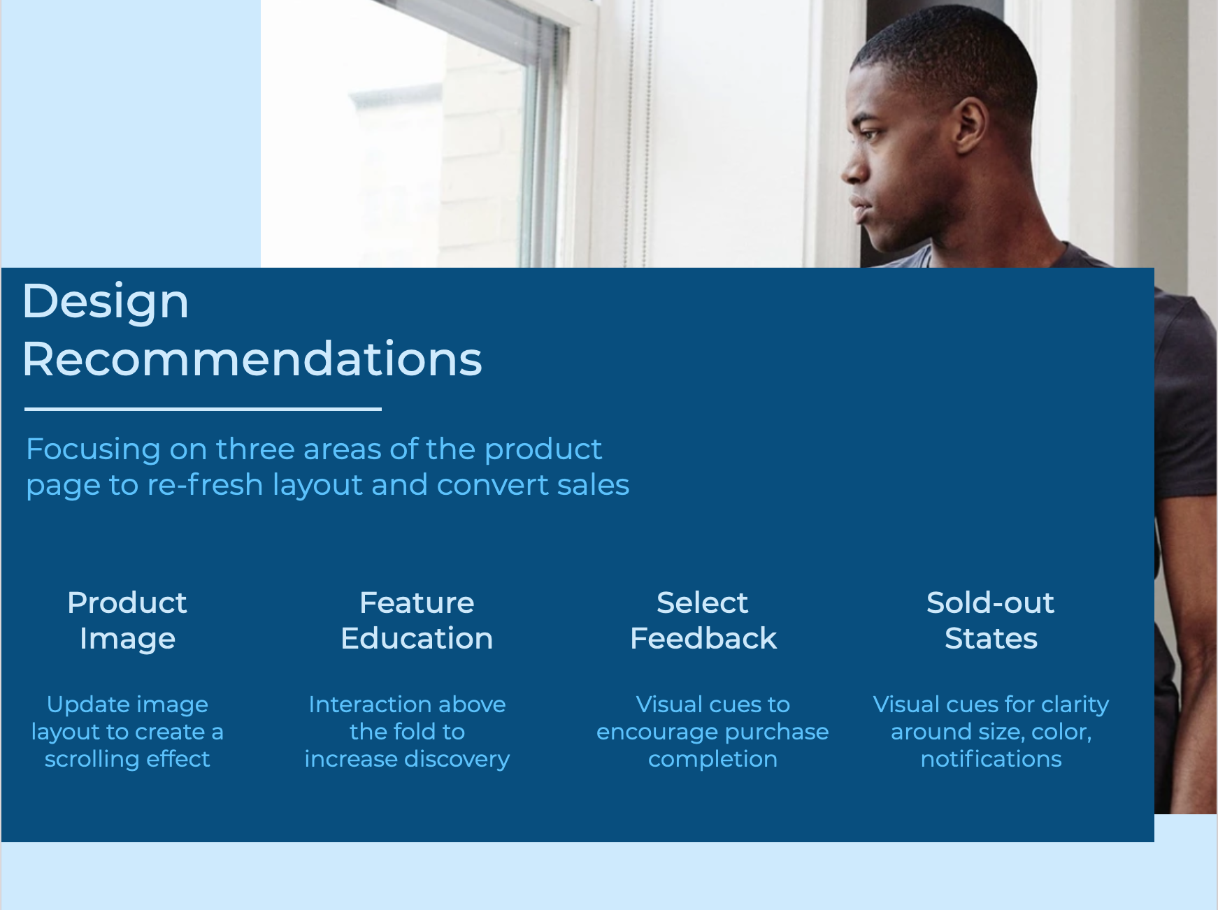
As a first step, I conducted a thorough audit of Mack Weldon’s product pages with a focus on accessibility, usability, and interaction design. By prioritizing the PDP in my design recommendations, I was able to address the most significant friction in the customer journey and ensure downstream benefits for overall site performance.
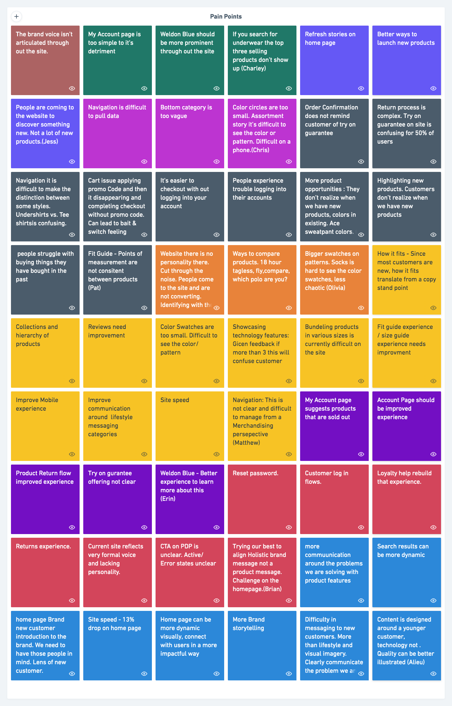
Stakeholder interviews
Next I conducted stakeholder interviews with the e-commerce, merchandising, and customer support teams to better understand recurring customer pain points and business goals. This helped align priorities across teams and surface opportunities that would provide the biggest impact on both conversion and customer experience.
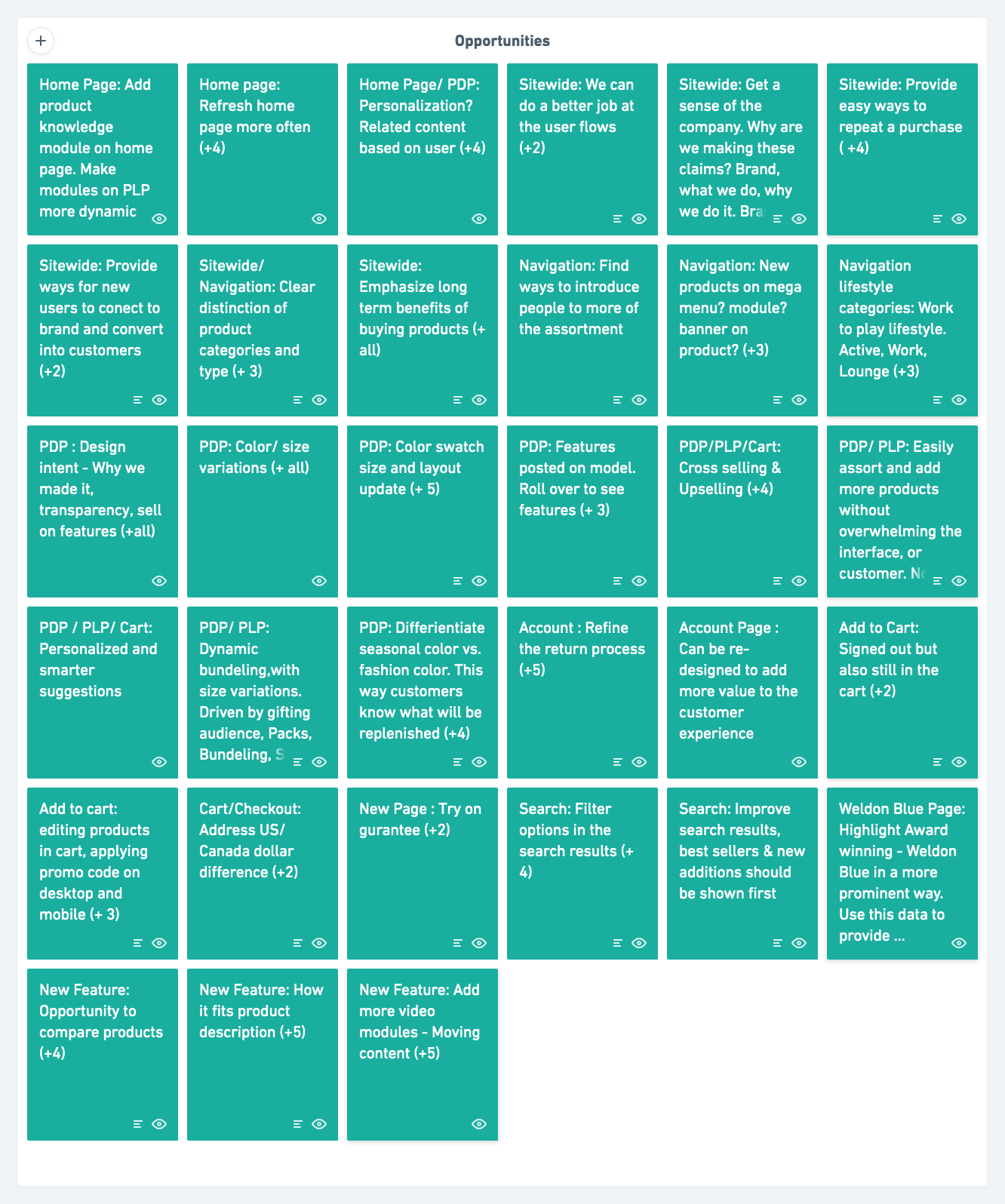
OPPORTUNITIES
01/ PDP OPTIMIZATION
The PDP consistently underperformed on conversions, particularly for products with the widest color and size options.
02/ nAVIGATION
The global navigation was confusing, but it presents an opportunity to highlight centralized campaigns and product launch stories.
03/ SIZE AND FIT
Users struggled to find size and fit information, a core element of the brand.
Design Prioritization
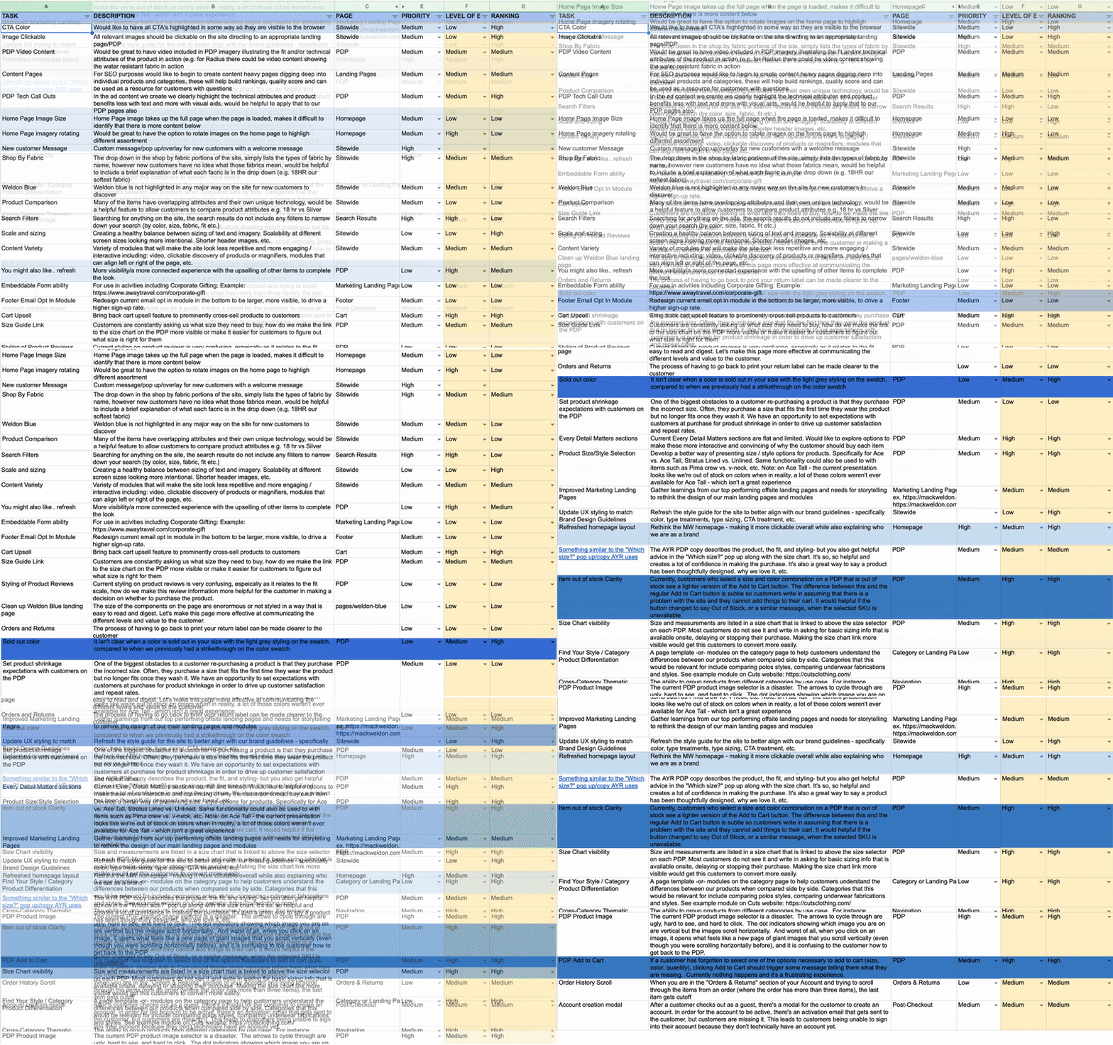
Synthesizing insights from stakeholder interviews, I created a Design Prioritization Chart. This framework aligned cross-functional teams on priorities, highlighted quick wins for immediate implementation, and guided the sequencing of higher-effort, high-impact redesigns.
PDP image update
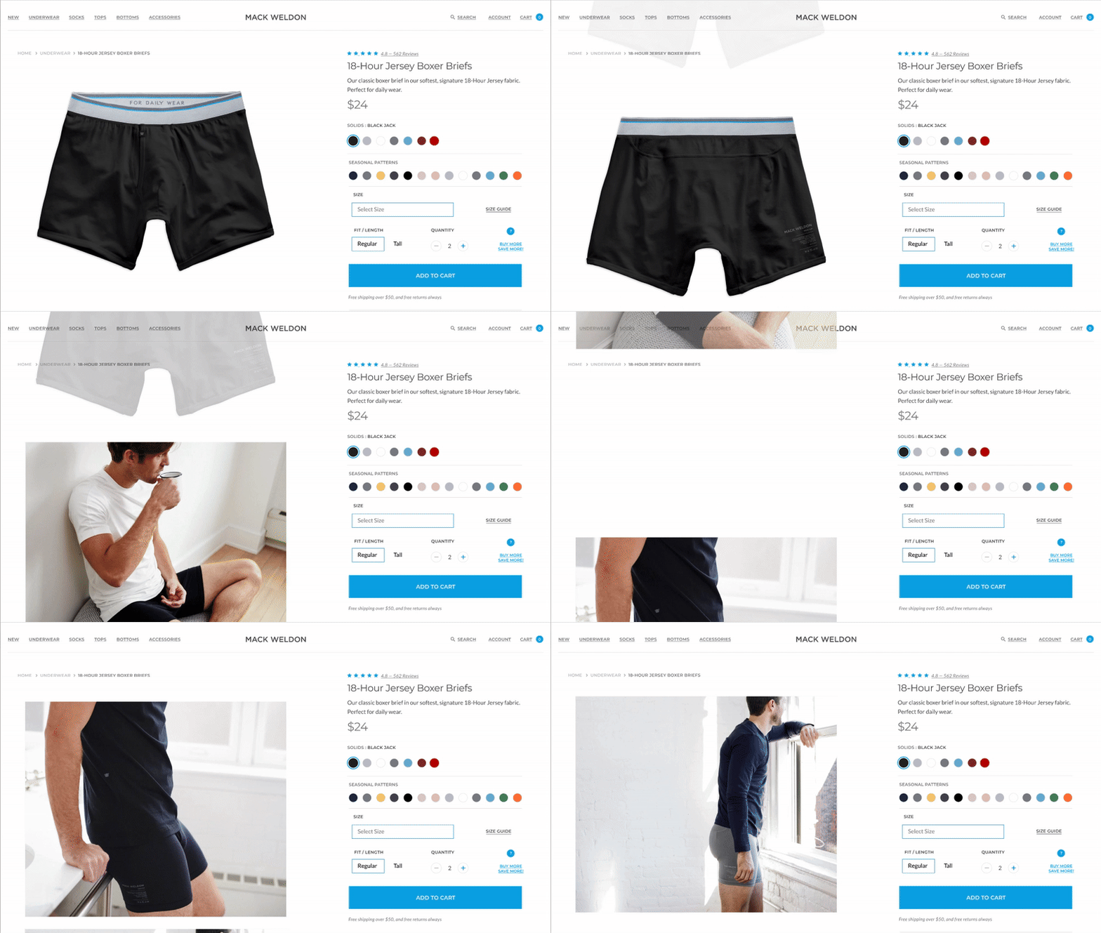
The small-format images felt outdated. I updated the experience with larger, scrollable images so users can view the full product gallery, while keeping product details locked in place for easy reference and call to action above the fold.
PDP SELECTION REFINEMENT
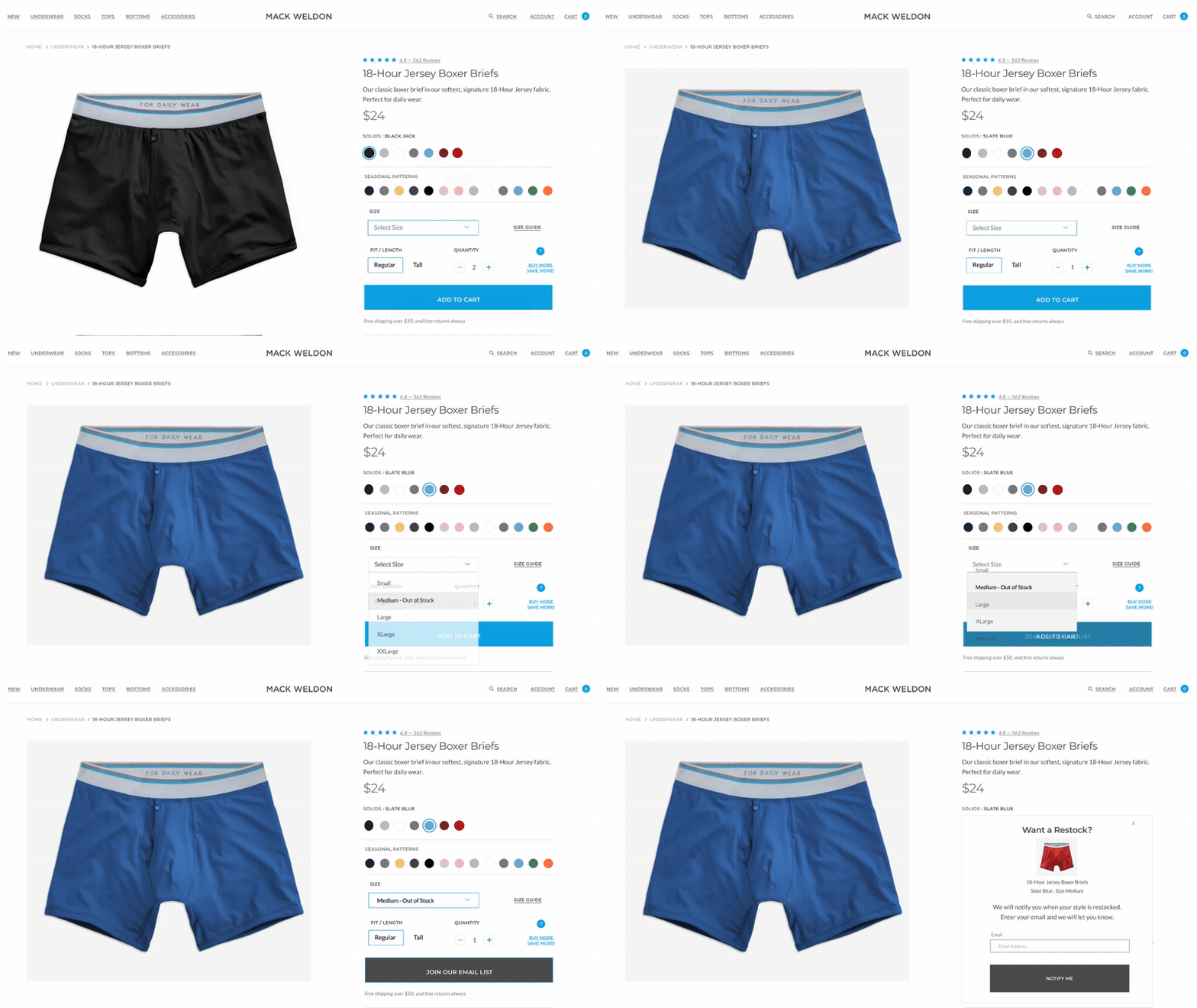
During my audit, I identified missing indicators in the color and size selection flow. FullStory heatmaps revealed rage clicks in this area, confirming the issue. I introduced clearer color selection states, added sold-out size indicators, and implemented a restock pop-up to capture user emails.
Additional CTA Feedback
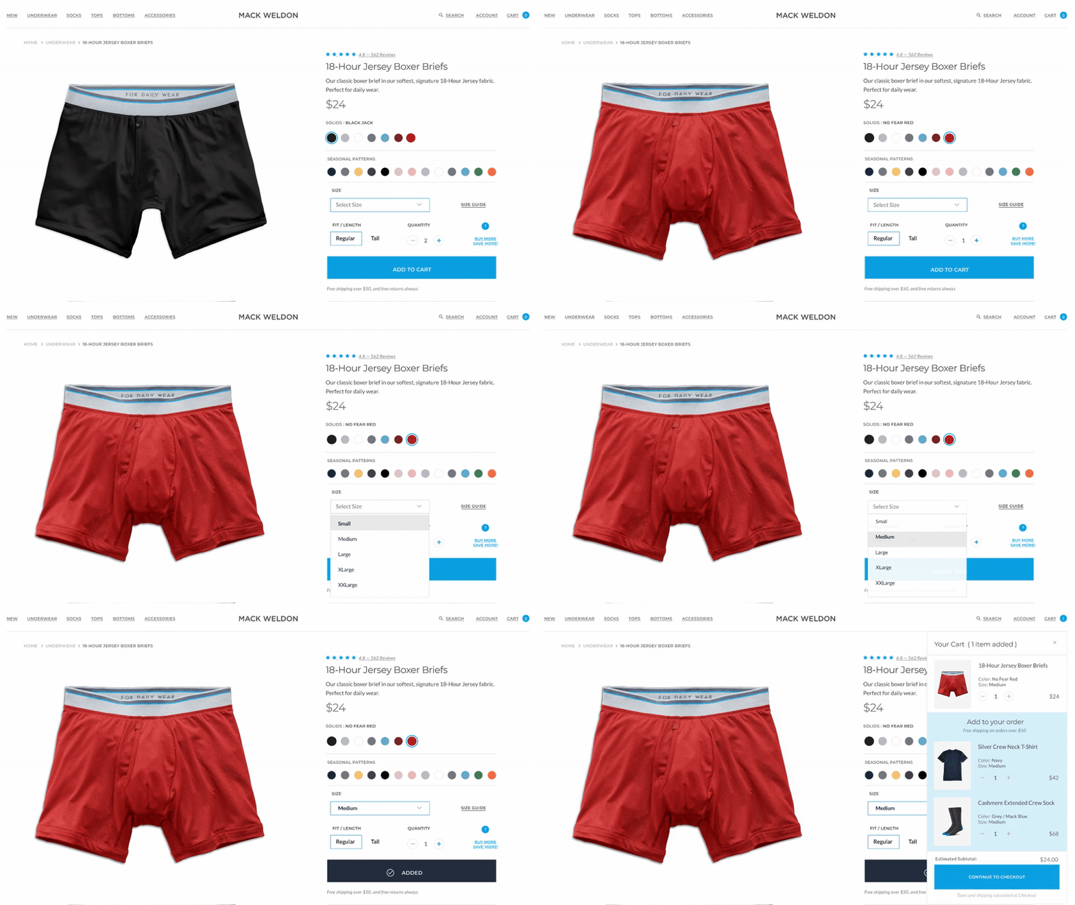
The CTA had poor color contrast and made it unclear when a product was selected. I added a confirmation message and a timed mini cart, allowing users to seamlessly proceed to checkout with promoted products or continue shopping with minimal friction.
LANDING PAGE A/B TEST
In collaboration with the marketing manager, I designed and ran an A/B test to evaluate which landing page layout would drive the strongest engagement following a podcast advertising campaign. The goal was to determine whether highlighting specific products directly from the podcast promotion would improve conversion.
I created two unique layouts to test distinct interaction models:
Version A (Z-pattern layout): A flowing path of imagery and messaging, with product highlights leading toward a strong call-to-action.
Version B (F-pattern layout): A scannable structure that emphasized quick access to information with multiple strategically placed calls-to-action.
The test revealed that the F-pattern layout outperformed the Z-pattern, confirming that users preferred scanning content quickly before engaging. Additionally, we discovered that a filled brand-color call-to-action button was more influential than outlined or secondary treatments, driving stronger click-through rates. These insights not only informed future campaign landing pages but also reinforced best practices for CTA design across the site.


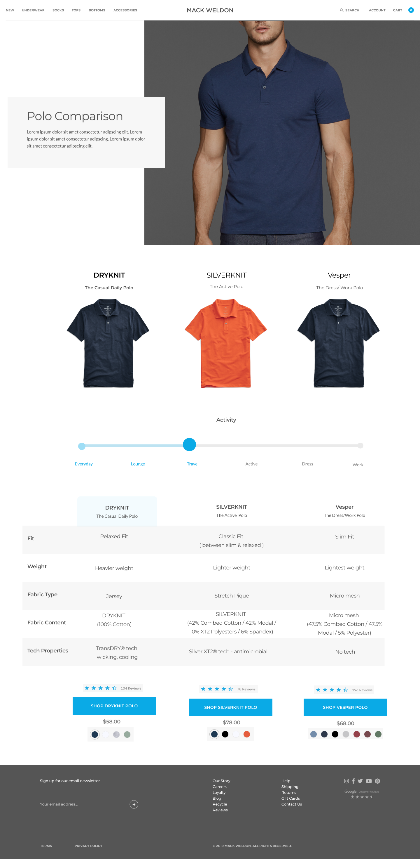
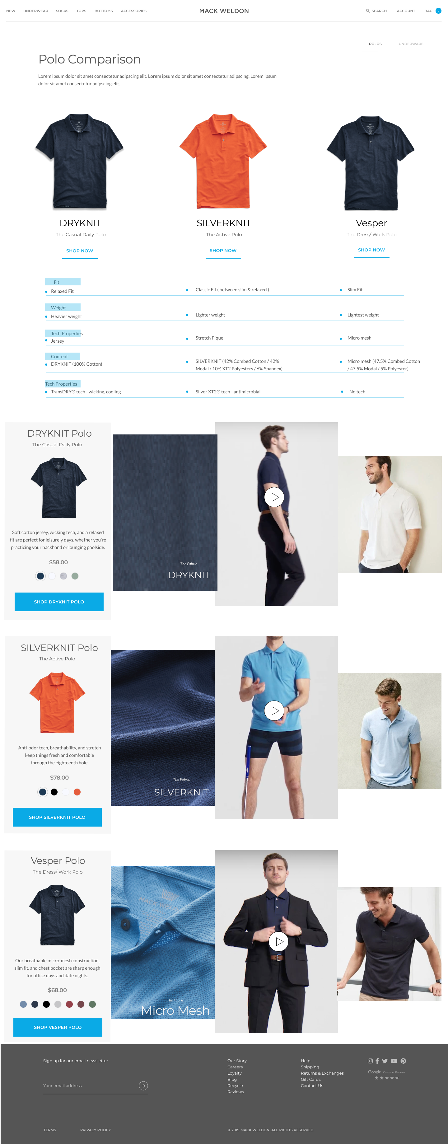
Polo Comparison PLP
I was tasked with designing a unique layout for a polo comparison experience that would highlight the differences between Mack Weldon’s offerings without resorting to a traditional comparison chart.
The creative director’s vision was to move beyond static tables and create a more immersive, lifestyle-driven presentation.
I explored two interaction models:
Slider layout: Allowed users to move between polos side by side, comparing key features and lifestyle imagery in a dynamic way.
Accordion layout: Organized details such as fabric, fit, and performance into expandable sections, paired with product photography and lifestyle content.
To bring the products to life, I also incorporated video elements—showing fabric movement and a model wearing the garments—to help customers visualize the feel and fit beyond static imagery.
While these explorations pushed creative boundaries, the final solution ultimately merged insights from the landing page A/B test (such as the winning F-pattern and brand-color CTA treatments) with the comparison content. This hybrid approach struck the right balance between education and conversion, delivering a polished experience that supported both storytelling and shopping goals.
